Paint colors come and go, but greige color has become a top home choice in recent years.
This modern neutral combines the cool tones of gray with the warm notes of beige.
Creating a balanced and flexible color option for any space.
Greige offers the best of both worlds—it’s not too cool like pure gray and not too warm like traditional beige.
This mix creates a subtle, sophisticated backdrop that works with many design styles, from modern to traditional.
As more homeowners look for versatile paint colors that adapt to changing decor.
Greige color has proven itself as a practical and stylish choice.
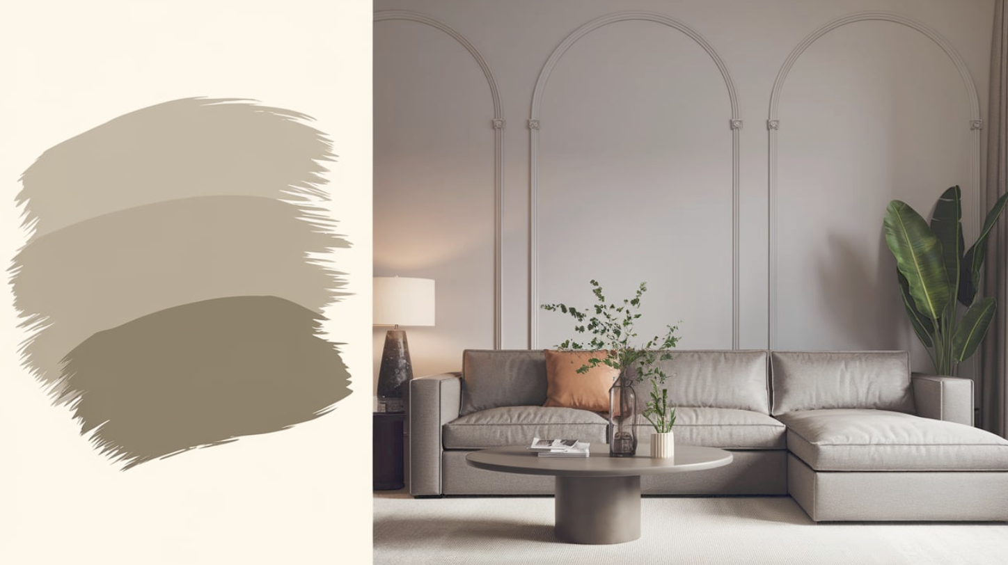
Understanding Greige Color
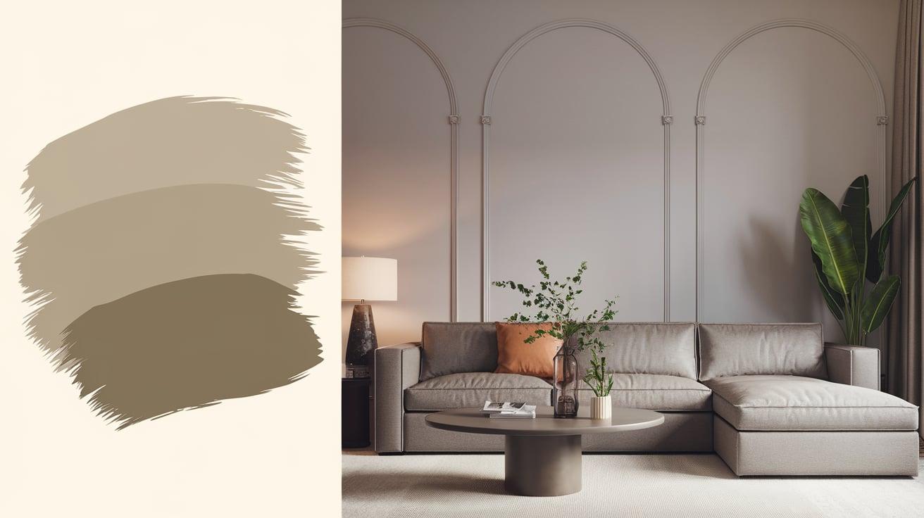
What Exactly is Greige?
Greige combines the sophisticated look of gray with the cozy feel of beige.
Think of it as mixing cool and warm colors to create something new – like adding warm milk to your cool iced coffee.
The result is a balanced color that feels modern yet comfortable.
This color shifts throughout the day as light changes, sometimes showing more gray notes, other times leaning into its beige side.
Each greige paint has its own special mix – some might have more gray for a cooler feel, while others lean warmer with more beige tones.
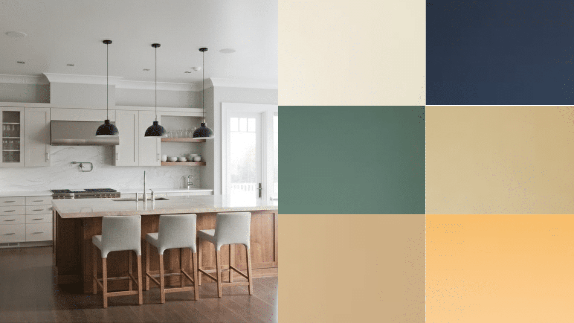
The Versatility of Greige
Greige shines in its ability to work with many different styles.
In modern homes, it creates a clean background that lets minimal furniture stand out.
It adds warmth while keeping things fresh in farmhouse-style spaces. Traditional rooms bring an updated feel while respecting classic design.
It works beautifully with:
- Cool blues and greens for a fresh look
- Warm woods and leather for a cozy feel
- Crisp whites for clean contrast
- Rich blacks for drama
- Natural materials like stone and wood
The color also helps spaces feel bigger and brighter while creating a comfortable setting that doesn’t feel too stark or too yellow.
This makes it perfect for open-plan homes where one color needs to flow smoothly from room to room.
Popular Greige Shades
Sherwin Williams’ Top Greige Paint Colors
Let’s look at Sherwin Williams’ most popular greige options that bring different moods to your space:
SW Accessible Beige
SW Accessible Beige brings warmth to your walls without feeling heavy.
It’s light and easy on the eyes, making it perfect for living rooms and hallways where you want a welcoming feel.
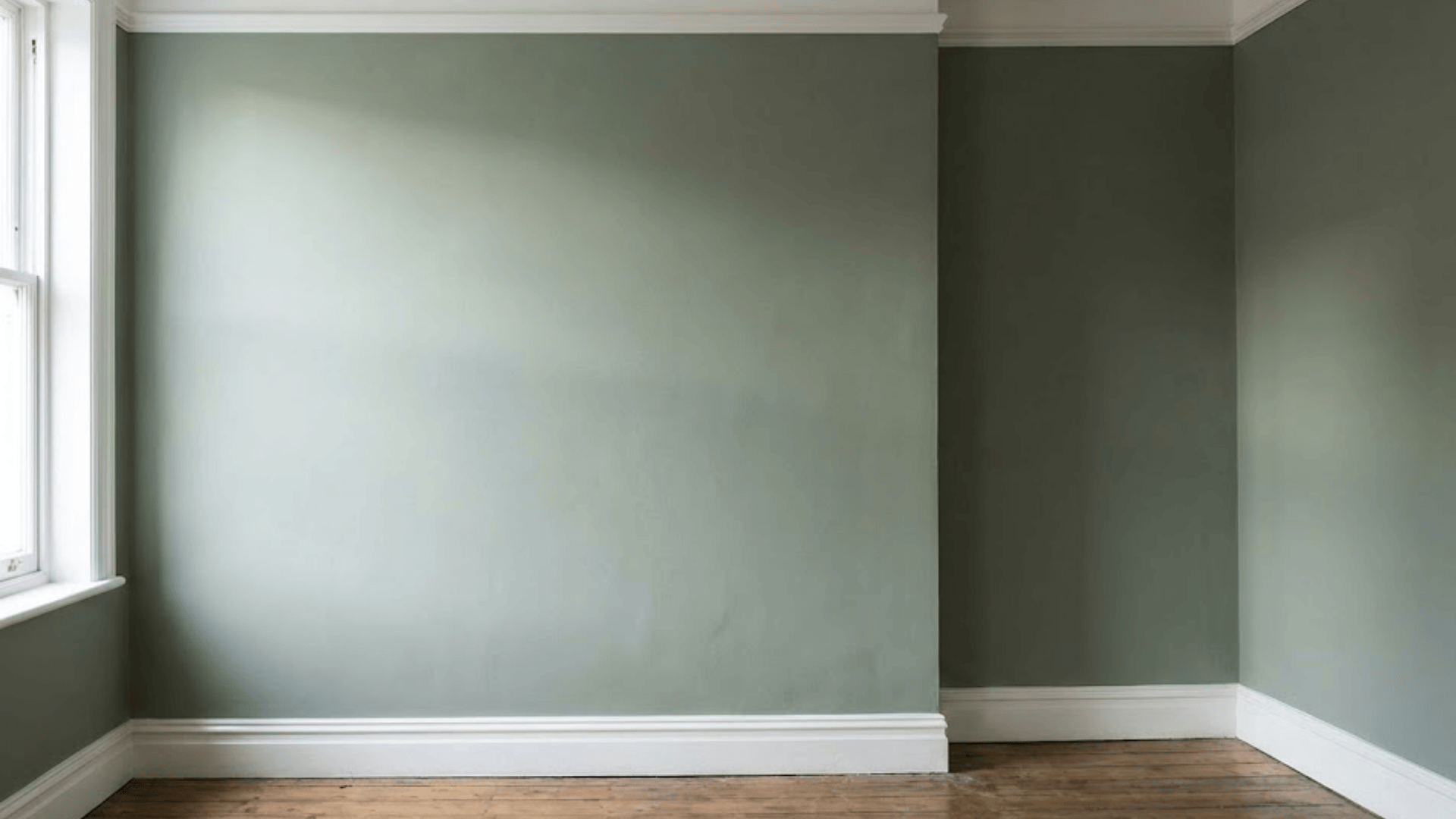
SW Perfect Greige
SW Perfect Greige lives up to its name with an even mix of gray and beige.
It stays true in different lighting, making it a safe choice for any room in your house.
SW Mega Greige
SW Mega Greige adds depth with its rich undertones.
This darker shade works well in rooms where you want to create a cozy feeling, like dining rooms or studies.
SW Functional Gray
SW Functional Gray leans into the cooler side while keeping some warmth.
It’s great for modern spaces where you want a clean but not cold look.
SW Alpaca
SW Alpaca brightens rooms with its light, airy feel.
It’s ideal for small spaces or rooms with limited natural light, helping them feel bigger and more open.
Other Brands and Greige Options
Beyond Sherwin-Williams, many paint brands offer excellent greige choices.
Behr’s Wheat Bread brings a soft, warm greige that works well in kitchens and breakfast nooks.
Benjamin Moore’s Revere Pewter is a light greige that changes beautifully with natural light throughout the day.
Valspar’s Bonsai Bark offers a mid-tone greige that pairs well with light and dark furniture.
PPG’s Lunar Surface provides a modern take on greige with slightly more gray undertones, perfect for contemporary homes.
Each brand offers its own take on greige, giving you plenty of options to find the perfect shade for your space and style preferences.
Best Places to Use Greige in Your Home
Greige for Cabinets

Greige cabinets offer a fresh take on neutral colors in kitchens and bathrooms.
The color adds warmth while keeping the clean look, making these spaces feel fresh.
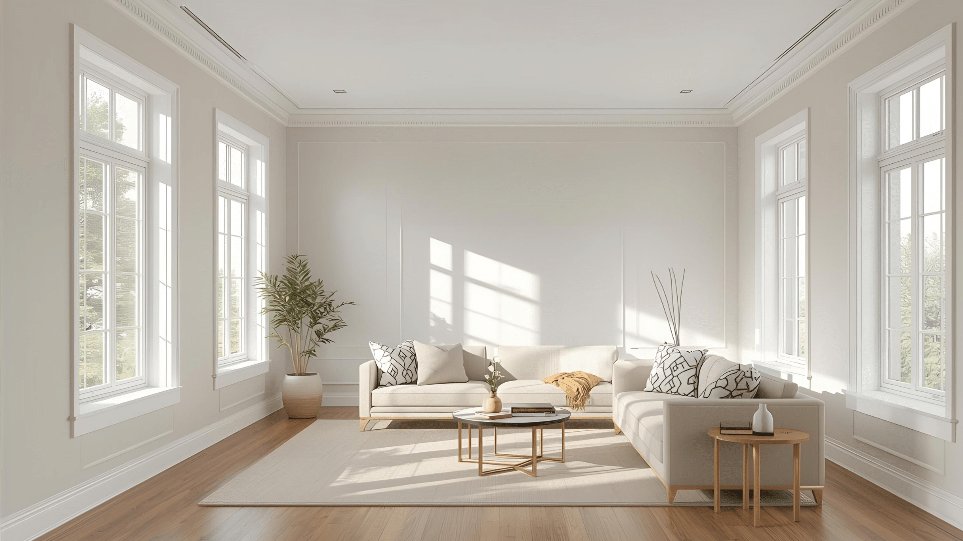
Greige in Living & Dining Rooms

Living and dining rooms come alive with greige walls.
The color creates a calm setting for family time and meals while still looking good with art and furniture.
Greige in Bedrooms and Personal Spaces

In bedrooms, greige shines as a sleep-friendly shade.
Its soft tones help create a quiet space perfect for rest, and they work well with any bedding or decor choices you make.
Why Greige is Perfect for Modern Interiors
Greige as a Transitional Color
Greige helps connect different styles in your home.
It smoothly links modern pieces with classic items, putting rooms together.
If you mix furniture styles or want to update your space gradually, greige walls make the change simple.
The Benefits of Greige Over Traditional Neutrals
Unlike plain white, beige, or gray, greige brings more to your walls.
It’s warmer than gray but fresher than beige and more interesting than basic white.
This mix creates depth that pure neutrals miss while still being easy to work with.
Plus, it hides marks better than lighter shades.
How to Use Greige Without Overdoing It
1. Avoiding a Muddy Look
Greige, a mix of gray and beige, can make a space feel flat if used too much.
To keep your room looking fresh and interesting, limit greige to 60% of your space.
Break up large greige areas with different materials and colors.
Add life to your space by:
Using different textures like smooth cotton, rough linen, and woven materials
Including metal finishes such as brass or chrome
Adding natural wood elements
Placing green plants against greige walls
Using varied lighting to create depth
2. Pairing Greige with Other Colors
Greige works well with many colors. Here are some effective color combinations:
Warm Whites: Add pure white trim or white furniture to make greige walls stand out.
This creates clean lines and makes the space feel bigger.
Earthy Greens: Plants and sage green accessories bring nature inside.
Green adds life to greige without making the room too busy.
Soft Blush Pinks: Light pink throws, pillows, or artwork add warmth to greige rooms.
This combination creates a cozy feeling without being too bold.
Tips for mixing colors:
Start with small items like pillows or art to test color combinations
Keep the 60-30-10 rule in mind: use greige for 60%, another color for 30%, and an accent for 10%
Make sure all colors have similar intensity to create balance
Conclusion
Greige color combines the best gray and beige to create a color that fits any home style.
This neutral shade gives rooms a clean look while staying warm and inviting.
You can use it on walls, furniture, or fabrics to make spaces feel calm and put together.
The key is finding the right balance – mix it with other colors and textures to keep rooms interesting.
From living rooms to bedrooms, greige gives you a base that stays fresh year after year.
It’s a color choice that makes decorating simple while giving your home a polished look that lasts.