Are you struggling to find the perfect colors that work harmoniously with Sherwin-Williams Alabaster in your home? Choosing SW Alabaster coordinating colors can feel overwhelming when you want every room to look cohesive and beautiful.
The right color combinations enhance each room’s function while originally reflecting your personal style. Wrong pairings can make your space look dull or create jarring contrasts that feel uncomfortable to live with day to day.
Different rooms need different approaches based on their purpose, lighting, and the mood you want to create.
I’ll show you exactly which colors complement Alabaster beautifully in living rooms, kitchens, bedrooms, and bathrooms throughout your home. Your perfect color matches are waiting, so let’s jump right in today.
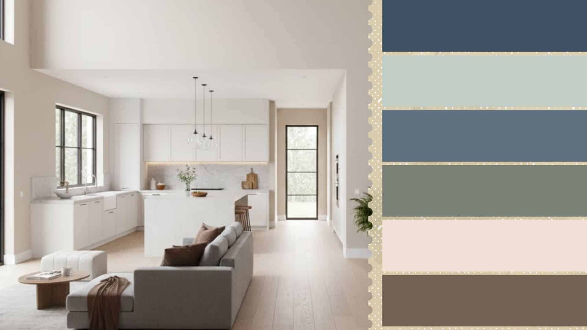
Why Sherwin-Williams Alabaster Works So Well in Interiors
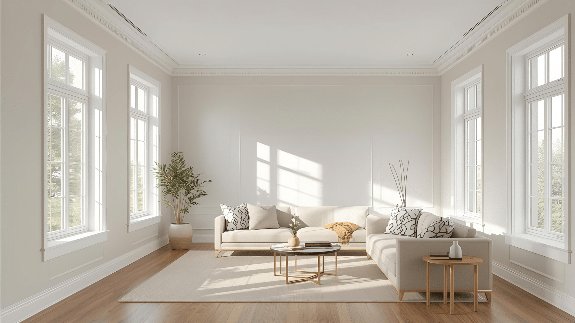
Alabaster stands out as a top choice for interior designers because of its warm, inviting character. This color brings a soft, timeless quality that works beautifully in any room you choose.
Its neutral base pairs easily with both bold accent colors and subtle, calming tones throughout your space.
Alabaster adapts perfectly, whether your style leans modern, traditional, farmhouse, or somewhere in between. The warm undertones create a cozy atmosphere without feeling too yellow or stark like pure white.
Small rooms feel larger and brighter, while large spaces gain a welcoming, cohesive look with this shade. Here are the technical specifications:
| Property | Value |
|---|---|
| LRV (Light Reflectance Value) | 82 |
| RGB | 237 / 234 / 224 |
| Hex Value | #EDEAE0 |
Best Coordinating Colors for Alabaster: A Room-by-Room Guide
Alabaster works beautifully throughout your entire home when paired with the right coordinating colors. Different rooms benefit from specific color combinations that enhance their function and mood.
1. Coordinating Colors for Living Rooms
Living rooms need colors that create inviting, comfortable spaces where family and guests naturally gather together.
Alabaster provides the perfect neutral foundation that lets you choose from calming, cozy, or refined accent shades.
| Color | LRV | Hex Code | Undertone | Appeal |
|---|---|---|---|---|
| SW Sea Salt | 63 | #CDD2CA | Green-gray | Calm, coastal, soothing atmosphere |
| SW Silvermist | 47 | #B0B8B2 | Cool gray | Soft, serene, peaceful vibe |
| SW Accessible Beige | 58 | #D1C7B8 | Warm beige | Cozy, grounded, natural warmth |
| SW Rosemary | 14 | #64695C | Deep green | Cultured, nature-inspired grace |
These combinations give your living room personality while maintaining Alabaster’s warm, welcoming character. Choose the palette that matches your style and the mood you want to create daily.
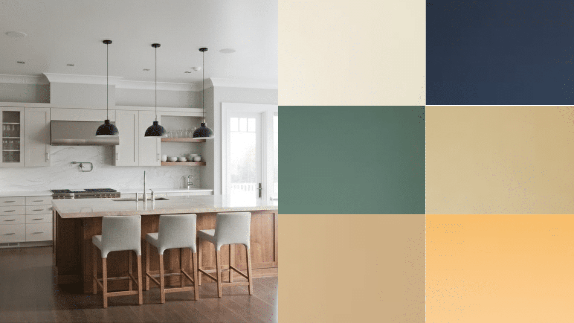
2. Coordinating Colors for Kitchens
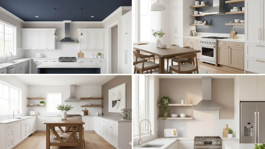
Kitchens require colors that feel fresh, clean, and energizing while you cook and gather for meals. Alabaster creates a bright, airy foundation that pairs beautifully with classic, bold, or natural accent colors.
| Color | LRV | Hex Code | Undertone | Appeal |
|---|---|---|---|---|
| SW Naval | 4 | #2F3D4C | Deep blue | Bold, dramatic, modern contrast |
| SW Indigo Batik | 8 | #3E5063 | Rich blue | Urbane design element |
| SW Smokehouse | 13 | #716354 | Warm brown-gray | Rustic, farmhouse, natural warmth |
| SW Balanced Beige | 46 | #C0B2A2 | Warm taupe-beige | Earthy, cozy, grounded character |
These kitchen combinations work for cabinets, islands, or accent walls, depending on your design vision. Alabaster keeps the space feeling bright while your coordinating colors add personality and style.
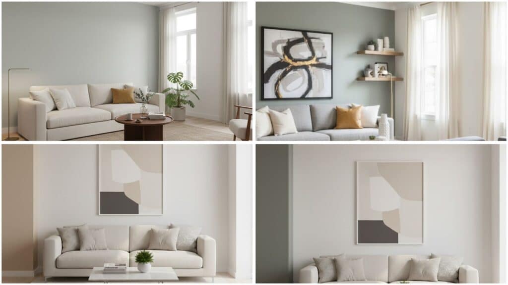
3. Coordinating Colors for Bedrooms
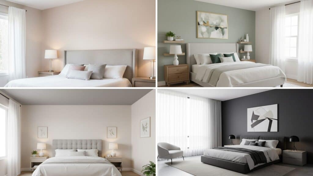
Bedrooms need soothing colors that promote relaxation and help you unwind after long, busy days. Alabaster’s warm neutrality provides the perfect backdrop for creating peaceful, personalized sleeping spaces you’ll love.
| Color | LRV | Hex Code | Undertone | Appeal |
|---|---|---|---|---|
| SW Intimate White | 77 | #F0E1D8 | Soft peach-pink | Gentle, calming, restful atmosphere |
| SW Softened Green | 49 | #BBBCA7 | Pale green | Natural, peaceful, relaxing vibe |
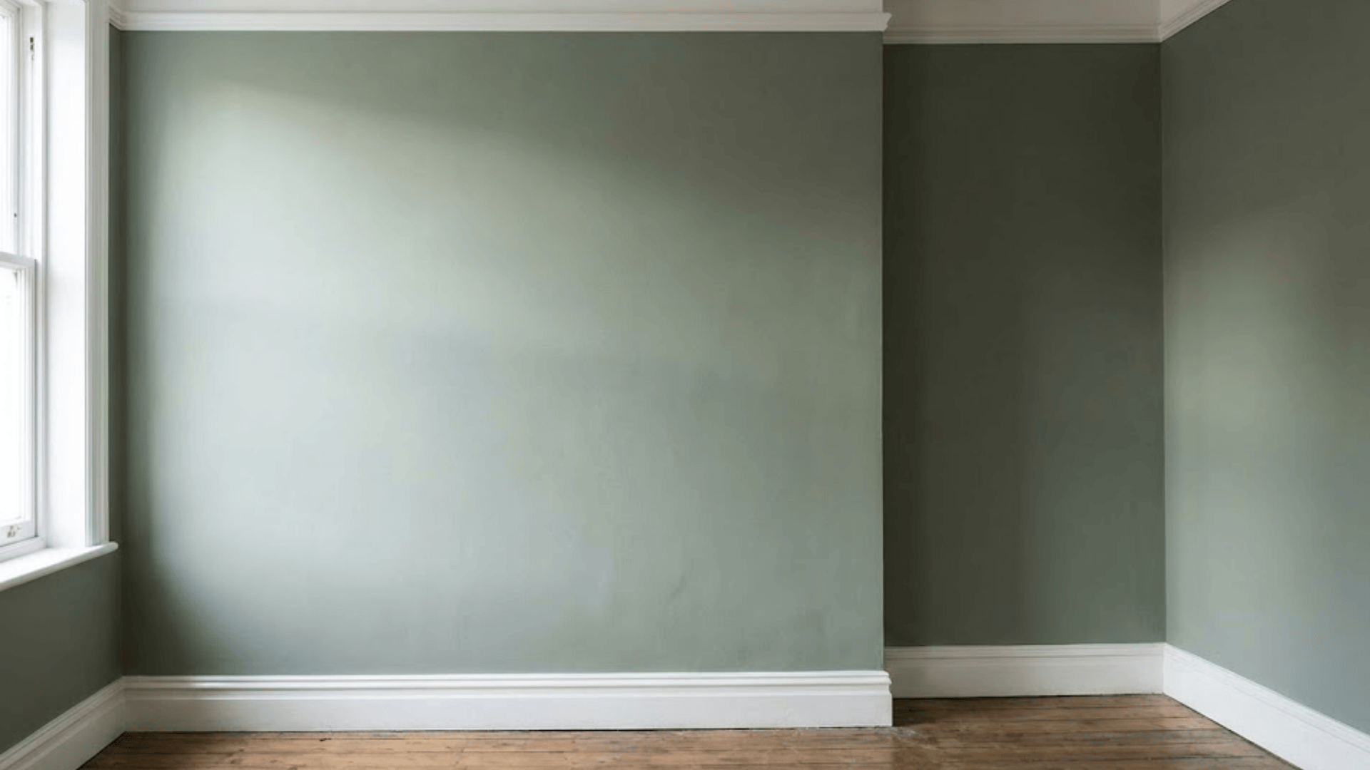
| SW Retreat | 21 | #7A8076 | Sage green | Warm, tranquil, nature-inspired feel |
| SW Tricorn Black | 3 | #2F2F30 | True black | Dramatic, urbane, cozy contrast |
These bedroom palettes help you design a space that feels like a true retreat. Whether you prefer soft and dreamy or bold and refined, Alabaster adapts perfectly.
4. Coordinating Colors for Bathrooms
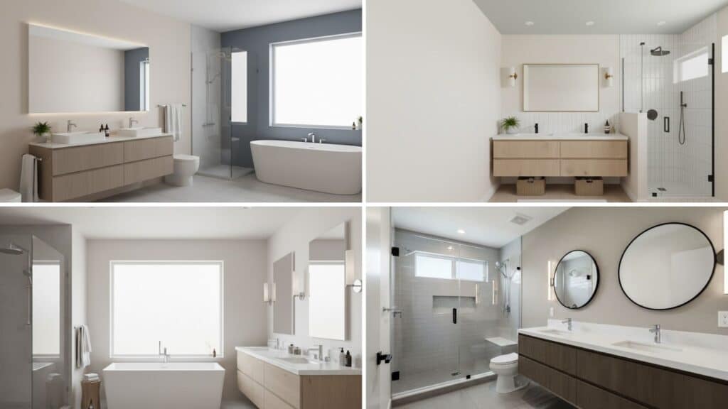
Bathrooms benefit from colors that feel clean, spa-like, and refreshing every time you step inside. Alabaster creates a serene foundation that makes small bathrooms feel larger and luxurious bathrooms feel sleek.
| Color | LRV | Hex Code | Undertone | Appeal |
|---|---|---|---|---|
| SW Distance | 15 | #5D6F7F | Blue-gray | Tranquil, spa-like, refreshing environment |
| SW Rainwashed | 59 | #C2CDC5 | Blue-green | Serene, coastal, calming atmosphere |
| SW Creamy | 81 | #EFE8DB | Warm cream | Flawless, soft, understated classiness |
| SW Wool Skein | 63 | #D9CFBA | Warm beige | Relaxing, neutral, comfortable feel |
These bathroom combinations transform everyday spaces into personal sanctuaries you’ll actually enjoy using. Alabaster keeps everything feeling fresh while coordinating colors to add your preferred style and character.
Color Combinations to Avoid
Alabaster pairs beautifully with many colors, but certain combinations can work against its warm, inviting character.
Pairing Alabaster with pure bright white creates too much contrast, making the space feel sterile. The warmth of Alabaster gets lost next to stark white, creating an unbalanced, cold atmosphere instead.
Overly bold contrasts like pairing Alabaster with pure black can feel jarring and harsh in most rooms. Unless used strategically in small doses, these extreme contrasts overwhelm Alabaster’s soft, gentle nature completely.
Very cool grays, free of warm undertones, clash with Alabaster’s inherent warmth, creating visual tension. Stick with colors that respect Alabaster’s warm, neutral base for balanced results.
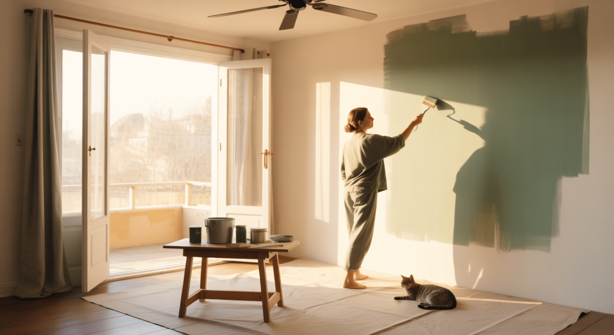
Accents and Trends for Alabaster Coordinating Colors
Alabaster becomes even more attractive when you add the right accents and design elements throughout your space. Here are popular ways to enhance Alabaster with accents and textures:
- Create Dramatic Accent Walls: Use contrasting colors like navy blue or dark gray on one wall to make Alabaster pop dramatically.
- Add Textural Elements: Incorporate shiplap, exposed brick, or natural stone to create visual interest and depth against Alabaster’s smooth finish.
- Include Metallic Accents: Pair Alabaster with gold, brass, or copper fixtures and hardware for a sleek, luxurious touch throughout.
- Update Light Fixtures and Hardware: Install metal light fixtures, cabinet pulls, or door handles that complement Alabaster’s warm undertones beautifully.
These accent choices transform Alabaster from a simple neutral into a urbane design foundation. Mixing textures and metallics adds layers of interest that make your space feel curated and complete.
Final Thoughts
Now you know exactly which SW Alabaster coordinating colors bring out the best in every room of your home. I’ve shown you how different spaces benefit from specific palettes that enhance their function and mood perfectly.
Living rooms feel more inviting, kitchens look fresher, bedrooms become true retreats, and bathrooms transform into spa-like sanctuaries. Remember to avoid pure bright whites and overly bold contrasts unless you’re using them strategically in small doses.
Metallic accents and textural elements, such as shiplap or natural stone, add depth and interest to your space.
Your home deserves color combinations that feel cohesive, welcoming, and uniquely yours every single day. Ready to start your Alabaster color journey? Share which room you’re painting first in the comments below!