I’ve been watching sage green take over Pinterest boards and design magazines, and honestly? I get the hype.
There’s something about this soft, nature-inspired hue that just works, going for calming bedroom vibes or a fresh kitchen update.
What I love most is how versatile it is: sage can play the neutral backdrop, pop as an accent, or command attention as your room’s star. Not all sage greens are created equal, though.
Different brands, different undertones, different lighting situations all matter.
I’ve put together this guide to help you compare shades and find the one that clicks for your space.
What Makes Sage Green Actually “Sage”?
Sage green is that soft, muted green-gray you see in dried sage leaves, sometimes called “herbal” or “dusty” green because of its earthy, subdued quality.
What makes sage tricky is that no two shades look quite the same. The undertones shift everything.
Some lean gray or silver, giving you that cooler, modern edge. Others pull yellow, beige, or khaki, wrapping a room in warmth and coziness. Then you’ve got the blue-tinted versions that feel spa-like and serene.
Beyond undertones, there’s Light Reflectance Value (LRV): basically, how much light a color bounces back. Higher LRV means your space feels airy and open.
Lower LRV? It reads deeper and more grounded. Both factors work together to determine whether your sage green whispers or makes a statement.
Top Sage Green Paint Colors by Major Brand
Finding the right sage green means knowing what each brand brings to the table. Some lean modern and airy, others feel warm and grounded.
Let me walk you through the standout options from Sherwin-Williams, Behr, and Little Greene so you can compare undertones, moods, and finishes all in one place.
1. Sherwin-Williams Sage Greens
Sherwin-Williams dominates the sage green game with options that range from cool and contemporary to warm and herbal.
Their shades tend to have refined gray undertones that work beautifully in both modern and traditional spaces, making them a safe bet if you want a color that feels polished and lasting.
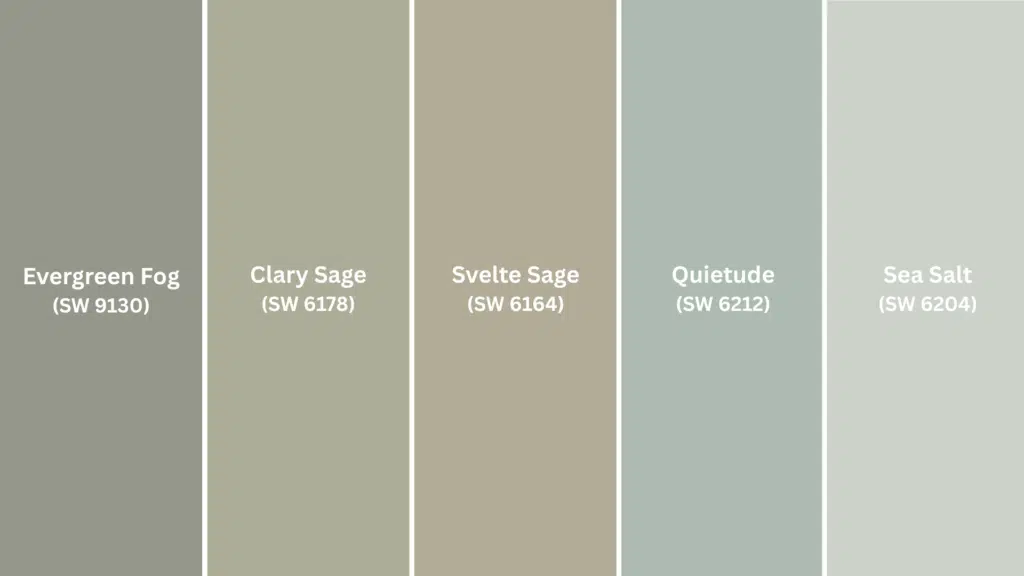
| Color Name | Code | LRV | RGB | Undertone | Vibe |
|---|---|---|---|---|---|
| Evergreen Fog | SW 9130 | 44 | 172, 177, 165 | Gray | Mid-tone, balanced, very popular |
| Clary Sage | SW 6178 | 53 | 189, 186, 166 | Yellow-gray | Warmer, herbal, cozy |
| Svelte Sage | SW 6164 | 60 | 199, 197, 181 | Beige | Neutral, understated |
| Quietude | SW 6212 | 58 | 195, 199, 191 | Blue | Soft, serene, 2025 Color of the Year |
| Sea Salt | SW 6204 | 64 | 204, 211, 203 | Blue-green | Light, airy, coastal feel |
- Sample multiple shades on different walls since lighting dramatically changes how these read
- Matte or eggshell finishes work best for walls to keep that soft, muted quality intact
- Pair with crisp white trim to let the sage take center stage
2. Behr Sage Greens
Behr offers budget-friendly sage options that punch above their price point. Their palette skews lighter and softer overall, with shades that feel accessible and easy to live with.
If you want a gentle introduction to sage green without committing to something too bold, Behr’s your brand.
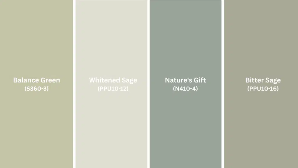
| Color Name | Code | LRV | RGB | Undertone | Vibe |
|---|---|---|---|---|---|
| Balance Green | S360-3 | 62 | 200, 210, 198 | Pale, jade-like | Very soft, almost minty |
| Whitened Sage | PPU10-12 | 71 | 217, 220, 209 | Nearly white | Barely-there green cast |
| Nature’s Gift | N410-4 | 54 | 186, 197, 189 | Blue | More vibrant, fresh |
| Bitter Sage | PPU10-16 | 48 | 178, 182, 164 | Olive, tan | Warmer, earthier |
- Grab sample cans and paint large swatches to see how the color shifts throughout the day
- Match your trim’s LRV closely if you want a seamless, monochromatic look
- Behr’s Premium Plus line has better coverage for these lighter shades
3. Little Greene Sage Greens
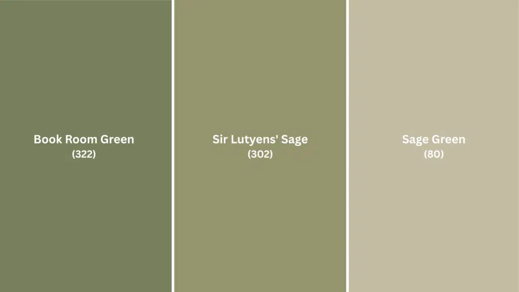
Little Greene brings a heritage sensibility to sage green that feels distinctly European and refined. Their formulations have more depth and richness than typical commercial brands, with pigments that create complex, layered looks.
This is the choice if you want something that feels curated and elevated rather than mass-market.
| Color Name | Code | LRV | RGB | Undertone | Vibe |
|---|---|---|---|---|---|
| Sage Green | 80 | 23 | 120, 131, 114 | Gray-green | Classic Victorian, traditional, medium-dark |
| Sir Lutyens’ Sage | 302 | 35 | 148, 158, 138 | Gray-green | Heritage-inspired, lighter than Sage Green |
| Book Room Green | 322 | 28 | 130, 140, 124 | Neutral green | Muted, library-inspired, works as a backdrop |
- Little Greene’s finish options are more nuanced; their Estate Emulsion has a chalky, flat look that improves the color’s depth
- The color reads differently than American brands due to different pigment formulations, so definitely sample first
- Works beautifully in period homes or spaces, going for that English countryside appeal
4. Other Notable Sage Greens
Beyond the big three, a few designer favorites deserve attention. Benjamin Moore‘s October Mist and Saybrook Sage bring their own take on muted green with excellent coverage and depth.
For a moodier, more premium feel, Farrow & Ball‘s Green Smoke and Lichen offer that signature richness the brand is known for, though you’ll pay for it.
| Color Name | Brand | LRV | RGB | What Makes It Special |
|---|---|---|---|---|
| October Mist | Benjamin Moore | 57 | 191, 195, 183 | Soft gray-green, versatile, and popular |
| Saybrook Sage | Benjamin Moore | 48 | 176, 180, 162 | Warmer, more yellow undertones |
| Green Smoke | Farrow & Ball | 24 | 121, 130, 120 | Moody, dramatic, deep |
| Lichen | Farrow & Ball | 36 | 151, 158, 141 | Complex gray-green, heritage feel |
- Benjamin Moore’s Regal Select line has superior hide and durability for high-traffic areas
- Farrow & Ball colors require proper prep and multiple coats, but the payoff is worth it
- These premium options work best when you want a statement wall rather than painting an entire room
Choosing the Right Sage Green for Your Space
Picking the perfect sage green isn’t just about the color itself. It’s about how that color behaves in your specific room.
Lighting conditions, existing decor, and even your finish choice can make the same shade look completely different from one space to another.
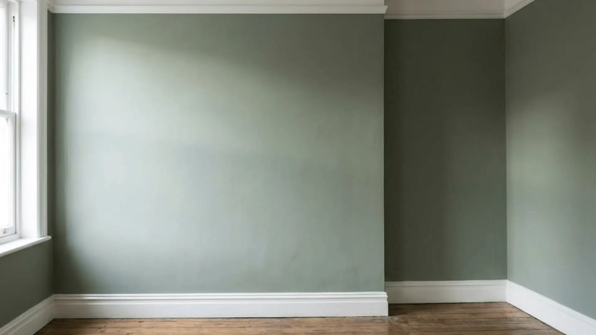
Understanding Undertones and Room Lighting
Room orientation changes everything. North-facing rooms get cooler, bluer light that can make sage feel muted and gray.
Counter this with warmer shades that have yellow or beige undertones. South-facing rooms flood with golden light that brings out yellow tones in paint, so cooler sages with gray or blue undertones work better here.
Your existing decor guides your choice, too. Warm wood furniture, brass fixtures, or beige flooring pair beautifully with yellow-beige sage greens. Cool gray sofas, white trim, or chrome accents need gray or blue-tinged sages for a cohesive look.
Paint large swatches on different walls and view them throughout the day. Sage green shifts dramatically from morning to evening, so what looks perfect at noon might feel completely different by dinnertime.
Finish and Sheen Recommendations
The finish you choose affects both how the color appears and how practical it is for your space.
- Matte or flat finish for walls keeps that soft, natural sage quality intact and hides wall imperfections beautifully
- Eggshell finish for high-traffic areas like hallways or family rooms offers subtle washability without looking shiny
- Satin or semi-gloss for cabinets and trim provides durability and makes cleaning easier in kitchens and bathrooms
- Exterior applications need semi-gloss or satin to withstand weather and moisture while maintaining that sage green character
- Avoid high gloss on walls, as it amplifies any yellow or green undertones and can make sage look artificial
Remember that higher sheens reflect more light, which can intensify undertones you might not want. When in doubt, go one sheen level lower than you think you need. Sage green looks best when it stays soft and understated.
What Colors Pair Best with Sage Green?
Sage green plays well with others, but the colors you pair it with can completely convert its personality. The right combinations bring out either its warm, earthy side or its cool, modern edge.
| Color Category | Specific Colors | Effect on Sage | Best For |
|---|---|---|---|
| Neutrals | Whites, creams, soft beige | Creates a clean, airy backdrop that lets sage breathe | Walls, trim, and large furniture pieces |
| Natural Materials | Wood tones, rattan, leather | Strengthens organic, nature-inspired quality | Flooring, furniture, texture layers |
| Warm Accents | Dusty pink, terracotta, blush, mustard | Brings out yellow undertones for a cozy feel | Pillows, artwork, small decor items |
| Cool Accents | Charcoal, slate gray, navy | Emphasizes gray undertones for a modern look | Accent walls, upholstery, rugs |
| Metallics | Brass, matte black, aged gold | Adds visual interest without overwhelming softness | Hardware, fixtures, frames |
Test your pairings with fabric swatches or decor samples against your chosen sage to see how the undertones interact before committing to larger purchases.
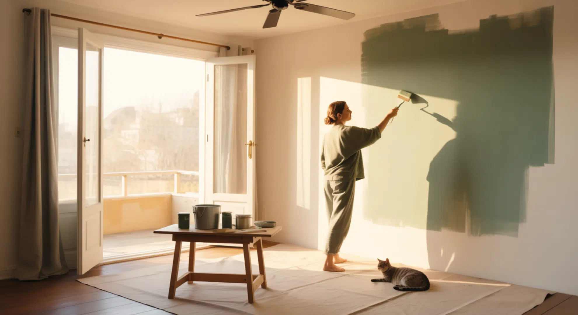
How to Test Sage Green Before You Commit?
Sage green looks wildly different depending on lighting and surroundings, so testing is non-negotiable. Skipping this step means risking a color that feels off once it’s on all four walls.
Download my complete sample strategy guide to streamline your testing process and make confident color decisions.
Download Free Sample Strategy PDF – includes step-by-step testing instructions, lighting evaluation checklists, and side-by-side comparison worksheets.
Best Practices for Applying Sage Green Paint
Getting sage green on your walls is only half the battle.
Proper prep and application make the difference between a professional-looking finish and a patchy DIY disaster that shows every flaw.
- Prime First, Especially Over Darker Colors: Sage green’s muted nature shows through old paint, so a quality primer creates an even base and reduces the number of topcoats needed
- Use a Roller for Walls, Brush for Trim and Edges: Rollers give you smooth, even coverage on large surfaces, while brushes handle detail work and corners without texture buildup
- Plan for Two Coats Minimum: Sage green’s subtle pigmentation means one coat rarely provides full coverage; wait 4 hours between coats for best results
- Patch and Sand Before Painting: Fill holes, cracks, and imperfections with spackling compound, then sand smooth; sage green’s soft tone won’t hide wall flaws like darker colors do
- Clean with a Damp Cloth Only, Touch Up as Needed: Avoid harsh cleaners that strip matte finishes; keep leftover paint and your original swatch for seamless touch-ups over time
Take your time with prep work and don’t skip steps to rush the process. Sage green rewards patience with a beautiful, lasting finish that looks intentional rather than hurried.
Sage Green in Modern Design: Trends and Inspiration
Sage green isn’t just having a moment. It’s become a design staple that bridges the gap between bold color and safe neutral, giving spaces personality without overwhelming them.
The shift toward nature-inspired neutrals and calm living has made sage the go-to choice for homeowners craving grounded, organic spaces that still feel modern and current.
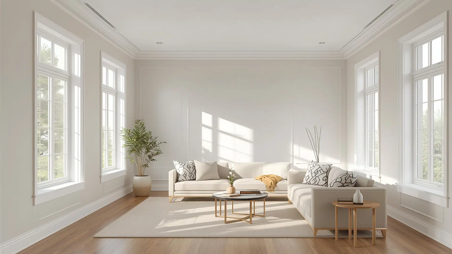
1. Sage Green in Living Rooms
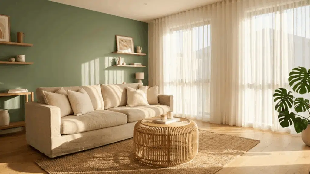
Sage creates a relaxing backdrop that doesn’t compete with your furniture or art. It works beautifully on all four walls or as a statement wall behind seating areas.
The color pairs effortlessly with natural materials like rattan, wood, and linen, making living rooms feel collected rather than decorated.
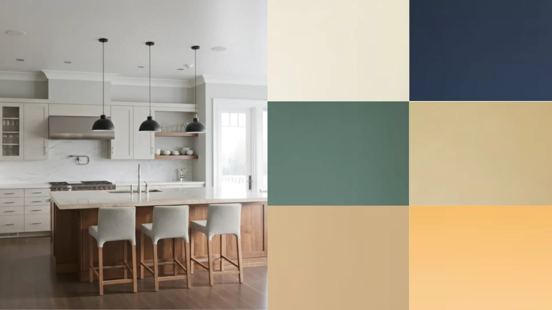
2. Sage Green in Kitchens
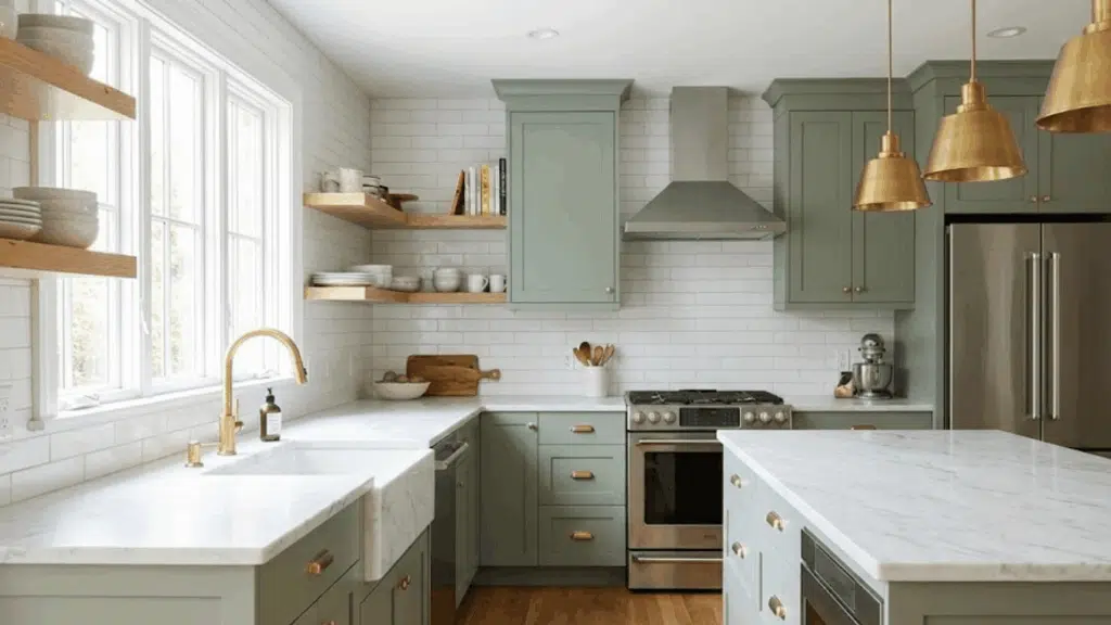
Sage green cabinets have exploded as an alternative to white or navy, bringing warmth without feeling too bold. The color works especially well in kitchens with natural light, shifting from fresh in the morning to cozy in the evening.
Pair sage cabinets with brass hardware and marble countertops for a look that feels both timeless and on-trend. It’s forgiving enough to hide fingerprints and smudges better than stark white.
3. Sage Green in Bedrooms
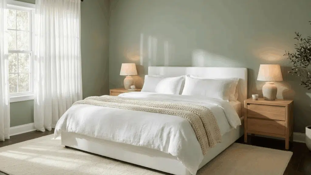
Sage creates the perfect sleep sanctuary with its calming, muted quality that never feels cold or sterile. It pairs beautifully with crisp white bedding, warm wood furniture, and soft textiles for a layered, restful look.
The color works in both small bedrooms, where it creates intimacy, and large primary suites, where it adds warmth without closing in the space. Consider sage on just one wall if you want a subtle introduction.
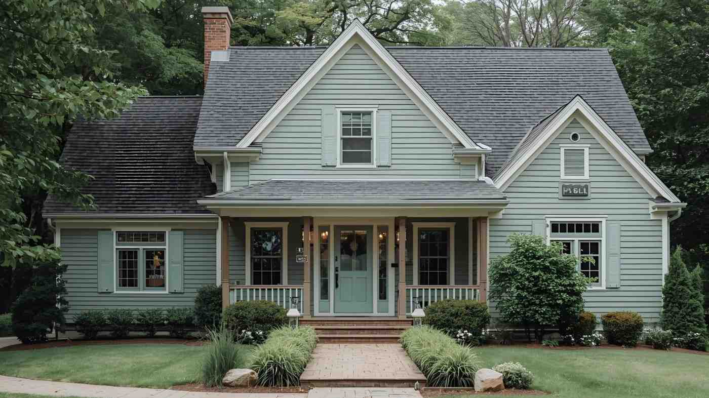
4. Sage Green on Accent Walls and Exteriors
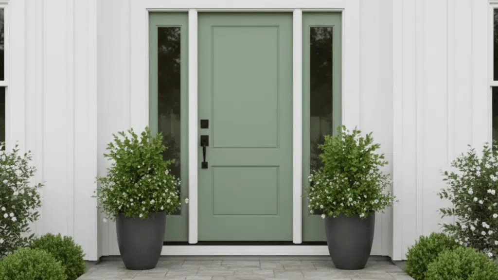
Not ready for full-room sage? An accent wall gives you impact without commitment, working beautifully behind beds, sofas, or in dining nooks. Sage also shines on exterior doors, creating an inviting entry point that feels fresh yet grounded.
Bathroom vanities, ceiling treatments, and built-in shelving are other unexpected places where sage adds character. The key is choosing one focal point rather than sprinkling sage everywhere.
Common Mistakes and Care Tips for Sage Green Paint
Even the perfect sage green can go wrong if you skip key steps or don’t plan for long-term maintenance.
Avoiding common pitfalls and knowing how to care for your painted surfaces keeps your space looking fresh for years.
- Don’t Choose Based on Screen Images Alone: Always test large swatches in your actual space under real lighting before buying
- Test LRV Before Committing to Darker Shades: Dark sage can make small rooms feel cramped; check Light Reflectance Value first
- Match Undertones to Your Existing Finishes: Yellow-toned sage clashes with cool gray floors; identify your space’s undertones before choosing
- Choose the Right Sheen for Your Walls: Flat hides undertones but shows scuffs; glossy exaggerates undertones; matte or eggshell works best
- Store Leftover Paint and Keep Color Records: Label extra paint for touch-ups and photograph the can label for easy reordering
Clean sage green walls with a damp microfiber cloth and mild soap for everyday marks. For exterior sage, invest in quality paint with UV protection to prevent fading.
Bottom Line
Choosing the right sage green paint doesn’t have to feel overwhelming once you understand undertones, lighting, and how different brands compare.
I’ve walked you through everything from testing samples to pairing colors, so you can make a confident decision that works for your space.
If you’re painting a full room or just trying sage on an accent wall, the key is testing in your own lighting and trusting what feels right.
Want more help picking the right paint color for your home? Check out other color guides and paint tips on the website to keep your project moving with confidence.