Are you considering BM Tapestry Beige for your next project?
Tapestry Beige from Benjamin Moore is a warm, comforting neutral that makes any room feel like home.
This paint color brings a soft, welcoming feel that works well with many home styles.
The gentle beige shade has subtle, warm undertones that create a cozy feeling in living rooms, bedrooms, bathrooms, and kitchens.
You can match it with white trim for a clean look or pair it with darker colors to add depth to your space.
This blog covers everything about Tapestry Beige, read on to know more!
What Makes Tapestry Beige the Right Choice?
If you want a warm and inviting paint color without being too bold, Tapestry Beige might be just the thing.
The Color Profile
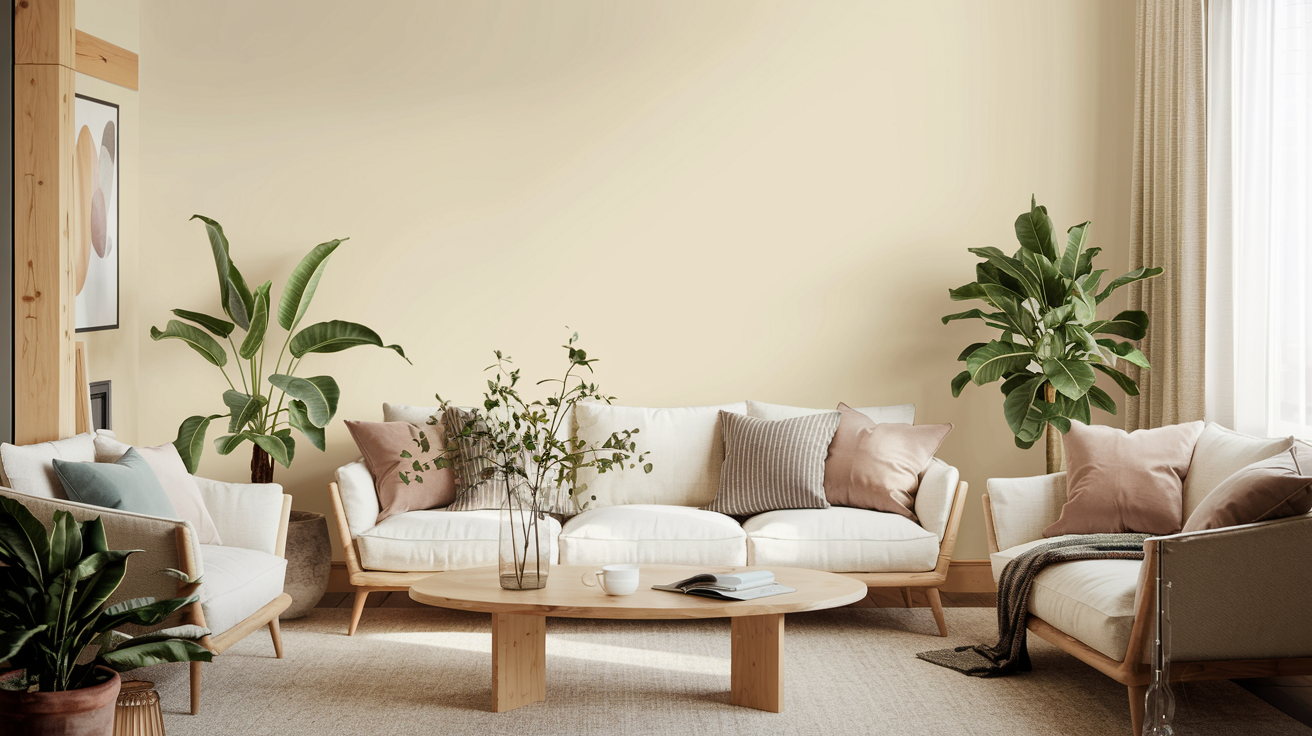
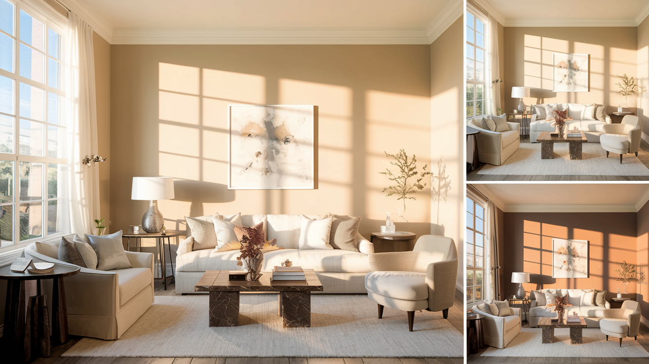
Tapestry Beige is a soft, neutral color that makes rooms feel calm and welcoming.
It’s not too dark or too light—it’s right in the middle, making it easy to work with.
The color brings warmth to your walls without being too noticeable, letting your furniture and decor stand out naturally.
Undertones of Tapestry Beige
Look closely at this paint color, and you’ll notice gentle yellow hints that give it life.
These warm touches make the color look different as sunlight changes throughout the day.
In morning light, it feels bright and fresh, while evening light brings out its cozy, golden glow.
Best Placement for Tapestry Beige
This color works well in many spots around your home. Let’s look at some of the best places to use it.
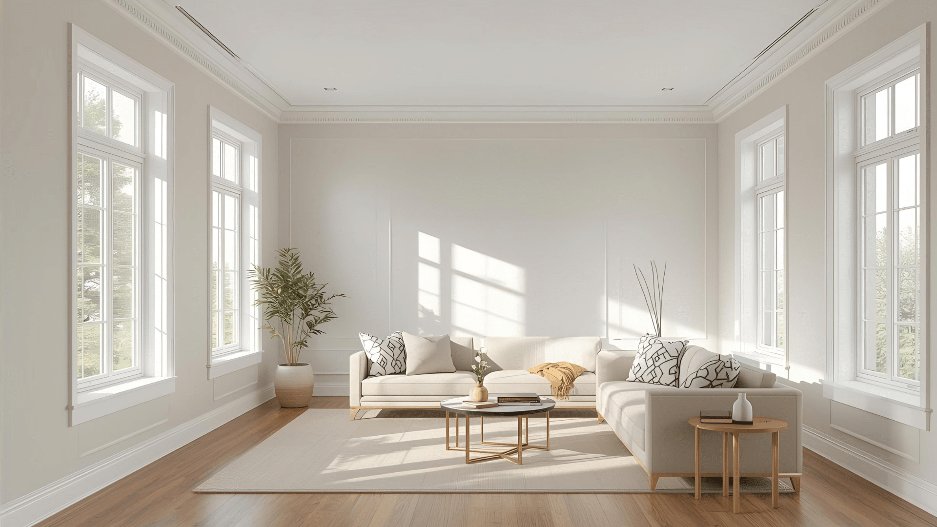
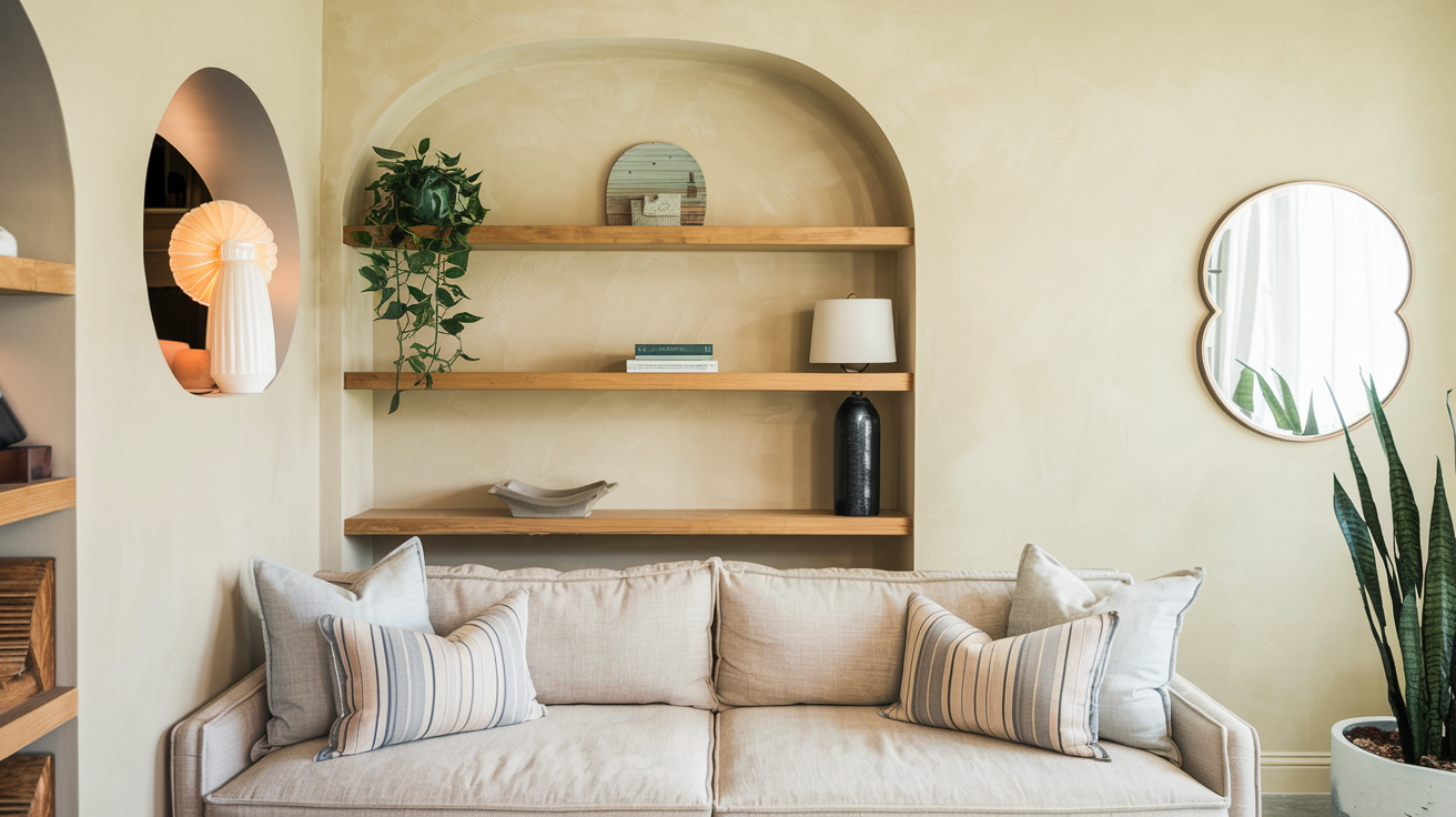
Living Room
Tapestry Beige makes living rooms feel warm and inviting – like a big, comforting hug.
It creates a perfect backdrop for your family gatherings and quiet evenings.
Try mixing it with soft blue pillows, muted green plants, or warm gray furniture.
These color combinations help create a space that feels balanced and homey.
Bathroom
Want your bathroom to feel like a peaceful retreat? Tapestry Beige can help with that.
It adds warmth without making the space feel dark or small.
The color looks great with white tiles, marble counters, and bronze fixtures.
It works equally well in small powder rooms and large master bathrooms.
Other Rooms and Accents
Tapestry Beige shines in hallways, where it makes these connecting spaces feel warm and welcoming.
It’s also a great choice for ceilings – it adds subtle warmth without drawing too much attention.
When used on doors, it creates a soft contrast with the white trim.
The color also works well with wooden furniture, making both the walls and your pieces look their best.
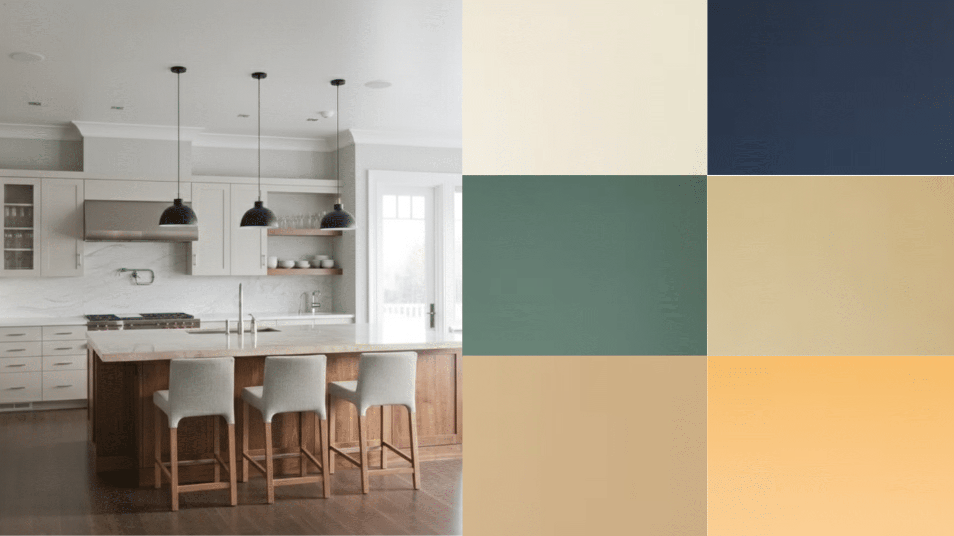
How to Pair Tapestry Beige with Other Colors
Getting your color combinations right can make a big difference in how your room feels.
Here’s how to mix Tapestry Beige with other colors.
Monochromatic Color Scheme
Want a calm, pulled-together look? Try using different shades of beige in the same room.
Pair Tapestry Beige walls with Benjamin Moore’s lighter Natural Cream for trim, or add Swiss Coffee for a brighter touch.
For a deeper accent, try Monroe Bisque on doors or built-in cabinets.
This approach creates a peaceful feeling that’s easy on the eyes.
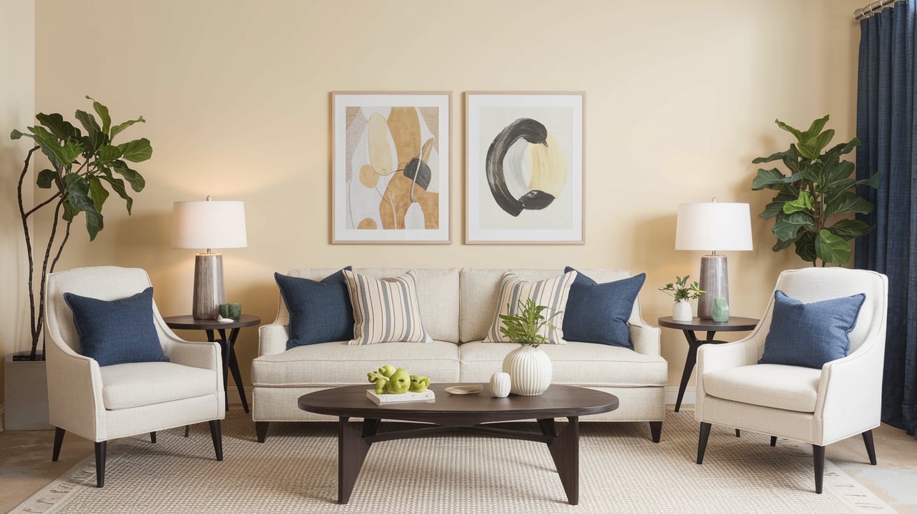
Complementary Color Scheme
If you want your room to feel more lively, try mixing Tapestry Beige with contrasting colors.
Benjamin Moore’s Approaching Storm (a cool grey) or Comet (a deep blue-grey) work well as accent colors.
You could paint one wall in these darker shades or use them for furniture pieces.
This mix of light and dark colors adds interest to your room without being too bold.
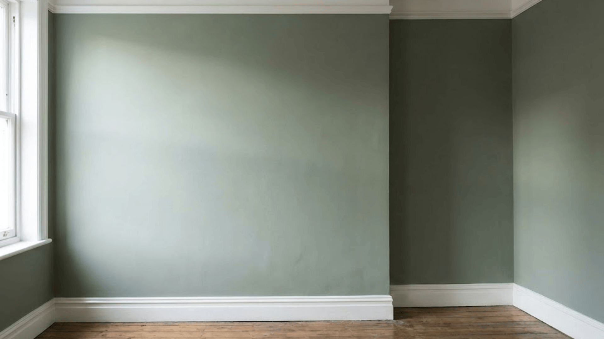
Tapestry Beige vs. Other Popular Colors
Here’s a clear look at how Tapestry Beige compares to other top choices to help you pick the perfect shade.
Edgecomb Gray vs. Tapestry Beige
Edgecomb Gray brings a cooler feel with its gray base, while Tapestry Beige adds warmth to your space.
In sunny rooms, Edgecomb Gray shows its true gray nature.
Meanwhile, Tapestry Beige stays consistently warm and creates a cozy feeling throughout the day.
Tapestry Beige vs. Revere Pewter
Revere Pewter shows stronger gray tones and can look slightly darker than Tapestry Beige.
In low light, Revere Pewter might feel heavy, but Tapestry Beige keeps its light, airy quality.
The beige undertones in Tapestry Beige make rooms feel warmer compared to Revere Pewter’s cool touch.
Tapestry Beige vs. Balboa Mist
Balboa Mist offers a lighter, more subtle look than Tapestry Beige. It shifts between white and pale gray, depending on the lighting.
Tapestry Beige stays more constant and brings more color to your walls.
Balboa Mist works well in bright spaces, while Tapestry Beige fits any lighting setup.
The Importance of Lighting with Tapestry Beige
Like all paint colors, Tapestry Beige can look different depending on your lighting. Here’s how lighting affects Tapestry Beige.
- Natural sunlight brings out the best in Tapestry Beige.
- In the morning light, the color feels fresh and bright, while the afternoon sun makes it feel warmer and cozier.
- If your room doesn’t get much sunlight, try using warm light bulbs – they help show off the color’s warm notes.
- Cool white bulbs might make the color look a bit flat, so stick with soft white or warm white bulbs if you can.
- Table lamps and wall sconces at different heights can help the color look rich and full throughout the day.
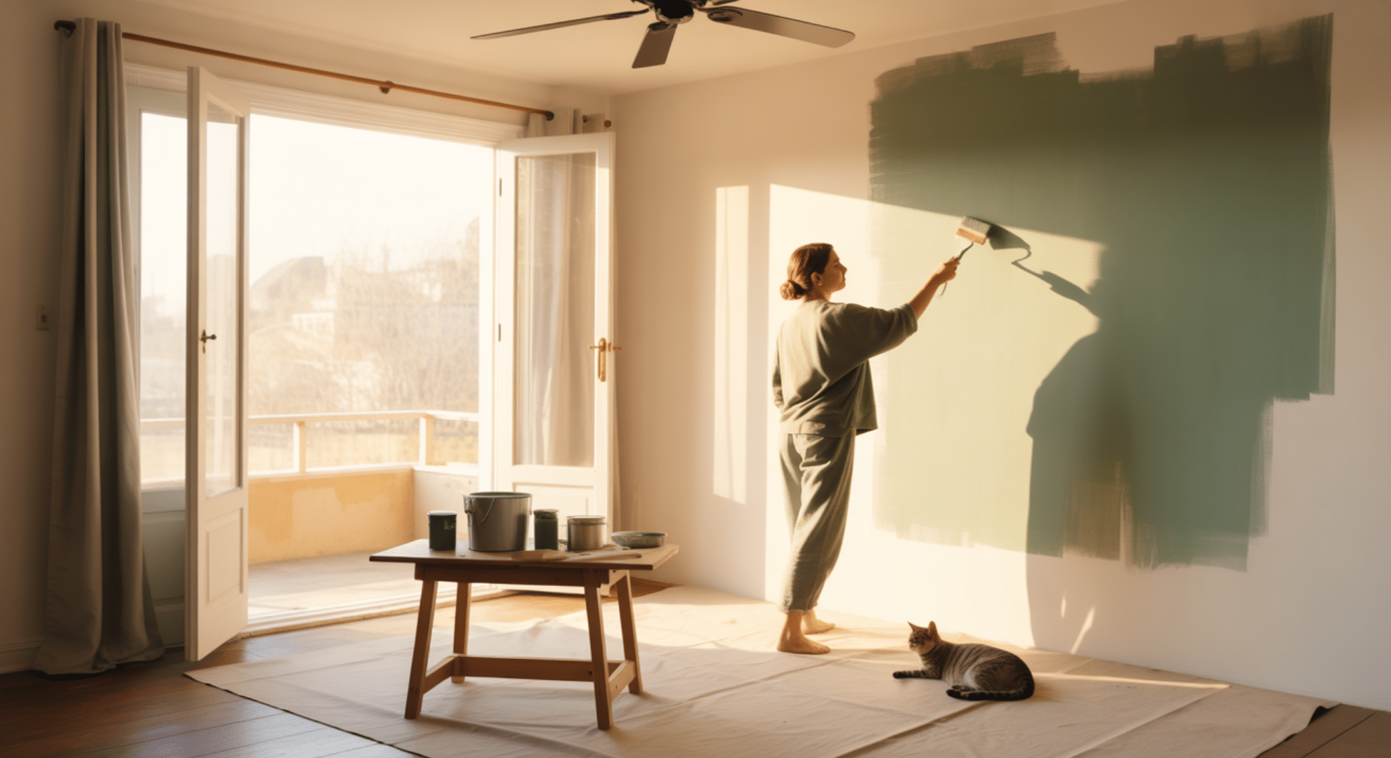
How to Incorporate Tapestry Beige in Your Home
Getting started with a new paint color can feel like a big step. You can make it work in your space using these tips.
Practical Tips for Painting
- Start small; try Tapestry Beige in a powder room or guest bedroom to see how you like it.
- Before painting the whole room, put up some sample squares and look at them at different times of the day.
- Use two coats of paint for the best coverage, and don’t skip the primer – it helps the true color shine through.
- The paint looks best when you work in sections, keeping a wet edge to avoid lap marks.
Design Ideas and Inspiration
In real homes, Tapestry Beige shows its flexibility.
Think of a living room with Tapestry Beige walls, crisp white trim, and brown leather furniture – it feels warm and put-together.
Or picture a kitchen where Tapestry Beige walls blend smoothly with white cabinets and dark countertops.
Many homeowners use it in bedrooms with light bedding and natural wood furniture for a calm, restful feel.
Conclusion
Now you know why so many people love Tapestry Beige. It’s not just another neutral – it’s a color that makes your home feel more welcoming and relaxed.
From sunny mornings to cozy evenings, this paint shade keeps your spaces feeling fresh and inviting.
It plays well with other colors and fits right in with any style you choose.
You don’t need to be a paint expert to make it work. With the right lighting and some simple planning, you can transform your rooms into spaces that feel just right.
Ready to give your walls a fresh look? Tapestry Beige might be the perfect choice for your next paint project.
For more such paint reviews, check out our website!