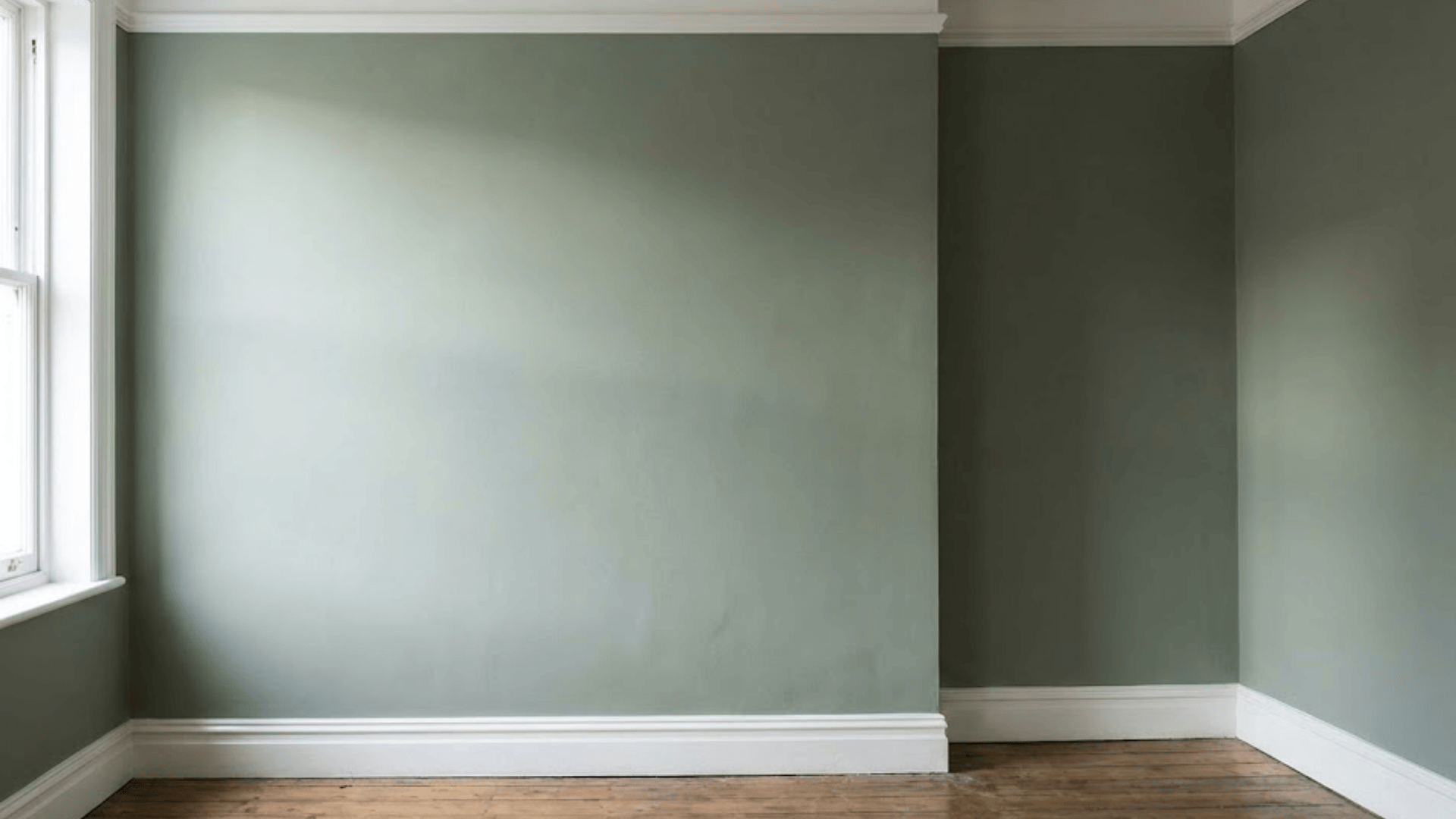
Sage Gray has become one of those paint colors I keep seeing everywhere, and it’s easy to understand why. This soft gray, touched with a subtle green herbal undertone, creates a look that feels both modern and comforting.
For homeowners planning a refresh or designers searching for a reliable neutral, this shade checks a lot of boxes.
I like that it adds color without being overwhelming, making it a calming backdrop that blends easily with natural textures, warm woods, or clean white trim.
To me, Sage Gray leans slightly green depending on the light, which gives it more depth than a flat gray. Overall, I’d call it versatile, soothing, and surprisingly flexible in different spaces.
Color at a Glance
Behr’s Sage Gray (710F-4) is officially described as a “medium gray mixed with natural green, reminiscent of dried herbs”. This balance of gray with a subtle green undertone makes it a calming yet character-filled neutral that feels fresh without being overpowering.
Homeowners and designers often turn to this shade for living rooms, bedrooms, and exterior spaces where they want a soft but grounded backdrop.
Available across Behr’s well-known paint lines, including Marquee, Premium Plus Ultra, and Dynasty, Sage Gray comes in finishes ranging from matte to satin and semi-gloss.
You can find it readily at The Home Depot, with options like a one-gallon can or larger sizes that provide dependable coverage.
Technical Specs You Should Know
When choosing Sage Gray for a project, it helps to understand the technical details that shape how this color performs in your space.
Below is an overview of key technical specs, including light reflectance value (LRV), digital color approximations, and recommended finishes based on room use.
| Specification | Details |
|---|---|
| LRV | 36 (medium reflectance; darker end of the scale) |
| HEX Code | #9ea49d |
| RGB Values | R: 158, G: 164, B: 157 |
| Recommended Sheens | Matte or eggshell for walls; satin enamel recommended for cabinetry, trim, and doors |
Did You Know? Sage Gray’s LRV of 36 makes it ideal for rooms with moderate natural light. It reflects enough light to keep spaces bright without feeling washed out, and its soft green undertone creates a grounded, nature-inspired ambiance.
Undertones & Lighting
Behr’s Sage Gray presents a gentle shift between gray and green tones, depending on lighting and room orientation.
Here’s a quick breakdown of its undertones:
- Subtle green herbal undertones that bring a fresh, organic quality
- In north-facing rooms with cooler, softer natural light, it leans more toward a muted gray-green
- In south-facing rooms with warmer sunlight, the green tones become more pronounced and cozy
- Warm incandescent lighting softens the color, enhancing muted green qualities
- Cool LED daylight emphasizes the crisper, balanced gray-green appearance
Because of these variations, always test a large paint swatch in the intended space under different lighting conditions and times of day to see how the undertones play in your unique environment
Room-by-Room Recommendations
Behr Sage Gray is a versatile shade that adds calm and sophistication to any room. Here’s how to use it effectively across key spaces, with pairing tips:
1. Living Room
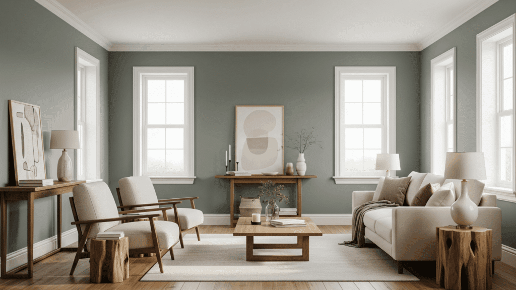
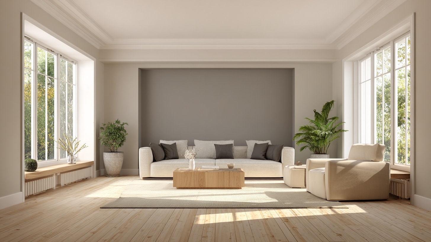
Sage Gray pairs beautifully with warm wood tones and cream neutrals, creating a cozy and inviting backdrop.
Its subtle green undertones add depth without overwhelming the space, making it perfect for family gatherings or quiet moments.
This soothing tone pairs well with natural textures and soft furnishings to maintain an inviting atmosphere.
Pair it with: Warm hardwood floors, cream sofas, and natural fiber rugs for a grounded, welcoming feel.
2. Kitchen/Cabinets
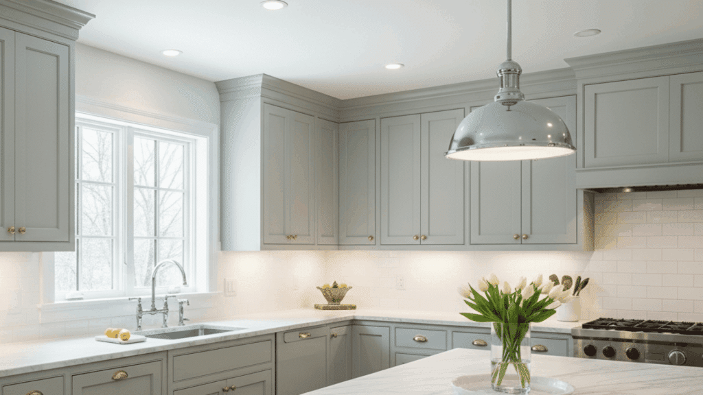
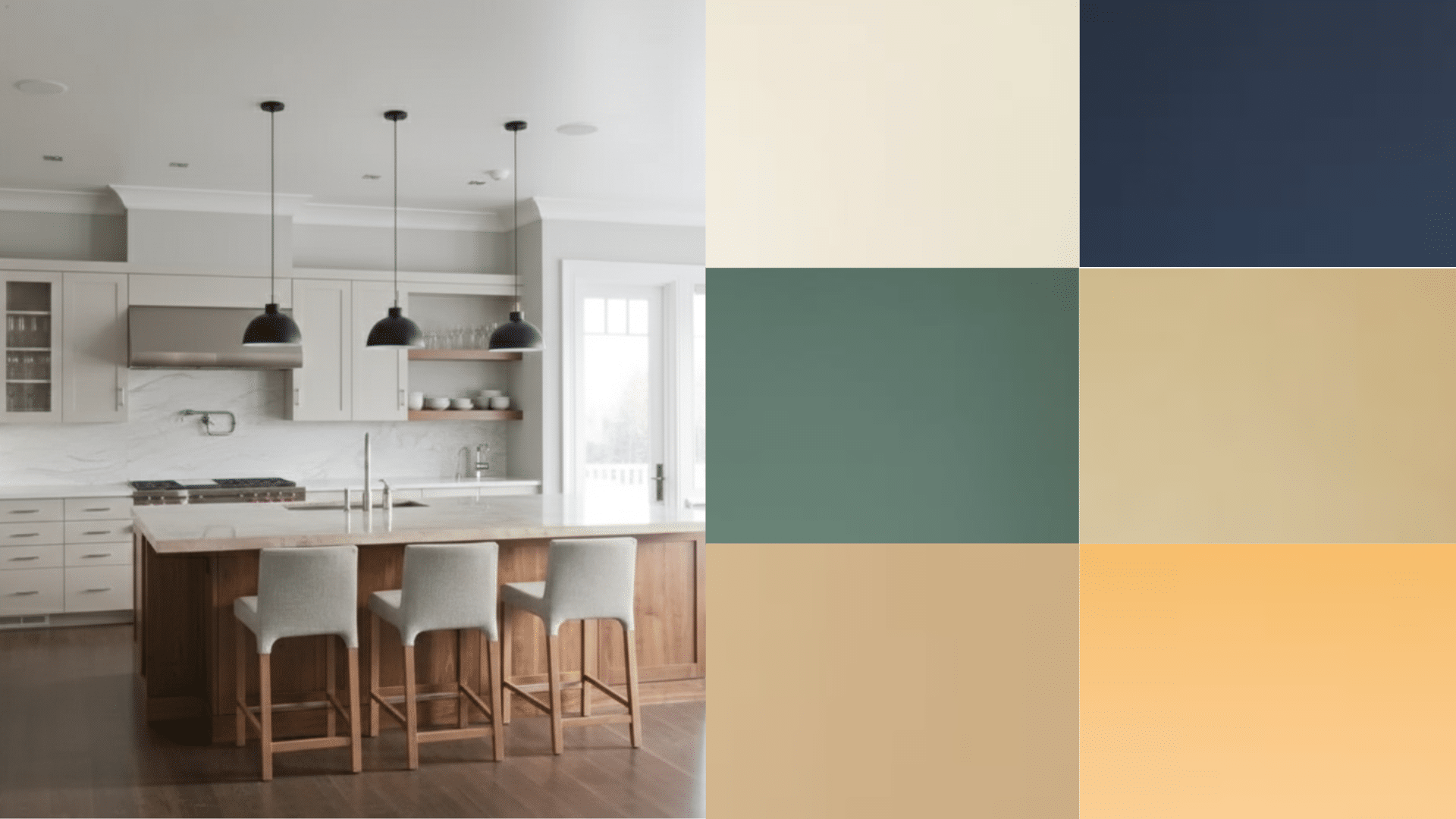
This shade works exceptionally well on kitchen cabinets, especially when combined with white counters and backsplashes.
Its satin sheen adds durability and makes cleaning easier. Sage Gray keeps the kitchen fresh and modern while lending a hint of warmth that contrasts nicely with cooler whites.
Pair it with: White marble countertops, white subway tile backsplash, and brass or chrome hardware for a sleek, stylish look.
3. Bedroom
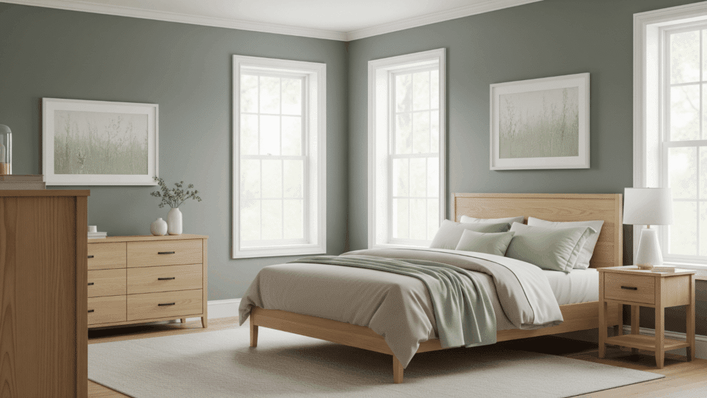
Sage Gray creates a tranquil atmosphere in bedrooms, whether used on an accent wall or throughout the entire room.
Its muted green undertones promote relaxation and restfulness, making it ideal for sleep areas. It blends effortlessly with soft whites, natural woods, and calming earth tones to foster serenity.
Pair it with: Crisp white trim, light wood furniture, and textiles in beige or light green hues for a peaceful retreat.
4. Bathroom
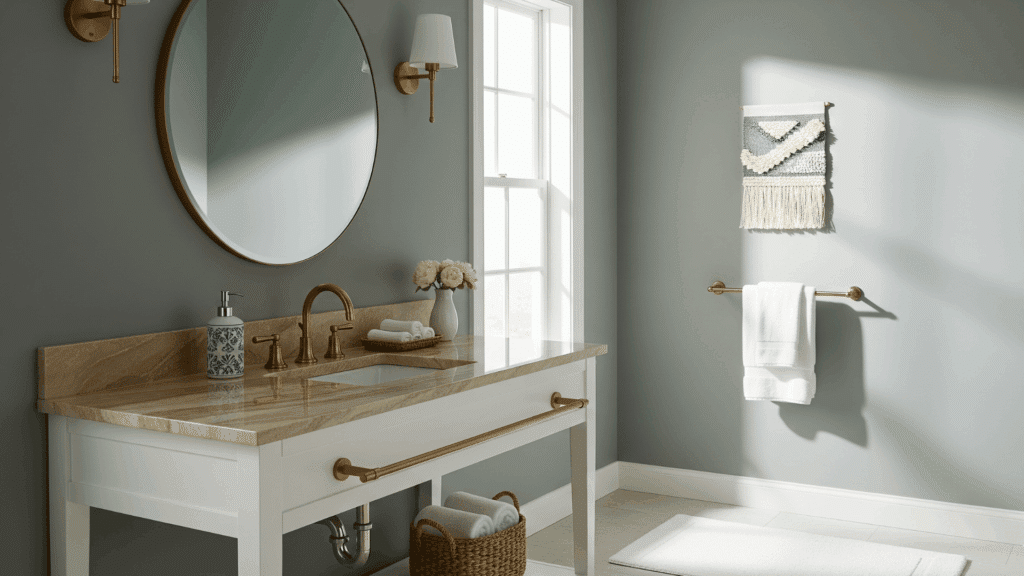
In bathrooms, Sage Gray complements warm marble surfaces and metallic brass or bronze fixtures beautifully.
Its organic undertones add freshness and balance, turning the space into a spa-like sanctuary. The color harmonizes with natural textures to create a graceful yet inviting feel.
Pair it with: Warm marble, bronze faucets, and natural woven accessories for a refined and cozy space.
Perfecting Your Color Palette
Selecting the right trim, ceiling, and hardware finishes can make or break your interior design. These foundational elements work together to create visual harmony and enhance your chosen wall colors.
| Elements | Recommendation | Rationale |
|---|---|---|
| Trim & Ceiling | Crisp whites (Behr Ultra Pure White or Frost) | Creates contrast against walls, brightens spaces, and offers lasting appeal without competing with decor. |
| Oil-Rubbed Bronze | Hardware & Fixtures | Adds warmth and depth; complements earth tones, creating a traditional feel. |
| Aged Brass | Hardware & Fixtures | Brings vintage charm, complements warm palettes, and adds luxury. |
| Brushed Nickel | Hardware & Fixtures | Offers modern versatility, blending with cool and warm tones for a fresh, contemporary look. |
| Flooring & Textiles | Medium oak floors, warm beige rugs, linen fabrics | Natural textures ground the space and create comfortable, lived-in warmth |
These combinations ensure your design elements work in harmony, creating spaces that feel polished and welcoming. Consistency across rooms creates flow while allowing each space to maintain its unique character.
Comparisons & Alternatives
Choosing a neutral paint with green undertones requires a clear understanding of subtle differences. Below is a direct comparison and some notable alternatives to Behr Sage Gray that can help refine your choice.
Behr Sage Gray vs. Sherwin-Williams Agreeable Gray (SW 7029)
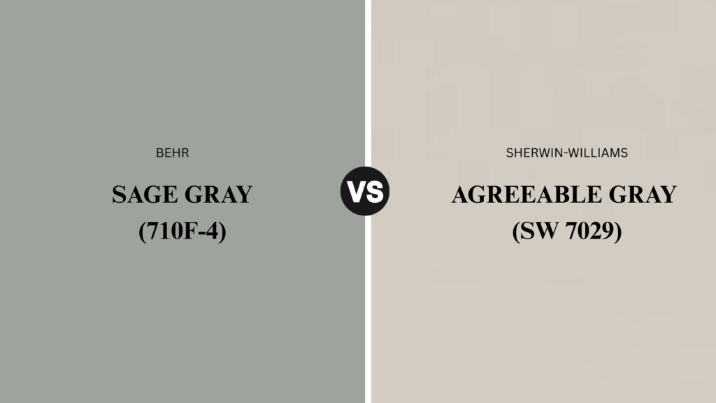
Behr Sage Gray leans greener and often appears darker and more saturated compared to Sherwin-Williams Agreeable Gray.
Agreeable Gray is a warm greige that tends to soften in many lighting situations, bringing a cozy, inviting feel.
In contrast, Sage Gray’s herbal undertones and medium reflectance value offer a more vibrant, nature-inspired vibe. Both are versatile neutrals but suit different moods and lighting conditions.
Suggested Alternatives
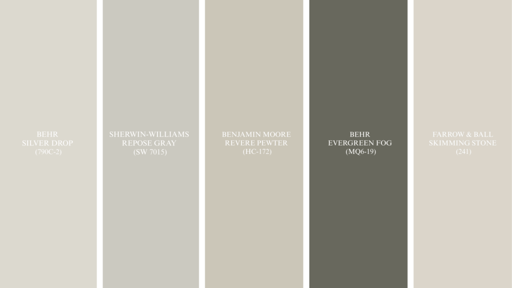
If you’re drawn to the calming versatility of neutral-green tones but want to consider options beyond your initial choice, these carefully selected alternatives offer varying depths, undertones, and personalities.
- Behr Silver Drop (790C-2): A lighter, cooler gray for brighter spaces needing subtle neutrality.
- Sherwin-Williams Repose Gray (SW 7015): Balanced greige with warm undertones, great for varied lighting.
- Benjamin Moore Revere Pewter (HC-172): Warm, muted gray with green undertones, perfect for cozy interiors.
- Behr Evergreen Fog (MQ6-19): Deeper green-gray for accent walls or cabinetry, strong natural presence.
- Farrow & Ball Skimming Stone (241): Warm, creamy gray that pairs well with traditional decor.
Each alternative offers a unique take on the neutral-green spectrum, providing great options for different lighting and style preferences.
How to Test Before Committing?
Smart homeowners always test paint colors before making the final decision. A small investment in samples can save you from costly mistakes and ensure your chosen color works perfectly in your specific space and lighting conditions.
- Buy sample pots or 8-oz testers from retailers like The Home Depot for accurate color representation
- Paint large poster-board swatches and view them at different times throughout the day
- Test on different walls to see how north-facing versus south-facing exposure affects the color
- Observe with your existing lighting and furniture to ensure harmonious coordination
- Consider primer and base color effects, as they can significantly alter the final appearance
- Live with samples for several days before making your final color commitment
Taking time to properly test your paint choices eliminates guesswork and gives you confidence in your color selection. This simple process ensures your new paint will look exactly as you envisioned in your finished space.
Conclusion
After reviewing all the details about Behr Sage Gray, I find that it offers a balanced mix of calm and personality. Its soft green undertones bring a natural, refreshing touch that shifts depending on the light in your space.
Each room will showcase its own unique side, but Sage Gray’s adaptability makes it suitable for cozy bedrooms, welcoming living areas, or modern kitchens.
Testing it in your home is the best way to experience its full effect. For me, it’s a dependable, warm choice that adds freshness without overpowering.
If there’s something more you’d like to know or share about your experience with this color, I welcome your thoughts in the comments below.

