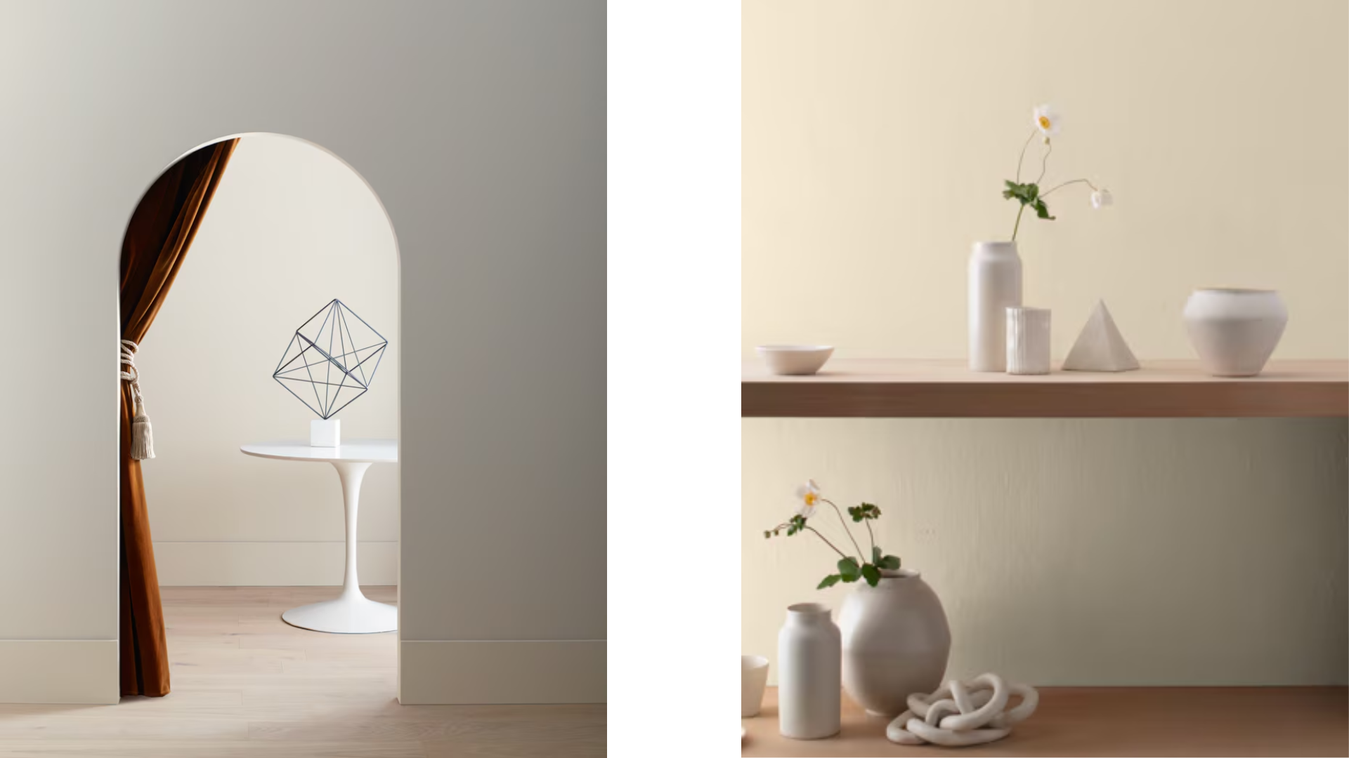
Choosing the right paint color can change how your entire home feels.
Benjamin Moore’s Manchester Tan (HC-81) has become a go-to option for many people looking for a reliable neutral.
This warm beige offers flexibility across different rooms and lighting conditions without being boring.
This guide checks what makes Manchester Tan special – from its key traits and light reflection values to how it compares with popular Benjamin Moore colors.
We’ll look at how this paint performs in various rooms, analyze its undertones, share testing methods, and provide color pairing ideas to help you make the most of this neutral shade.
Overview of Benjamin Moore Manchester Tan
Manchester Tan is a warm, neutral beige paint color that works well in various rooms and lighting conditions.
Key Characteristics
Manchester Tan has a soft, yellow-beige base that feels warm without being too dark.
It pairs nicely with white trim and wood tones.
This color changes slightly throughout the day, appearing more yellow in morning light and more neutral in evening hours.
It’s a practical choice for walls in living areas.
Why It Stands Out
Manchester Tan stands out because it’s highly adaptable to different spaces.
It creates calm in bedrooms and works in busy areas like kitchens. The color doesn’t compete with furniture or artwork.
It’s been popular for years because it doesn’t follow trends but works in most homes.
LRV of Manchester Tan
The Light Reflectance Value (LRV) of Manchester Tan is 57.94. This mid-range value reflects a good amount of light while adding warmth.
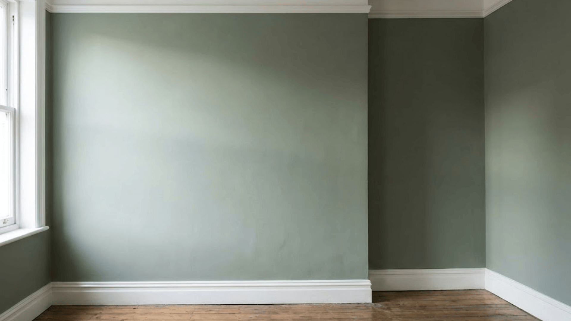
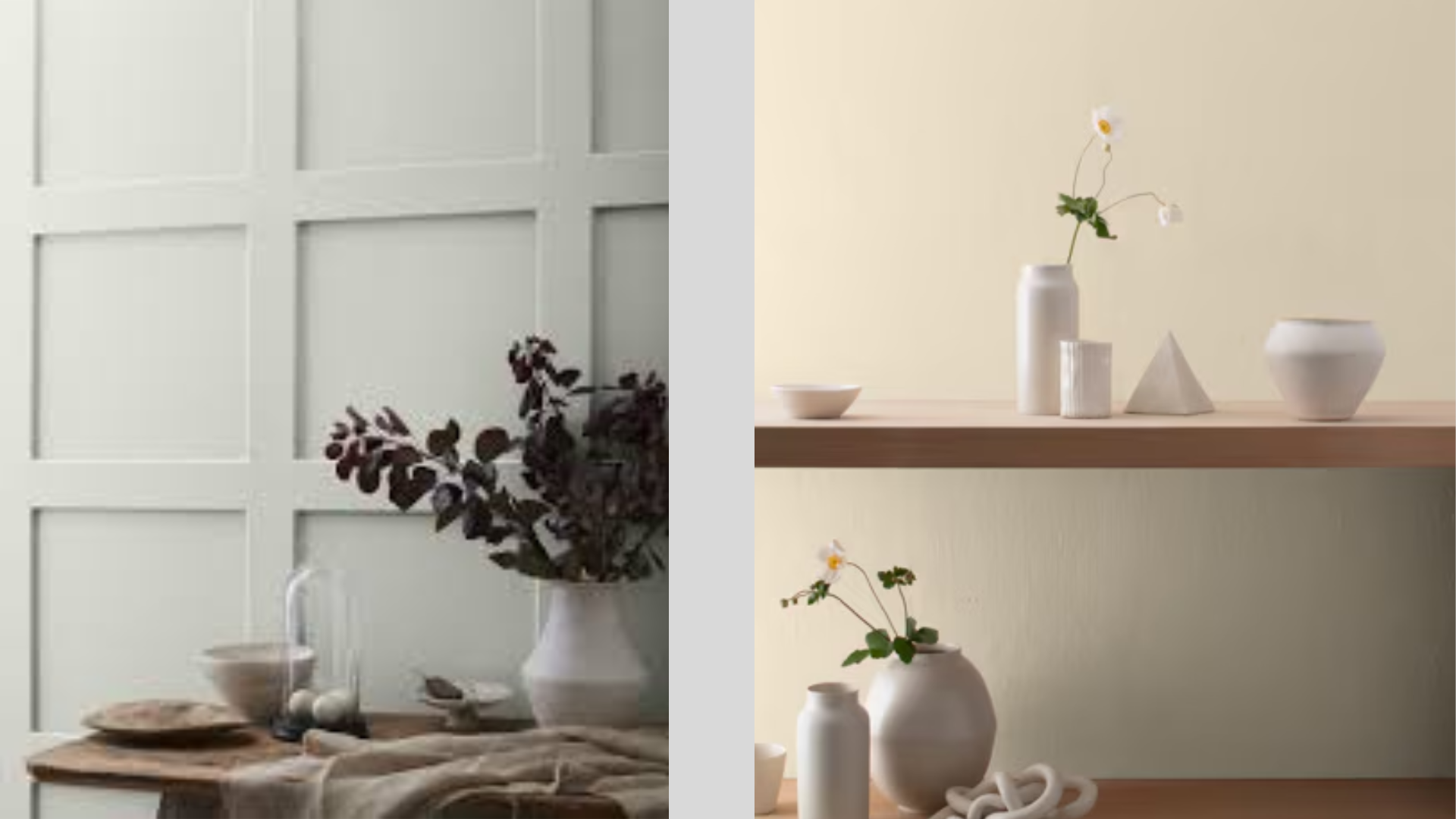
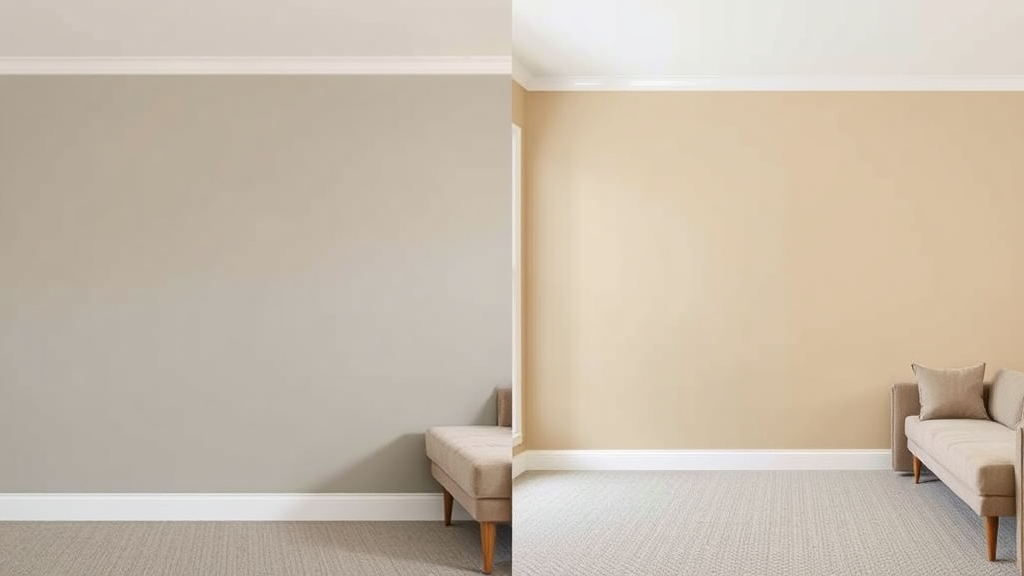
Comparison with Other Undertones
Gray Owl (OC-52) vs. Manchester Tan (HC-81)
Gray Owl leans cooler with a blue-green base, while Manchester Tan has a warmer yellow-beige base.
Gray Owl appears more blue in north-facing rooms, whereas Manchester Tan stays consistently warm.
Revere Pewter (HC-172) vs. Manchester Tan (HC-81)
Revere Pewter contains more gray and looks slightly darker than Manchester Tan.
Manchester Tan is a more traditional neutral, while Revere Pewter has a more modern, somewhat cooler feel.
Balboa Mist (OC-27) vs. Manchester Tan (HC-81)
Balboa Mist has pink-violet undertones that create a soft, airy look compared to Manchester Tan.
Manchester Tan is more golden and feels grounded, while Balboa Mist shifts dramatically in different lighting conditions.
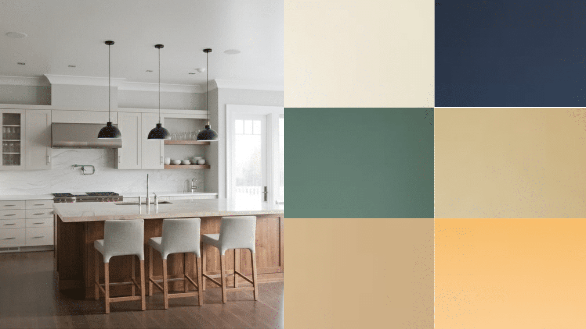
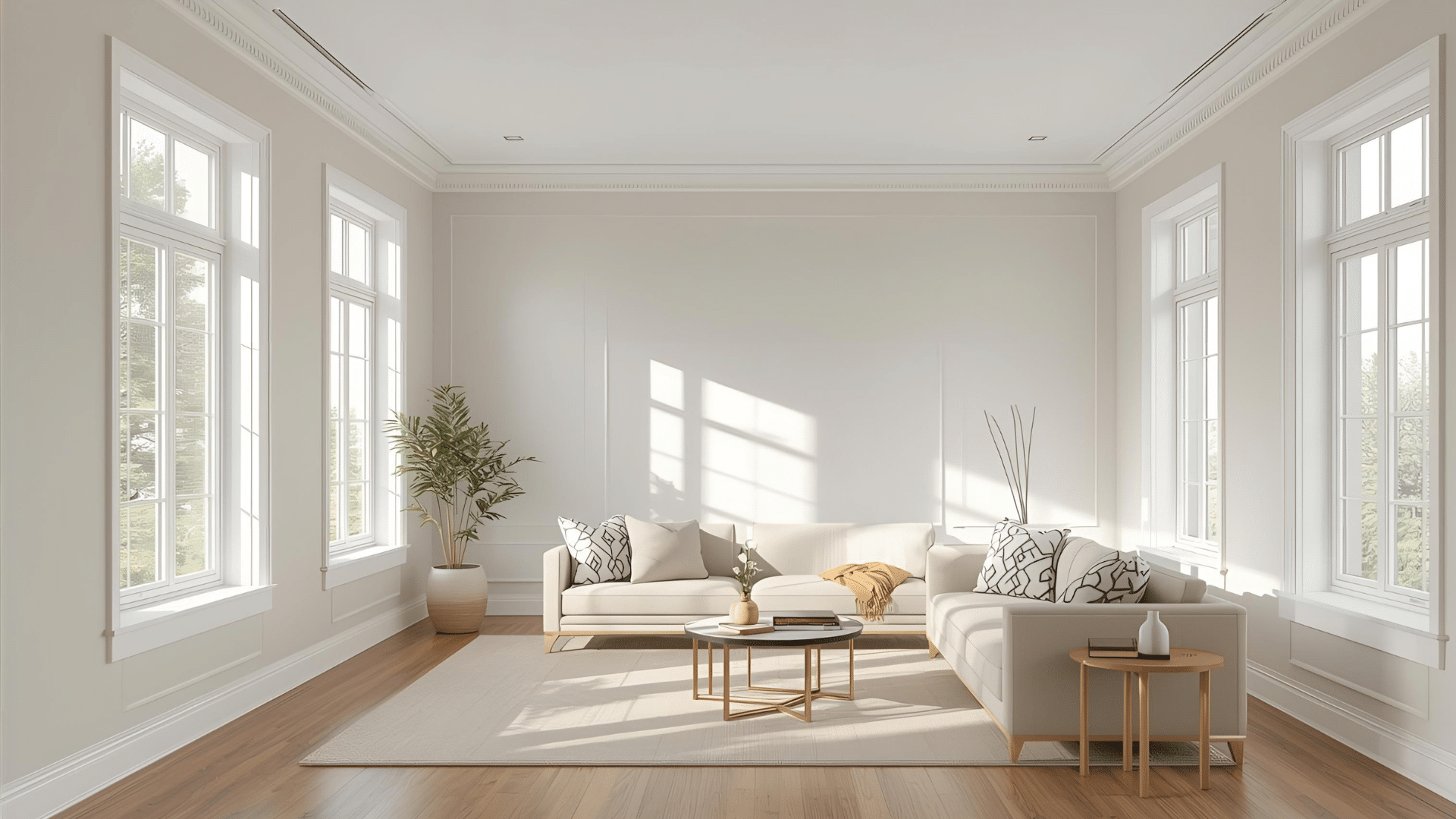
Manchester Tan in Different Rooms
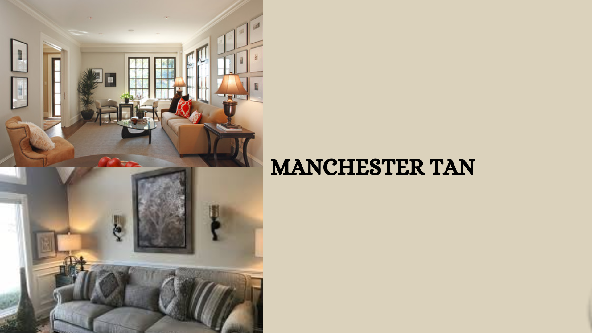
Living room
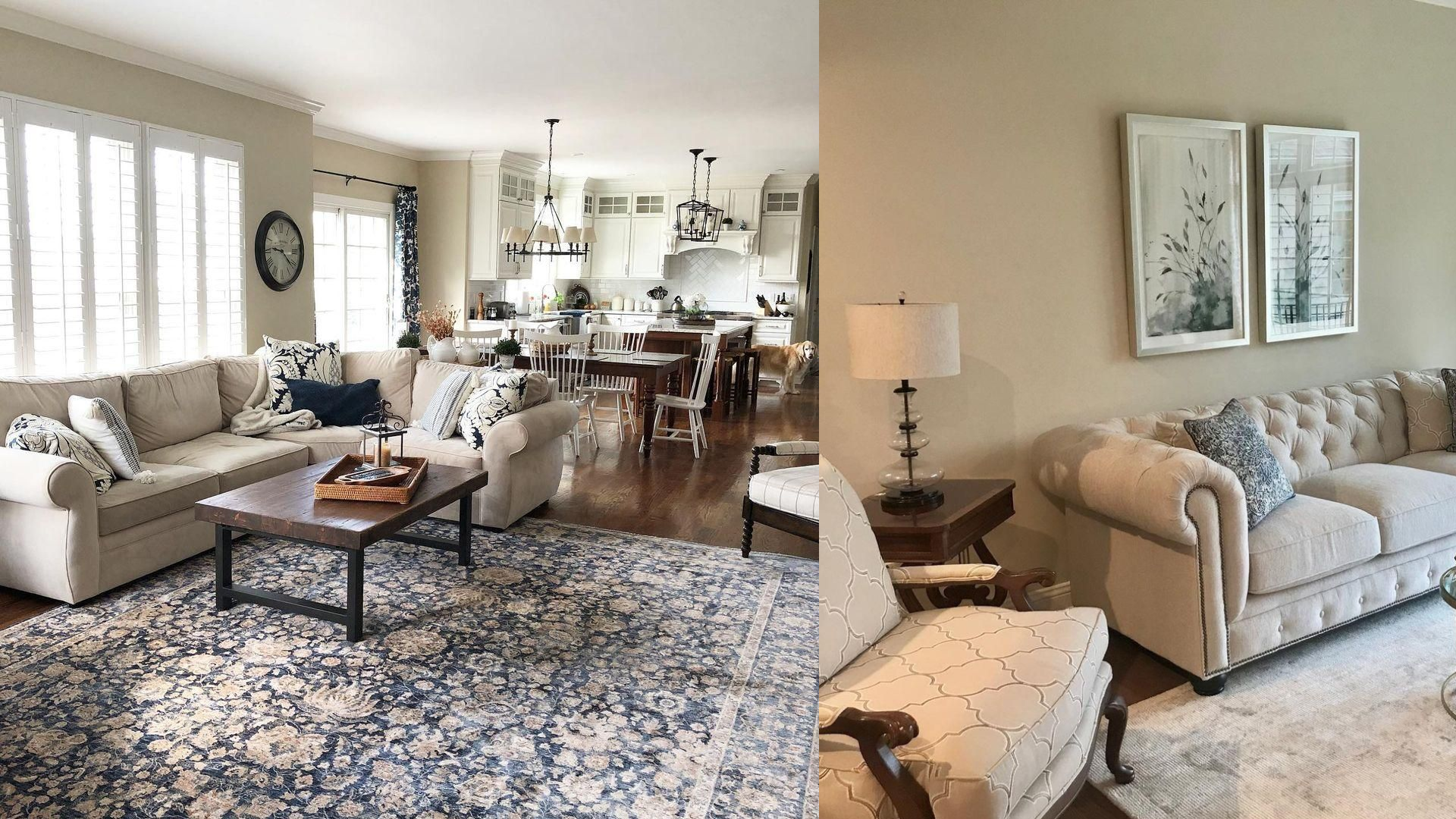
Manchester Tan creates a cozy backdrop in living rooms without distracting your furniture.
It pairs well with both modern and classic styles, making your space feel welcoming and put-together.
Kitchen
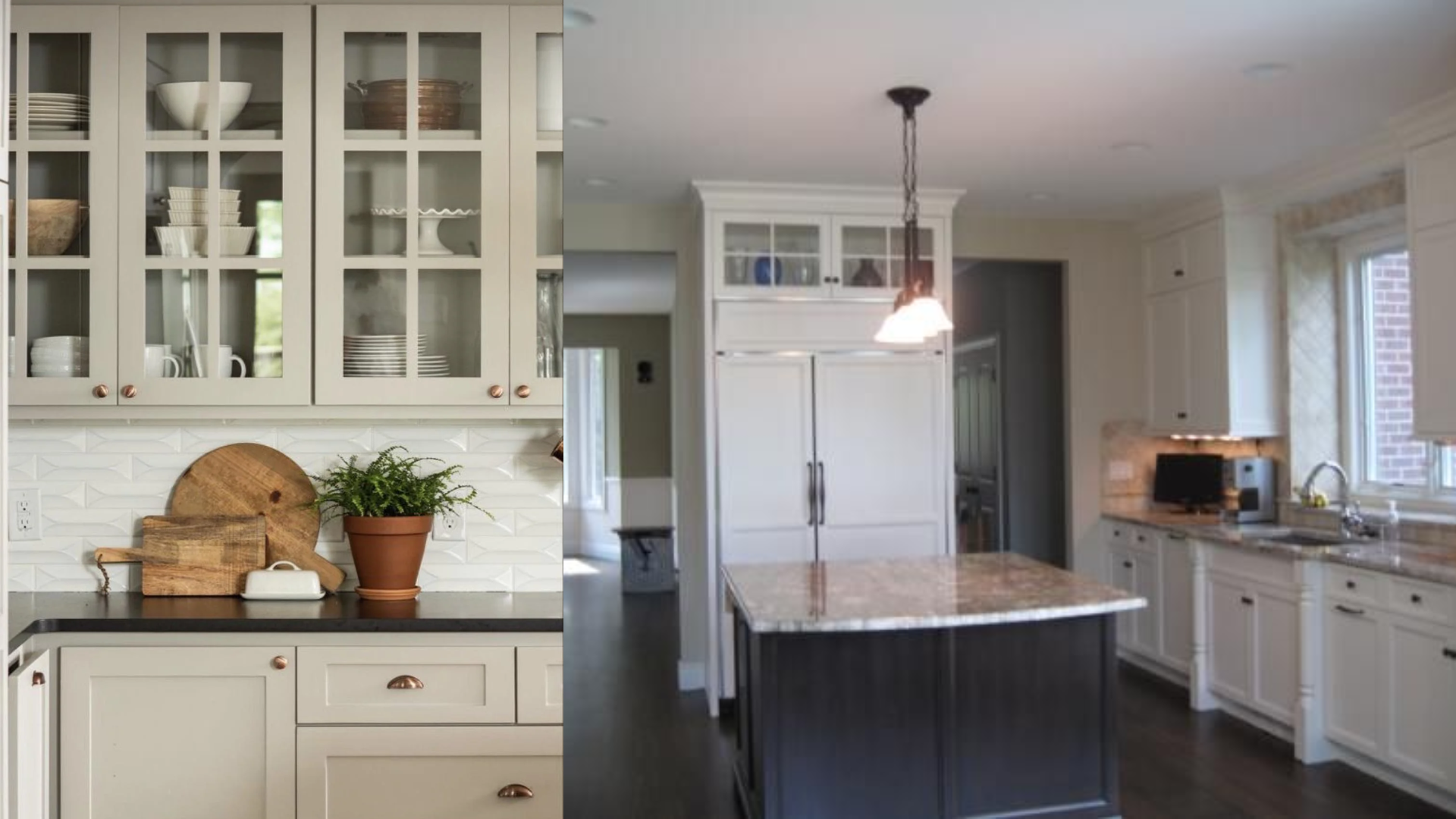
In kitchens, Manchester Tan adds warmth without making the space feel small.
It complements both dark and light cabinets while creating a clean look. The color stays true even with changing light from morning to evening.
Bedroom
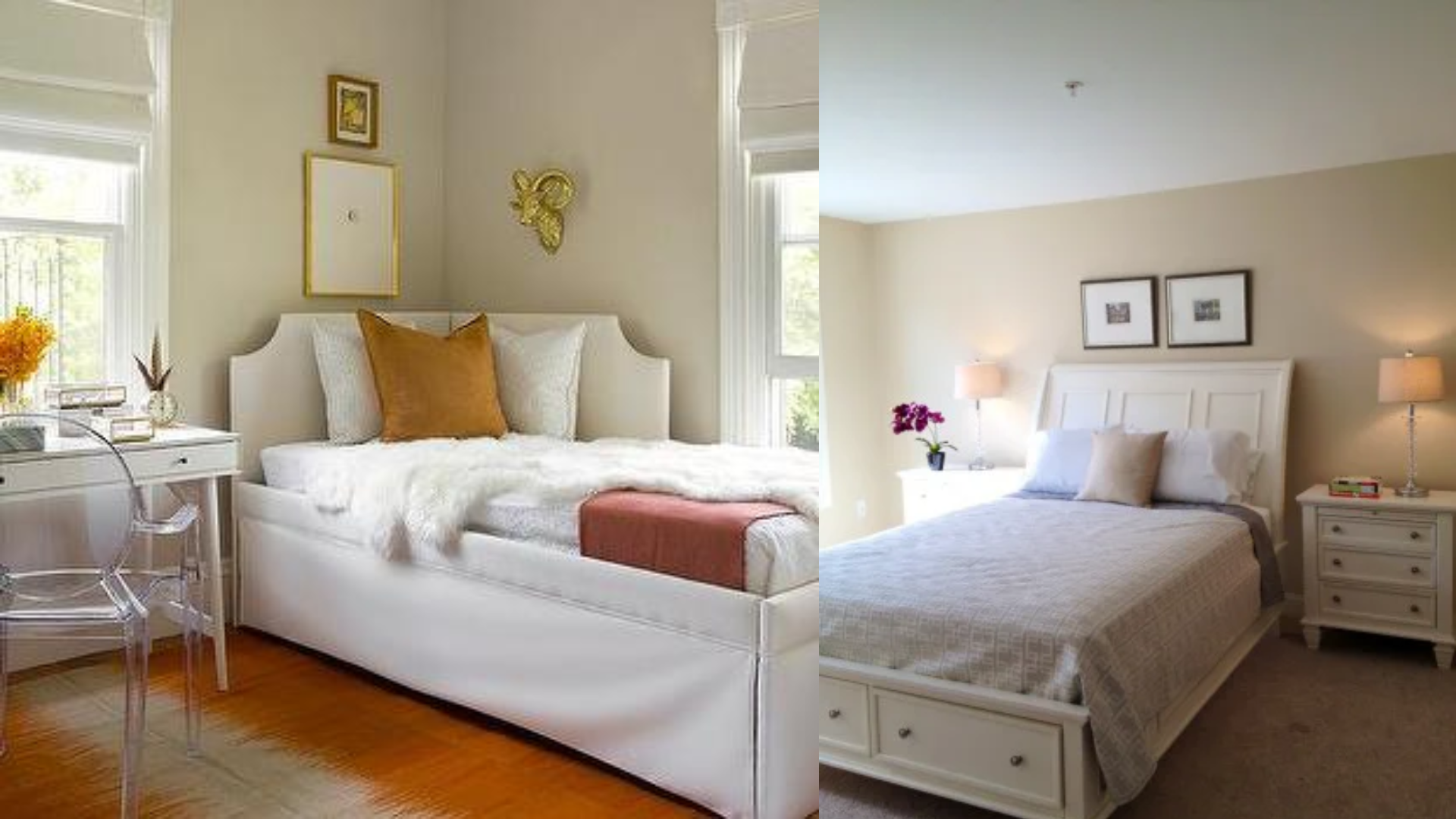
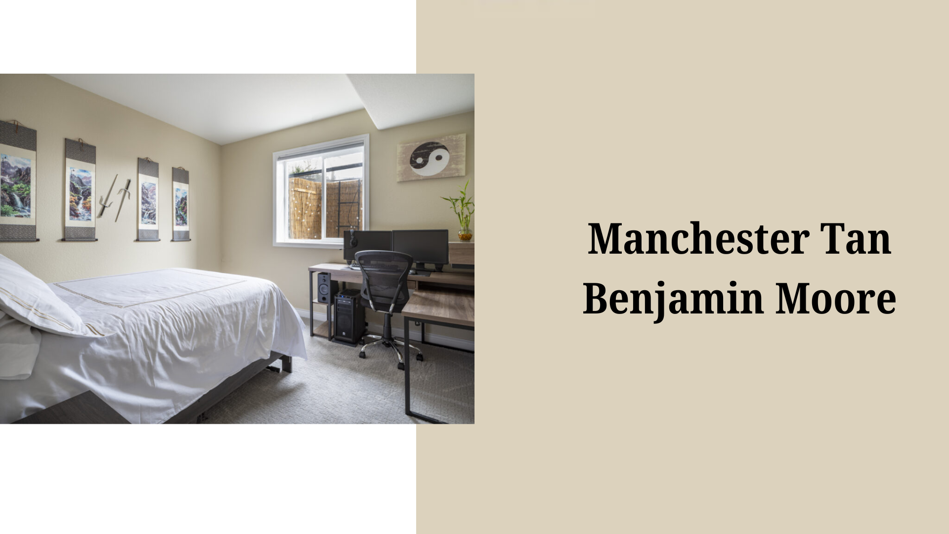
Manchester Tan makes bedrooms feel calm and restful.
The soft color helps create a peaceful space for sleep.
It works nicely with all bedding colors and doesn’t distract from your personal items.
Bathroom
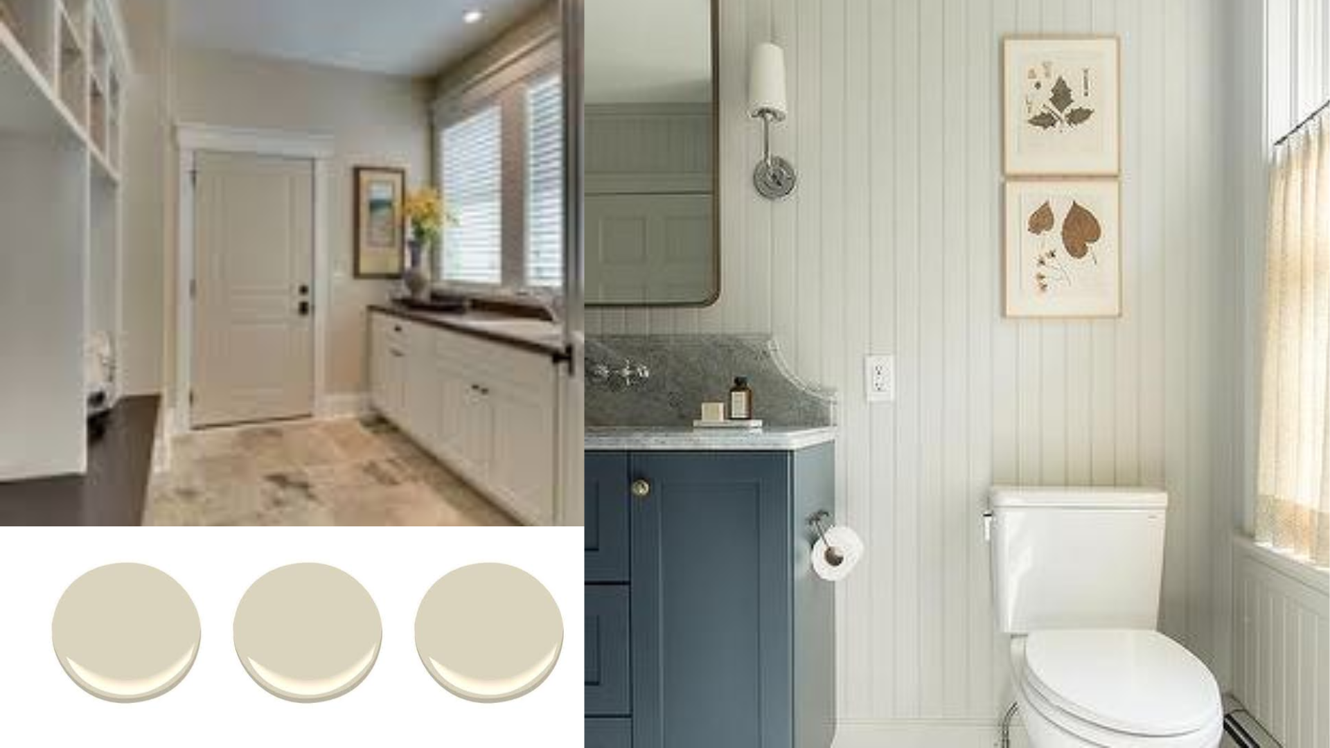
In bathrooms, Manchester Tan adds warmth but still keeps the space feeling clean.
It pairs well with white fixtures and marble countertops.
The color performs well in the moisture and limited light often found in bathrooms.
Analyzing the Undertones in Manchester Tan
Primary Undertones
Manchester Tan has warm, soft yellow and beige undertones. It lacks strong green or pink tints that many similar colors show.
Lighting Effects
- In north-facing rooms, Manchester Tan appears more neutral.
- South-facing light brings out its warmth.
- Morning light shows its yellow notes more clearly.
- Evening light makes it look more beige.
In-Depth Manchester Tan Review
Manchester Tan works in most homes because it’s so flexible. It feels warm but not too yellow.
The color stays true throughout the day. It helps rooms feel bigger and more open.
It pairs well with wood floors, white trim, and most furniture colors.
Paint samples show it’s a safe choice for people who want a neutral that isn’t boring.
Many painters recommend it because it rarely disappoints clients. It stays powerful in design because it doesn’t try to be trendy.
The color blends with modern and classic styles, making it a good base for any home style.
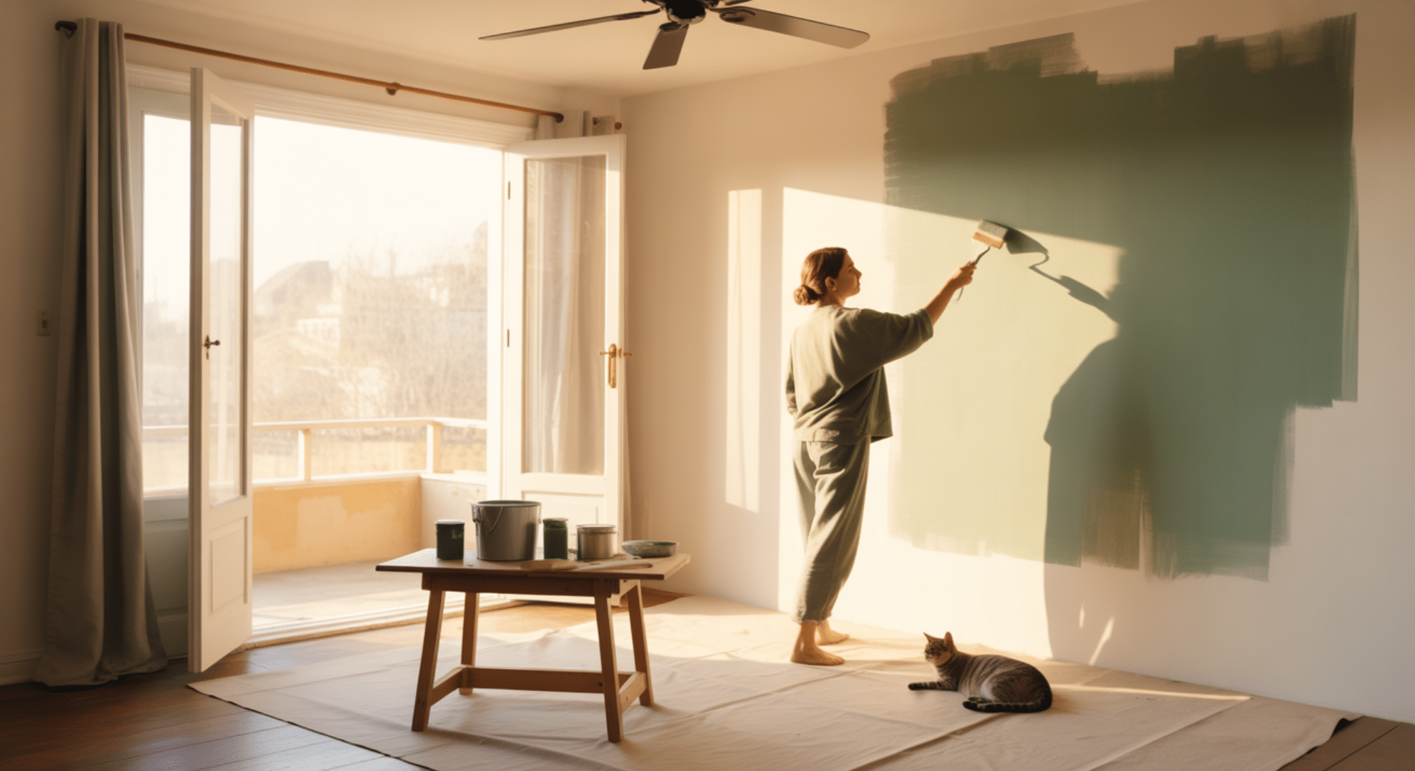
How to Test and Choose the Right Paint
Preparation & Testing
- Buy small sample cans of paint colors you like.
- Paint large squares on different walls in your room.
- Check how they look in morning, afternoon, and evening light.
- Move your samples near windows and away from them.
- Look at them beside your furniture, floors, and other fixed items.
Wait at least 24 hours before making your choice.
Application Techniques
Clean walls before painting. Use good-quality brushes and rollers for smooth results.
- Start with a primer if going from dark to light colors.
- Paint in small sections using a “W” motion.
- Do two thin coats instead of one thick coat for best results.
- Let the paint dry fully between coats to see the true color.
Exterior Paint Suitability
Manchester Tan works well on house exteriors. It pairs nicely with white trim and looks good in sunny and shady spots.
Common Pitfalls
Many people choose colors that are too bright or dark based on small paint chips.
Room size affects how colors look – small rooms make colors seem stronger.
Existing light bulbs change how paint looks – warm bulbs make colors more yellow.
Skipping test patches often leads to regret after painting whole rooms. The paint looks different when wet versus dry, so always wait to judge.
Color Pairing Strategies
Manchester Tan pairs well with many colors:
- White (Pure white or off-white for clean contrast)
- Navy blue (Creates a classic, timeless look)
- Soft sage green (Enhances the natural feeling)
- Burgundy or rust (Adds warmth and depth)
- Charcoal gray (Offers modern contrast)
- Pale blue (Creates a calm, coastal vibe)
- Chocolate brown (Builds a rich, cozy feeling)
Compatibility with Wood Trims & Cabinets
Manchester Tan works with almost all wood tones.
It complements oak, maple, and cherry without clashing.
The color lets the wood grain stand out while creating a smooth background. It works equally well with painted white cabinets for a clean look.
Conclusion
Benjamin Moore Manchester Tan is a trustworthy neutral that has earned its place in the paint world.
Its warm beige tones offer the perfect balance – not too yellow or gray and adaptable to nearly any space or style.
It works well in most settings: painting a cozy living room, a functional kitchen, or a peaceful bedroom. This color creates the right backdrop without taking over.
By understanding its undertones, testing it properly, and pairing it with complementary colors, you can use Manchester Tan to create fresh and timeless spaces.
This color’s staying power comes from its simple ability to work well in most homes while allowing your furniture and personal style to shine.
Frequently Asked Questions
Does Manchester Tan Work with Cool-Toned Furniture and Decor?
Yes, it pairs well with cool tones despite its warm base. The neutral quality of Manchester Tan helps it bridge the gap between warm and cool elements in a room.
How Does Manchester Tan Compare to Benjamin Moore’s Classic Gray?
Classic Gray is lighter and cooler than Manchester Tan. While Manchester Tan has yellow-beige undertones, Classic Gray has subtle purple-gray undertones that make it appear more crisp.
Can Manchester Tan Work in the Basement with Limited Natural Light?
Yes, its medium LRV of 57.94 makes it light enough to brighten basement spaces. In artificial light, it tends to appear warmer and more inviting than cooler neutrals would.