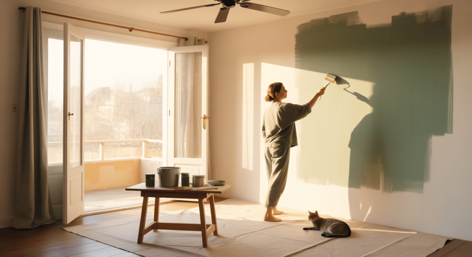
If you’ve ever paused at a sample card and thought, “What color is sage supposed to look like?” You’re not the only one.
Sage feels simple at first glance, but there’s a lot happening in this soft green.
That’s why it shows up in so many homes. I like how it brings quiet warmth without taking over the space.
You’ll see how this shade works in real rooms, how it shifts in light, and why it stays so steady.
So let’s take a closer look at what color sage is and how it works in everyday spaces.
Defining Sage Green: Color Profile and Psychology
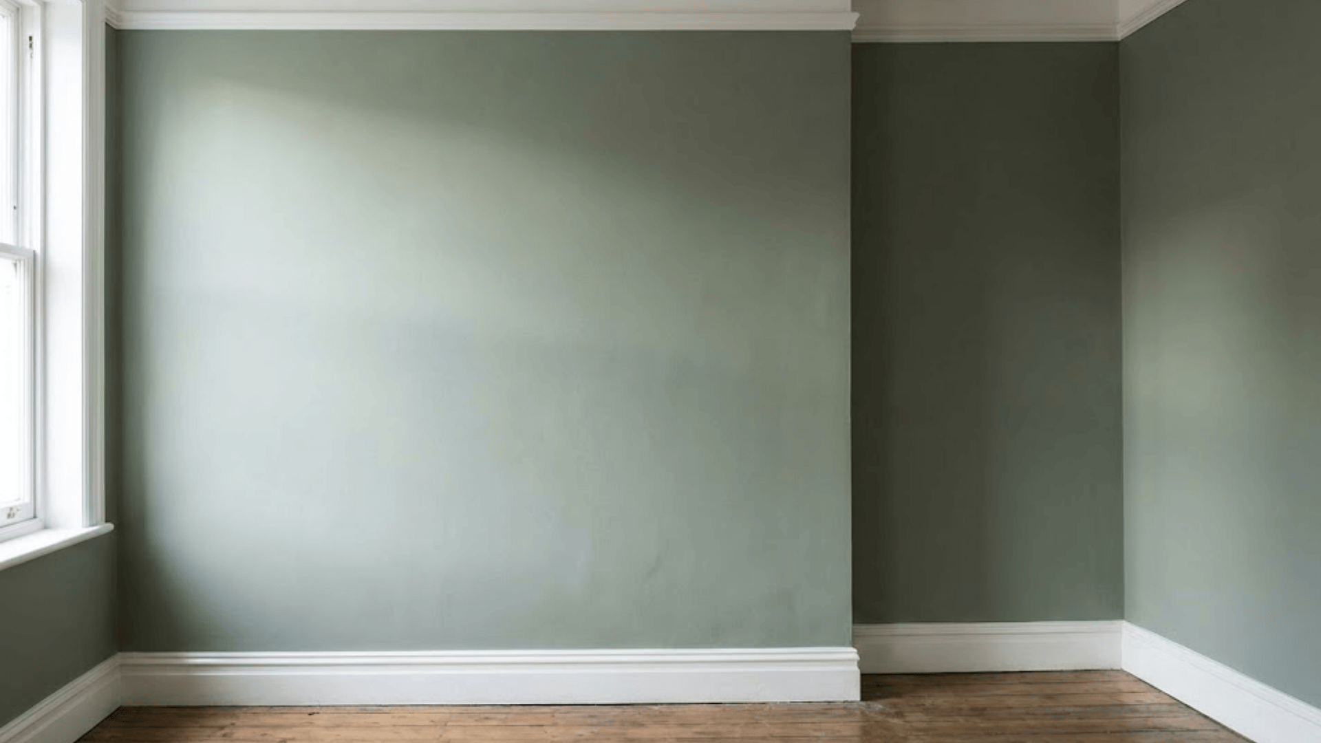
The appeal of sage green lies in its beautiful complexity. Unlike vibrant forest or lime green, sage is a soft, muted, earthy green characterized by a high proportion of gray and brown undertones.
It is this heavily desaturated quality that stops the green from being overly saturated, earning it the coveted title of a “new neutral” that can effortlessly anchor any room.
Its position in the color spectrum makes it incredibly flexible. Its temperature depends entirely on its base:
- Cool Sage: Has more blue-gray pigment, resulting in a silvery, ethereal tone (perfect for high-light rooms).
- Warm Sage: Has more brown or yellow pigment, resulting in a khaki or olive tone (ideal for cozy or North-facing rooms).
Symbolism and Emotional Impact
Sage green’s popularity is deeply rooted in our innate response to the natural world. Symbolically, the color is linked to calmness, tranquility, healing, and wisdom.
In design psychology, this power is explained by Biophilic Design, the concept that humans have an evolutionary drive to connect with nature.
When incorporated into a home, sage green grounds a space by mimicking botanical elements, instinctively reducing stress, slowing the heart rate, and promoting overall well-being.
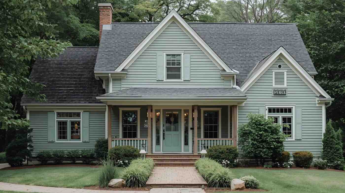
How the Color Sage Works in Home Design
A soft green that adds calm, balance, and natural warmth while blending easily with many home styles and simple design choices.
Sage works across many rooms and surfaces, giving you an easy way to add color through walls, furniture, cabinets, and simple decor accents.
Bedrooms
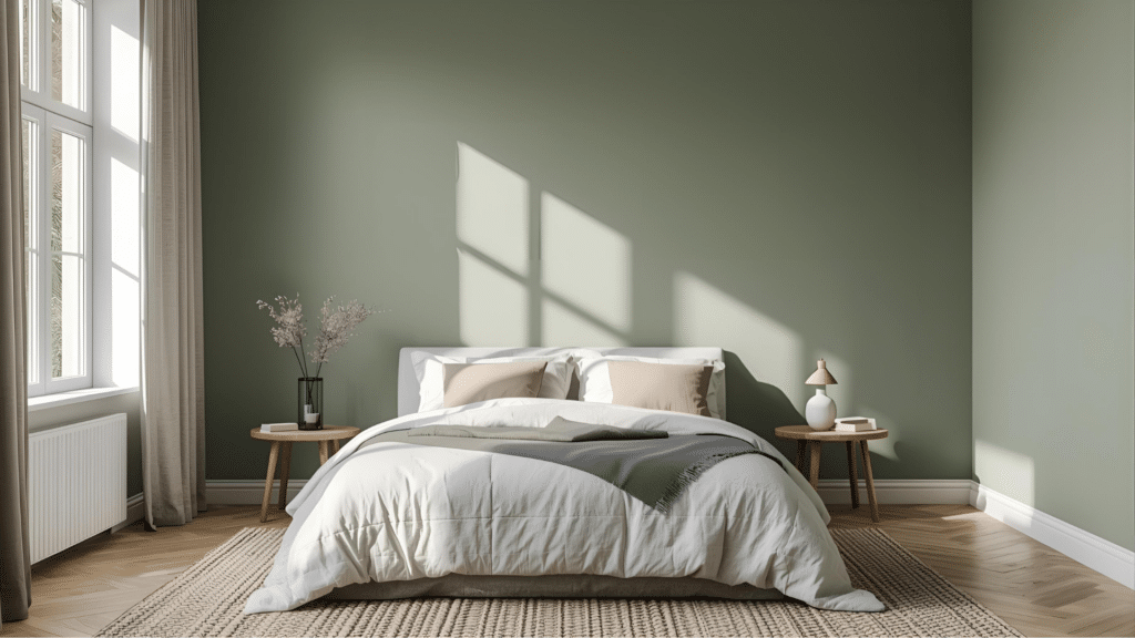
Sage works well in bedrooms because it creates a calm setting that supports rest. You can use it on the walls to bring softness to the space without making it feel heavy.
Sage furniture also works well, especially on dressers or nightstands, because it adds color without being too strong. Soft decor accents like bedding, pillows, and rugs help tie the room together.
The color works in both small and large bedrooms, giving you a peaceful look you can enjoy daily.
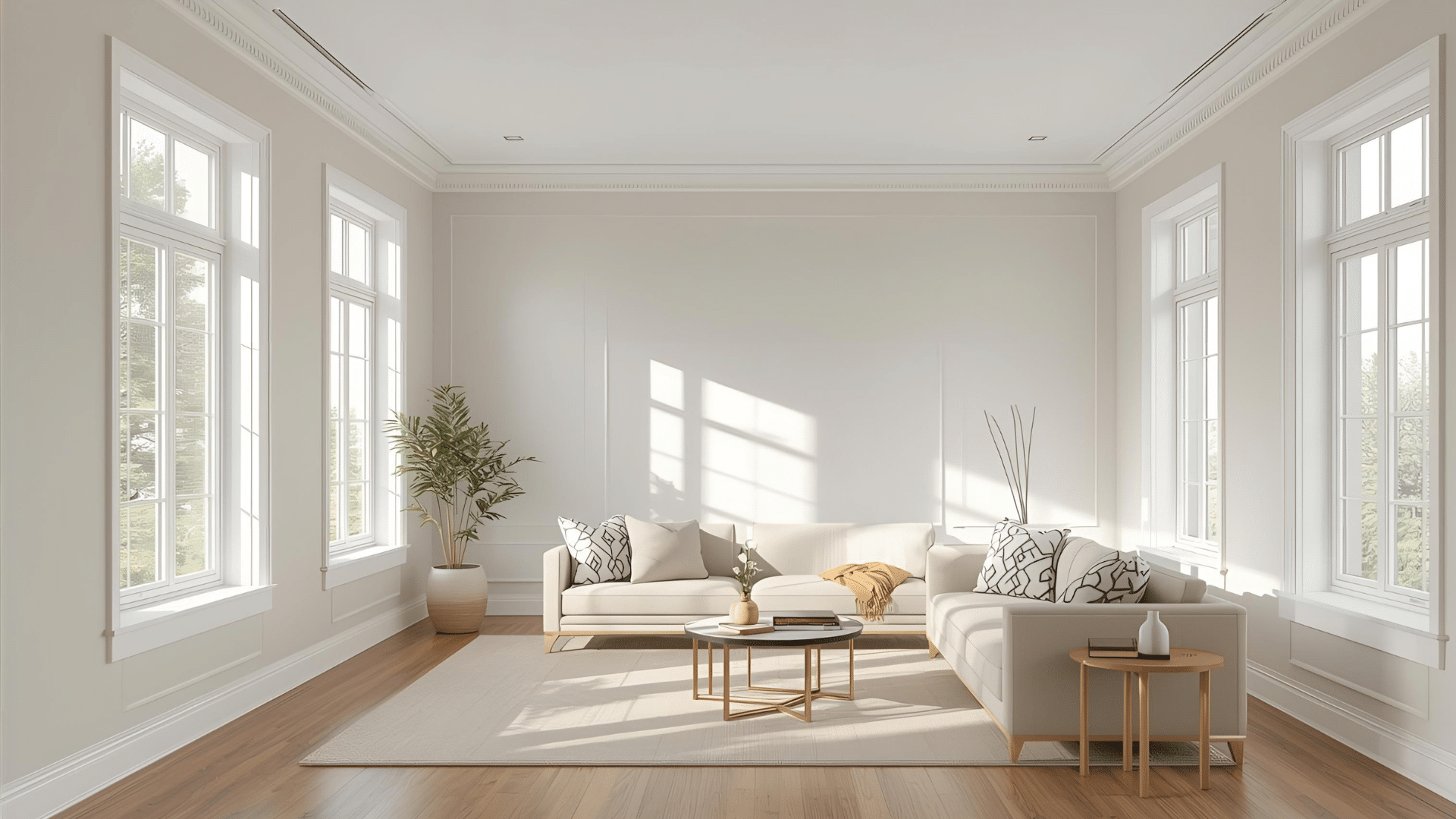
Living Areas
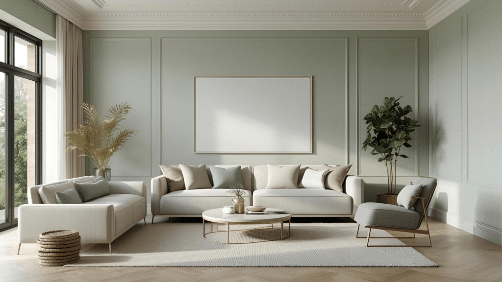
Sage is a helpful color for living areas because it brings warmth without feeling bright. You can use it on walls if you want a soft backdrop that supports simple decor. Built-in cabinets in sage also work well, giving the room a grounded look.
Accent furniture, such as side tables, consoles, or media stands, offers another way to bring sage into the space. Small touches like pillows, art, and planters add color without making the room feel busy.
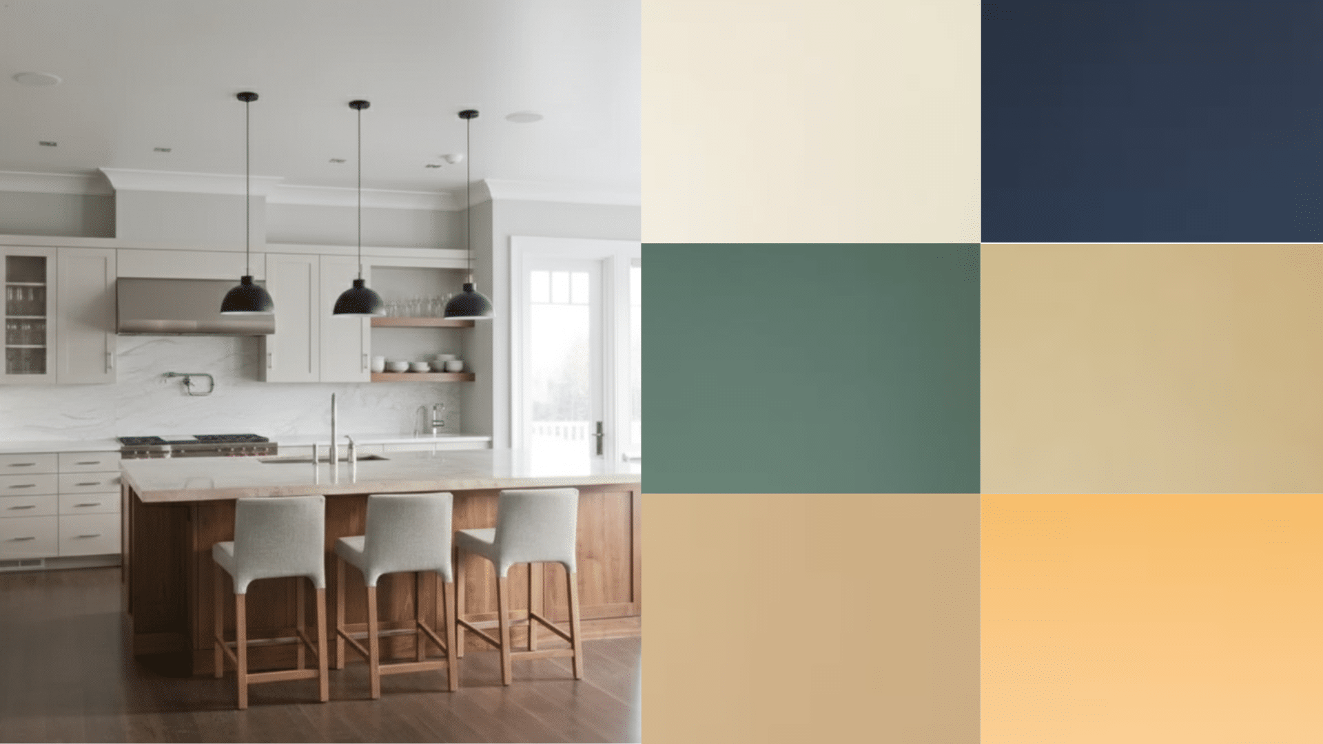
Kitchens
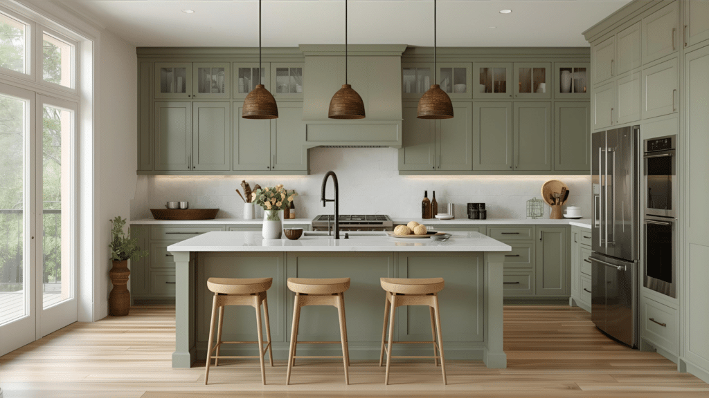
Sage fits naturally into kitchens because it gives you a clean look without feeling plain. Cabinets painted in sage offer a warm but simple base for the rest of your design. Accent walls work well too, especially near windows or open shelving.
If you prefer smaller touches, consider stools, a small island, or a baker’s rack in sage. Decor accents such as pottery, rugs, or simple dishes help carry the color throughout the room in a soft and steady way.
Bathrooms
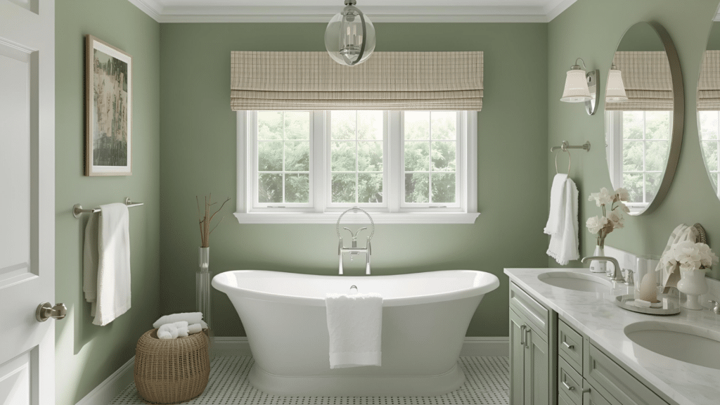
Sage helps bathrooms feel calm and clean without making the space feel cold. You can use it on the walls for a soft backdrop that works with tile or stone. Vanity cabinets painted in sage offer color without taking over the room.
Small furniture pieces like shelves or storage units also look good in sage, especially when paired with simple accessories. Decor accents such as towels, rugs, or baskets help bring the color through the space in a gentle and balanced way.
Sage Color Palettes That Work Well
Soft, muted green works with simple neutrals, warm accents, and natural materials, giving you flexible options for many home styles.
Neutral Pairings
Neutral colors help sage stay soft and balanced, giving you simple options that support light, warmth, and a clean look in any room.
| Neutral Color | How It Works With Sage | Best Places to Use It |
|---|---|---|
| Cream | Adds warmth and softness without overpowering sage. | Bedrooms, living rooms, bedding, rugs |
| Soft White | Keeps the room bright while letting sage feel calm. | Walls, trim, cabinets, kitchens |
| Taupe | Grounds sage and adds depth in low-light rooms. | Furniture, accent walls, and decor pieces |
Modern Accent Choices
Modern accent colors give sage a stronger contrast and shape, helping your space feel clear, steady, and supported without reducing its soft feel.
| Accent Color | How It Works With Sage | Best Places to Use It |
|---|---|---|
| Terracotta | Adds warmth and contrast for a grounded, natural feel. | Pillows, pottery, rugs, wall art |
| Charcoal | Creates depth and contrast without feeling heavy. | Furniture, cabinets, hardware |
| Mauve | Brings a soft, muted contrast that feels calm and steady. | Bedding, textiles, accent walls |
| Black | Offers a clear contrast and helps define shapes in the room. | Hardware, picture frames, lighting |
Wood and Metal Matches
Natural woods and simple metals support sage by adding warmth, texture, and structure, helping the color stay steady throughout the entire space.
| Material | Why It Works With Sage | Best Places to Use It |
|---|---|---|
| Light Wood | Keeps the room bright while adding clean warmth. | Cabinets, flooring, furniture |
| Medium Wood | Balances sage with even, steady color. | Shelving, tables, vanities |
| Brass | Adds soft warmth that blends with sage’s muted tone. | Lighting, hardware, small decor |
| Matte Black | Gives strong definition and contrast without feeling sharp. | Hardware, fixtures, frames |
Popular Sage Paint Colors by Brand
These soft green options give you steady color, reliable undertones, and simple results across walls, cabinets, and furniture in many rooms.
Sherwin-Williams Picks

Sherwin-Williams offers calm sage shades that stay steady in different lighting, giving you easy choices for walls, cabinets, and everyday spaces.
- Clary Sage: Warm, olive-based green that softens cool light
- Sensible Hue: Gentle gray-green that stays balanced in bright rooms
- Evergreen Fog: Neutral, muted green that works well in many spaces
These shades offer soft, steady color that blends smoothly with simple materials, helping you build calm rooms with very little effort.
Benjamin Moore Picks

Benjamin Moore includes muted green tones that stay calm in many rooms, giving you flexible options for simple, steady home design.
- October Mist: Soft, muted green that fits many design styles
- Soft Fern: Light green that stays gentle and balanced
- Camouflage: Warm, grounded green suitable for classic rooms
These colors work well with light woods, soft whites, and natural textures, making it easy to add gentle sage to your home.
Behr Picks

Behr’s sage shade gives you a clean green tone that works across walls, cabinets, and small furniture without feeling bright or heavy.
- Sage Green ICC-77: Soft muted green that stays balanced in most lighting
- Works on many surfaces, including cabinets and furniture
- Pairs well with natural materials and simple decor
This shade offers a steady look that blends easily with simple colors and textures, giving you a calm, soft backdrop in any room.
Conclusion
I hope you feel clearer about how this soft green works and why it shows up in so many rooms.
Simple undertones, calm energy, and easy pairings make sage helpful when you want steady color without a strong look. I like that it works in almost any room and still feels relaxed.
If you’re still thinking about what color is sage and how it could fit your home, this is a good time to test a few samples and see which one fits your space.
I’d love to hear what shade you try. Keep finding related posts, and check out the other blogs for more simple color ideas.