I’ve always loved the look of light hardwood, but choosing the right wall color can feel harder than it should.
You might feel the same way, especially when every shade shifts as the light changes. That’s the part that makes matching wall color with light hardwood floors so confusing for many people.
A color can look perfect in the store and completely different once you bring it home. I’ve made those mistakes too, and I know how frustrating it feels.
So I pulled together simple steps that help you make clear choices without second-guessing every sample. This guide walks you through steady colors, smart testing tips, and easy ways to balance your room.
So here’s where we begin.
Understanding Wood Floor Undertones
All wood floors have undertones. These are subtle color hints beneath the main surface color. Undertones affect how wall colors look once everything is in the room.
Some floors lean warm, some lean cool, and some sit right in the middle.
With light hardwood floors, undertones matter even more because pale wood reflects light easily. Small color shifts show up faster on light floors than on darker ones.
Warm undertones in light hardwood often show soft hints of yellow, honey, peach, or light orange. These floors can look brighter in daylight and warmer at night. To keep them steady, wall colors with gentle cool balance usually work best.
Cool undertones in light hardwood may lean slightly gray, ashy, or pale beige. These floors can feel crisp but sometimes flat if paired with the wrong wall color. Soft warm wall shades help keep the room from feeling cold.
Neutral undertones sit between warm and cool. Light hardwood with neutral undertones works with the widest range of wall colors because it does not push the room in one direction.
A simple way to spot undertones is to place a plain white sheet of paper directly on the floor. Look at it in natural daylight. If the wood looks yellow or golden next to the paper, it leans warm. If it looks gray or muted, it leans cool.
Once you know your undertone, choosing wall colors for light hardwood floors becomes much easier. You are no longer guessing. You are balancing what is already there.
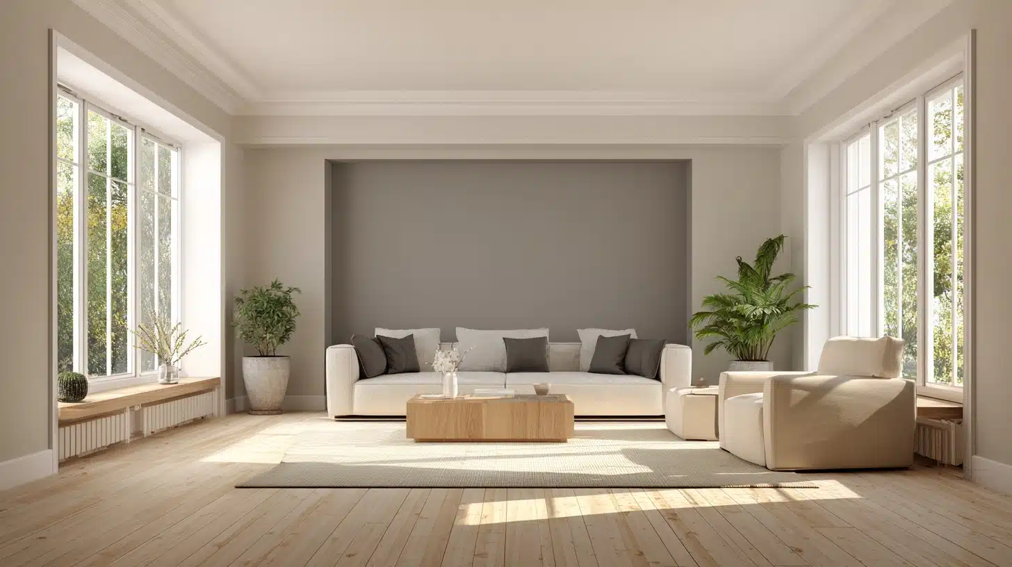
Best Wall Colors for Light Hardwood Floors
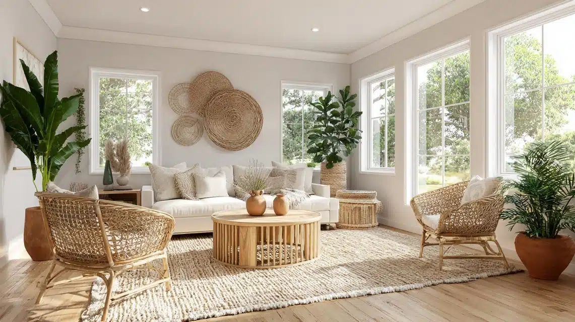
Light hardwood works with many wall colors because its soft tone helps the room feel open while keeping the focus on the floor.
1. Whites and Off-Whites
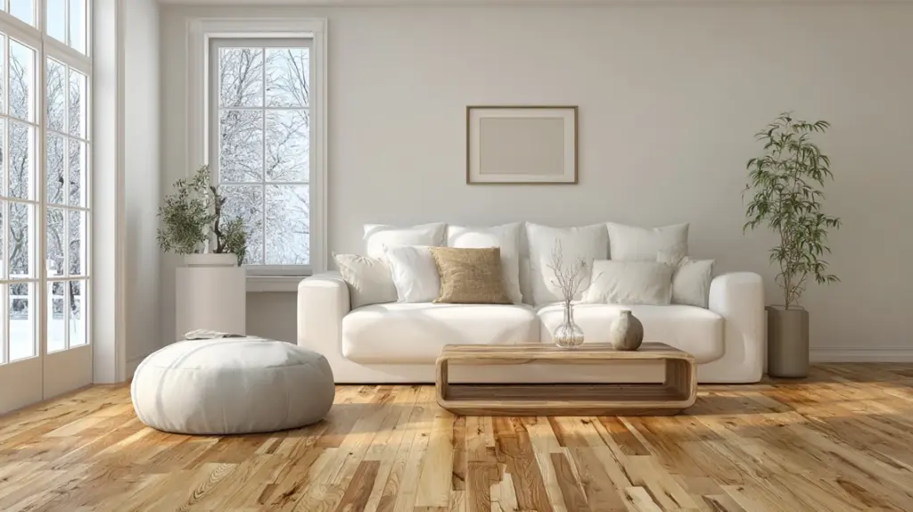
White and off-white help your light hardwood stand out without pulling attention away from the floor. These shades work well in tight rooms, busy layouts, or areas with mixed furniture styles.
They brighten dark corners and keep the room feeling open during the day and evening. If your floor has a warm tone, choose a soft white. If the floor leans cooler, use a clean white. Both keep the space simple while letting the wood grain show clearly.
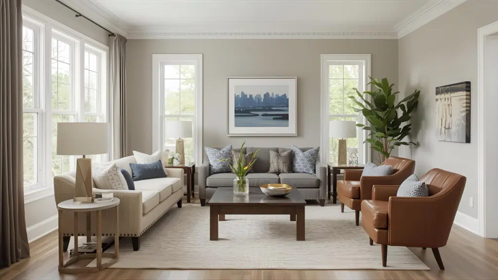
2. Light Grays and Greiges
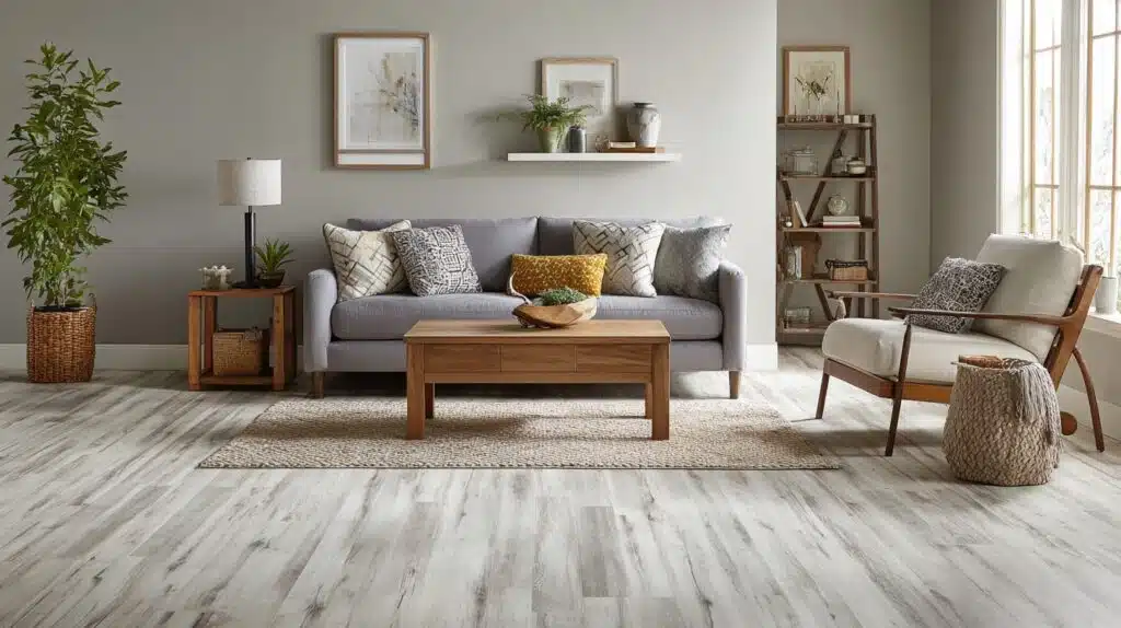
Light gray and greige give your room a calm look while still letting the floor remain the main feature. These colors help tone down wood that leans warm and add gentle depth to cooler floors.
They work well in living rooms, bedrooms, or any room with mixed wood pieces. Light gray fits floors with a cool cast, while greige supports floors with a soft, warm hint. Both choices keep the room steady without feeling flat or heavy.
3. Beiges and Tans
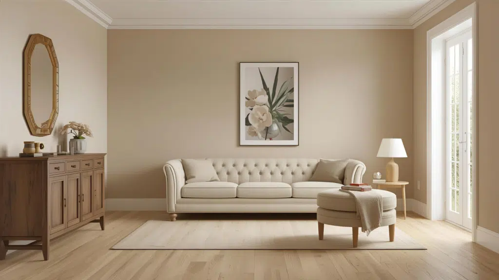
Beige and tan add a soft warmth that works well with many light hardwood floors. These colors help rooms feel steady without pulling focus from the wood.
They pair well with natural textures, simple furniture, and cozy layouts. Beige fits floors with a cooler cast, helping balance the tone. Tan works with floors that show more warmth.
Both choices stop the room from feeling too stark and help the floor look even across different lighting conditions.
4. Soft Greens and Blues
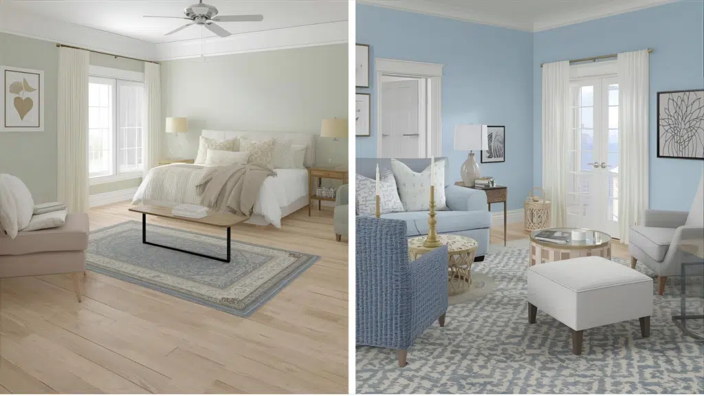
Soft greens and blues add a calm touch while keeping your light hardwood as the anchor of the room. These colors help reduce any slight yellow cast in warm floors and support cooler floors without clashing.
Soft green works well in bedrooms and living spaces that need a peaceful tone. Light blue adds a gentle lift without feeling strong.
Both colors stay subtle enough to match simple decor while giving the room a light layer of personality.
5. Pastels and Muted Colors
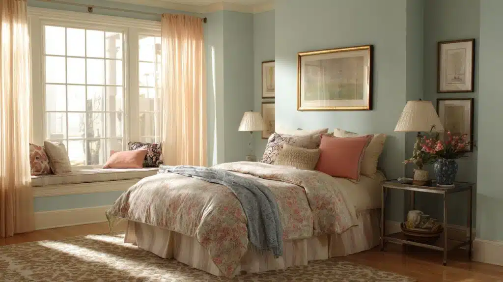
Pastels and muted colors bring gentle color into the room without fighting your light hardwood.
Soft peach, pale blue, muted green, and similar tones give the room a quiet lift while keeping the floor steady. These colors work best in small rooms, kids’ spaces, or areas where you want color without strong contrast.
Because they stay soft, they support warm and cool floors fairly well. They add interest without making the room feel busy or cramped.
Summary: These color groups stay steady across different rooms, lighting, and furniture choices, making them the safest wall colors for light hardwood floors.
Best Bold Colors for Light Hardwood
Bold wall colors can stay steady with light hardwood when you choose shades that give the room depth without overpowering the floor.
1. Navy
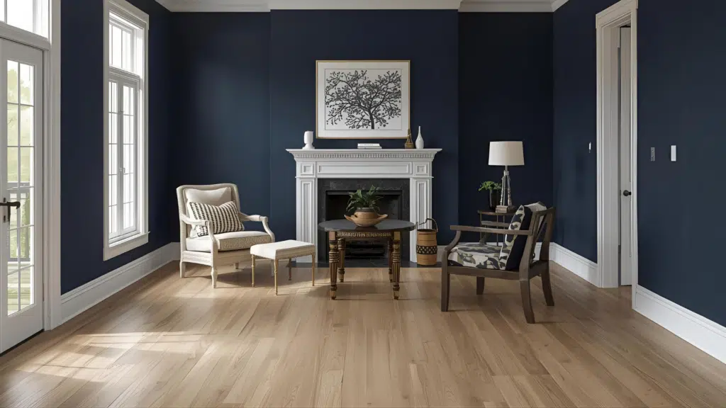
Navy adds a strong contrast against light hardwood while keeping the room steady and comfortable. It works well in living rooms, dining rooms, or offices where you want a darker color without making the space feel tight.
Navy supports both warm and cool floors because it stays neutral in most lighting. If your room has large windows, navy looks clear during the day and soft at night. It also keeps the wood grain easy to see instead of pushing it back visually.
2. Teal
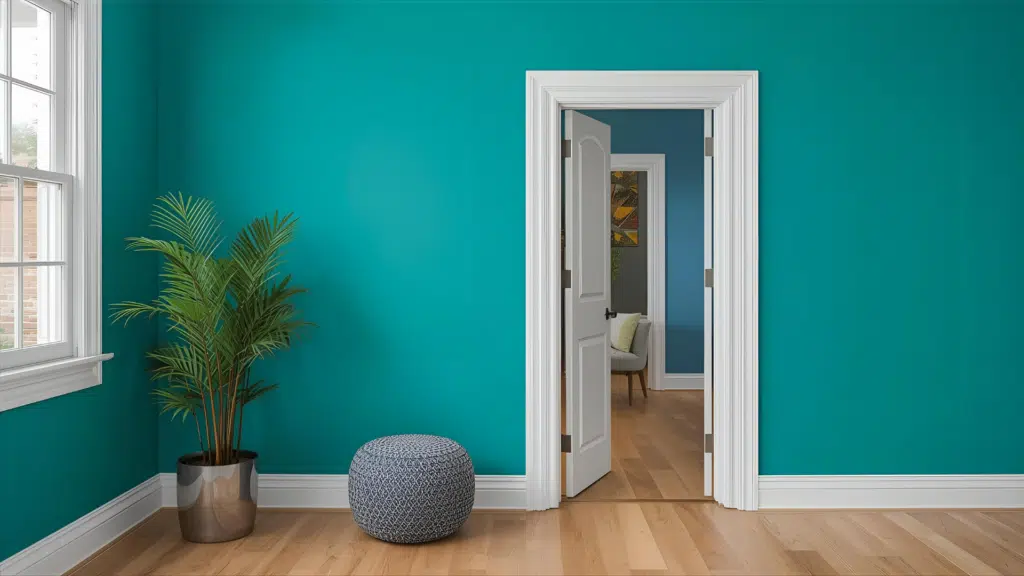
Teal brings a strong color presence while still working with many light hardwood tones. It stays balanced because it carries both blue and green, helping it pair with warm or cool floors.
Teal works well in rooms where you want energy without harsh edges, such as entry areas or feature walls. It keeps the floor steady by giving enough contrast without taking over. This shade also holds up well under daylight, keeping the room from feeling flat.
3. Hunter Green
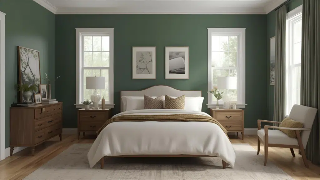
Hunter green pairs nicely with light hardwood because it adds grounded color that stays calm and steady. This shade works best in rooms where you want a cozy feel, such as bedrooms or reading areas.
Hunter green supports warm floors by reducing any slight yellow cast, and it balances cooler floors by adding depth. It remains smooth under different lighting conditions and helps the wood stand out instead of fading into the background. This makes it a strong option for bold spaces.
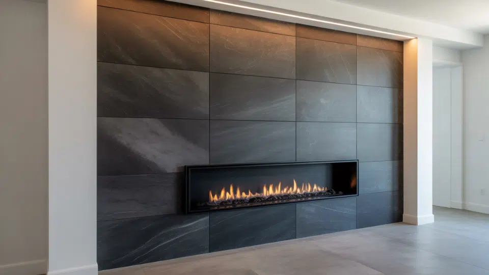
4. Charcoal Gray
Charcoal gray brings depth to a room with light hardwood without pulling too dark. It works well in modern layouts, hallways, or rooms with strong daylight. This shade supports cool floors by staying steady in tone, and it balances warm floors by adding a clear contrast.
Charcoal gray also works with many decor styles because it remains easy to pair with soft or strong colors. It keeps the room grounded and allows the wood grain to stay visible and clear.
Best Colors for Each Wood Species
Each wood species reacts differently to wall color, so this table gives a fast way to choose the right shade for your floor.
| Wood Species | Best Wall Colors |
|---|---|
| White Oak | Soft gray, warm white, gentle blue, pale green, muted beige |
| Birch | Cream, light sage, pale yellow, muted blue, warm white |
| Maple | Greige, soft gray, calm beige, light taupe, pale green |
| Ash | Cool white, light gray, sage, pale blue, soft charcoal |
| Beech | Warm tan, soft cream, muted peach, pale taupe, gentle green |
These matches help each wood species look even in different rooms, keeping the floor steady while giving you simple, reliable wall color choices.
Room-By-Room Wall Colors
Each room has different lighting, layout, and use, so the right wall color depends on how the space feels during daily routines.
Living Room
A living room usually has mixed furniture and steady daylight, so you need a wall color that supports the floor without drawing attention. Soft gray works well because it stays calm in morning and evening light.
Warm white fits rooms with large windows and keeps the space open. Pale green or light blue can help steady warm floors. If your living room has dark furniture, greige or light tan adds balance without taking focus away from your wood floor.
Bedroom
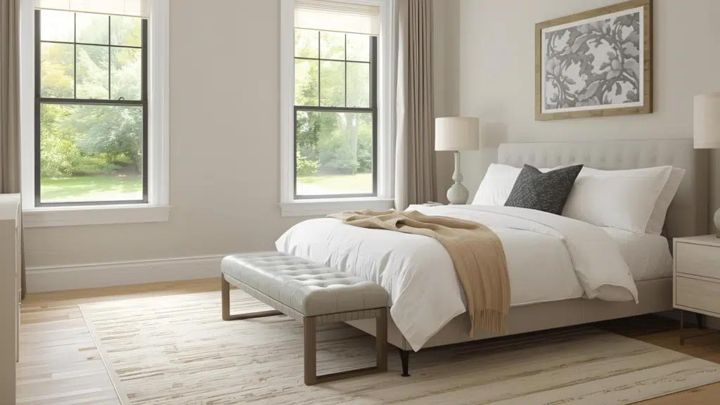
Bedrooms need calm color, so gentle shades work best with light hardwood. Soft beige adds warmth without feeling strong. Light gray stays steady in dim morning light, which helps the room feel smooth when you wake up.
If your floor leans warm, pale green or muted blue keeps the room balanced. Warm white fits simple rooms and helps the floor stay clear. Pick a color that feels easy at night since bedrooms depend on soft lighting.
Kitchen
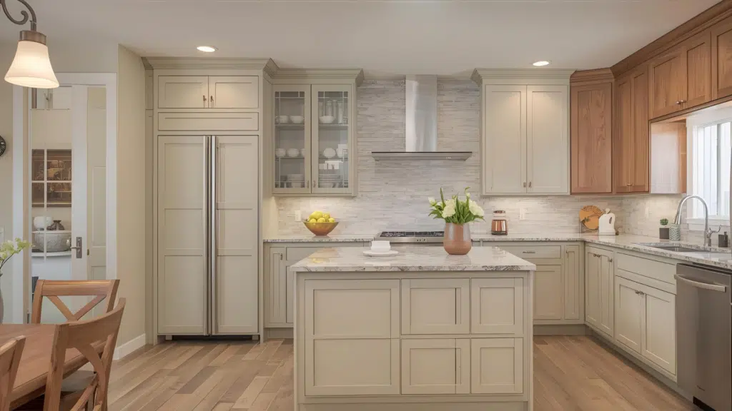
Kitchens usually have cabinets, counters, and metal finishes, so the wall color should support all those pieces while keeping the floor steady. Warm white works well with natural wood cabinets.
Light gray fits modern layouts and helps control warm tones from appliances or lighting. Pale green pairs with many cabinet colors without clashing. If your kitchen has cooler light, gentle beige helps the room feel smooth.
Choose a color that stays clear under strong task lighting near prep areas.
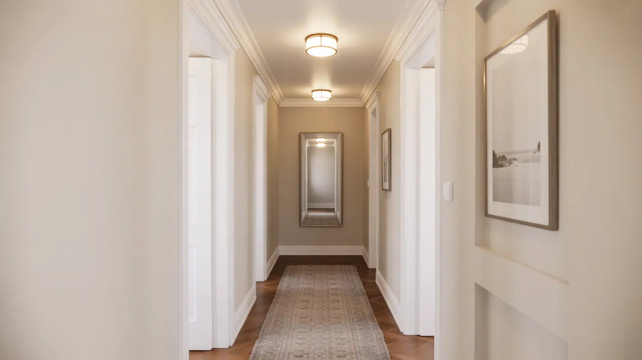
Hallway
Hallways can feel tight, so light wall colors work best with hardwood. Soft white keeps the space open, especially in narrow layouts.
Light gray stays steady when the hallway has little daylight. Pale beige helps warm up a space with closed doors or limited windows.
If your hallway connects different rooms, choose a neutral shade that links everything together without pulling too strongly in one direction. Aim for a color that feels smooth between bright and dim areas.
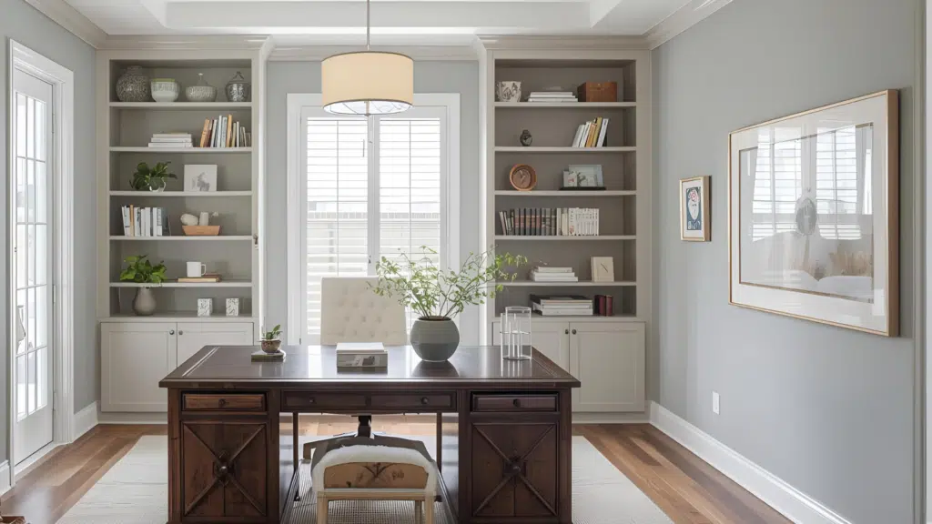
Office
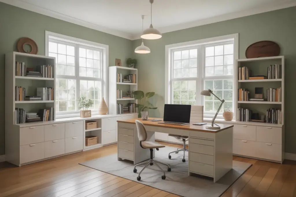
A home office needs color that keeps the room focused and steady. Light gray works well because it stays even during long work hours. Soft white helps brighten screens and documents.
Pale green reduces eye strain and supports warm floors without pushing the room in a strong direction. If your office has bookshelves or large desks, calm beige helps the wood floor stay clear under mixed lighting. Pick a color that feels steady through your full workday.
Basement
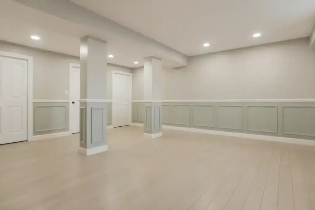
Basements often have low light, so wall colors need to lift the room without feeling heavy. Soft white keeps the space open and prevents shadows from taking over. Light beige helps warm the room when natural light is limited.
Pale gray fits finished basements with bright fixtures. If you want a hint of color, muted green or gentle blue keeps the floor steady without darkening the room. Aim for colors that stay clear under cool basement lighting.
Adjusting Colors for Room Lighting
Room lighting shifts wall color throughout the day, so choosing the right shade helps your light hardwood stay steady in every space.
| Room Lighting | Best Wall Colors | Why It Works |
|---|---|---|
| North-Facing | Soft white, light gray, pale beige | North light is cool, so gentle warm shades help the space stay even. |
| South-Facing | Cool white, pale blue, muted green | Strong warm daylight needs cooler tones to keep the room steady. |
| East-Facing | Warm white, soft beige, pale yellow | Morning light is bright and warm, so gentle warm shades stay smooth throughout the day. |
| West-Facing | Light gray, greige, pale green | Afternoon light can look strong, so steady mid-tones help control color shifts. |
| Low-Light Rooms | Soft white, calm beige, pale blue | These colors lift the room without making it feel tight or heavy. |
How Trim and Cabinets Affect Wall Color
Trim and cabinets play a large role in how your wall color looks next to light hardwood.
Trim often sits against the wall and floor, so its shade affects how warm or cool the room feels. Bright white trim makes wall colors look clearer, while soft white can make the room feel smoother.
If your trim has a warm cast, certain cool wall colors may look sharper than expected. Cabinets also influence color because they cover large areas and sit close to the walls.
Dark cabinets add strong contrast, so lighter wall colors help balance the room. Light cabinets keep the space open, so you can use stronger wall colors without feeling tight.
Always test wall colors next to trim and cabinet finishes to see how everything fits together.
How to Test Paint Colors
Testing paint the right way helps you see how each color reacts with your light hardwood and the room’s daily lighting.
1. Swatches
Use swatches large enough to show the true color across the wall. Small swatches often look different once the color spreads out. A sheet about the size of a notebook page gives you a better idea of how the shade works with your hardwood.
Place the swatch halfway down the wall where light hits naturally. This helps you see how the color behaves during the day. Larger swatches prevent guessing and save time when narrowing your options.
2. Compare Against Baseboards
Baseboards sit between your wall and floor, so they affect how the paint appears against your hardwood. Hold swatches directly next to the baseboard to see if the shade shifts warmer or cooler.
Some colors might look good in the center of the wall but clash near the trim. This step helps you catch small changes early. It also makes sure the color stays clear across the whole room, not just in bright areas.
3. Daylight vs. Evening
Paint changes throughout the day, so check each swatch under both daylight and evening light. Morning light may make the shade look soft, while evening light can make it look deeper.
Light hardwood often reflects brightness, so you want a color that stays steady as the light shifts. Stand in different spots in the room and look at the swatch for several hours. This gives you a better sense of how the color truly behaves.
4. Move Samples Around the Room
Different walls receive different levels of light, so move your swatches around the room to see how the shade responds. A color that looks clear on one wall might seem darker or warmer on another.
Tape the swatch near windows, corners, and hallways to see if any shifts appear. This helps you find a color that stays smooth across the entire space. Moving samples also helps avoid surprises after the full room is painted.
Designer Color Palettes for Light Hardwood Floors
Designer brands offer steady color choices that work well with light hardwood because their shades stay clear in most rooms.
Sherwin-Williams has several options that pair smoothly with warm and cool floors. Soft colors like Pure White, Alabaster, and Sea Salt work well in living rooms, bedrooms, and hallways.
If you want calm depth, Light French Gray or Agreeable Gray stay even through daily lighting.
Benjamin Moore also has reliable shades that keep the room steady. Popular picks include White Dove, Classic Gray, and Pale Oak, which help brighten the room without pushing the wood tone.
If you want gentle color, Quiet Moments and Soft Fern fit many spaces.
Behr also offers steady choices such as Swiss Coffee, Cotton Grey, and Light Drizzle. These colors help your light hardwood stay clear and balanced in different rooms.
Final Thoughts
Matching your walls with light hardwood becomes much easier once you understand your floor’s tone, your lighting, and the colors that stay steady in real rooms.
Each section in this guide focuses on simple steps that help you pick shades with confidence and avoid choices that compete with your wood.
These ideas make matching wall color with light hardwood floors feel less overwhelming and more practical for you at home. I hope the tips help you see your space more clearly and give you a place to start.
If you want more no-guesswork help, take a look at other blogs on the site. They walk through color choices, lighting tips, and room planning ideas that’ll make your next update feel much easier.