Finding the right neutral paint color for your home can be challenging after trying many samples and painting several rooms.
I’ve found that Sherwin-Williams Accessible Beige (SW 7036) is a standout option.
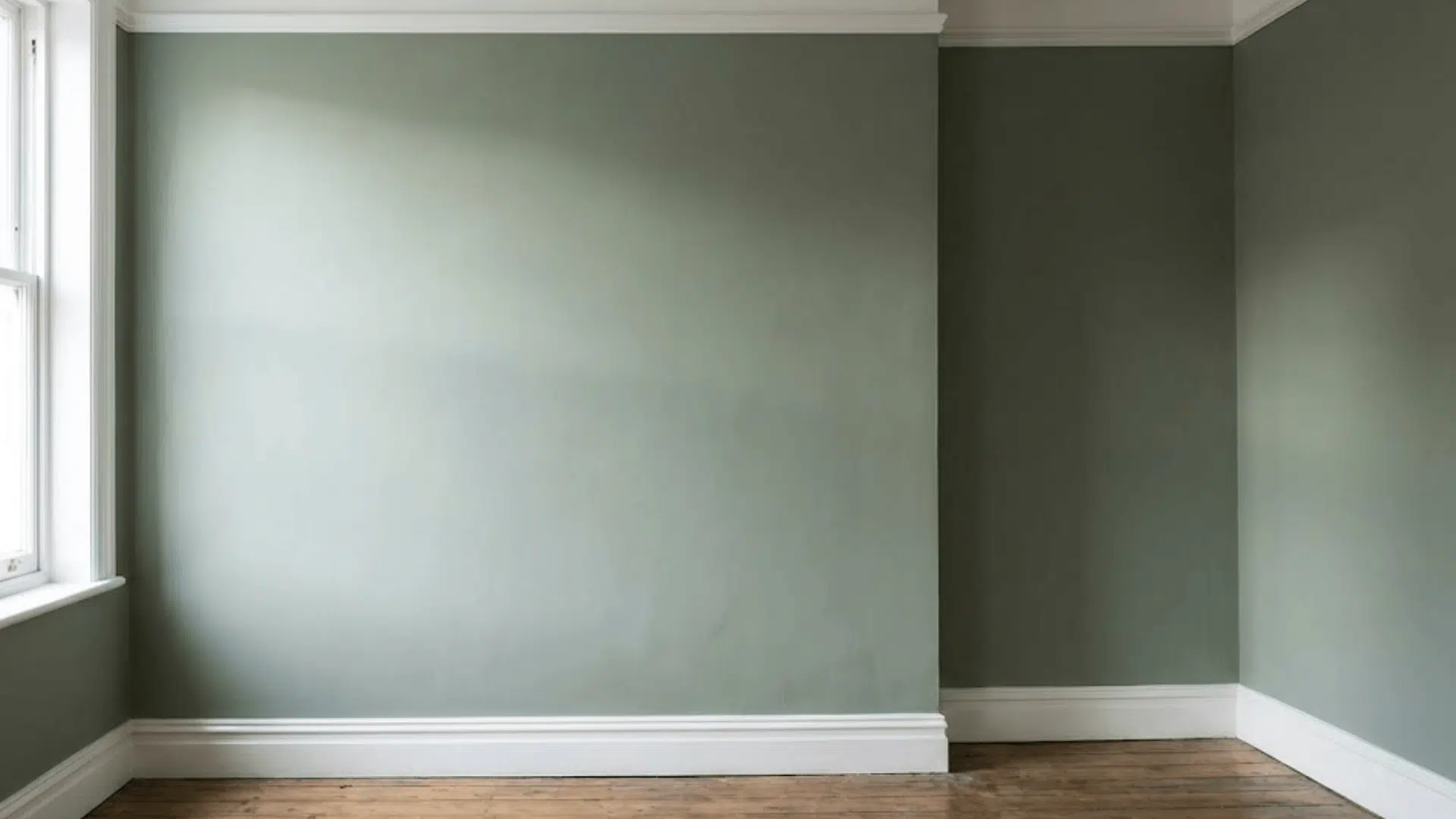
This light neutral combines subtle beige and gray tones, making it work well with most color schemes and in any room.
It’s not too warm or too cool – just right. In this review, I’ll cover why this color might work for your space, how it looks in different lighting, examples from my home, similar colors to think about, and tips for testing and using this paint.
Let’s see what makes this color so useful.
What is Accessible Beige?
As someone who’s spent countless hours testing paint colors, let me tell you about Sherwin-Williams Accessible Beige (SW 7036).
It’s a light neutral that sits perfectly between beige and gray on the color spectrum.
What makes this color special?
When I first used it in my home, I noticed how it shifted subtly throughout the day.
In morning light, the beige tones come through more strongly. As the day progresses, the gray undertones become more noticeable.
It’s light enough to brighten a room without being too stark.
I’ve seen this shade pop up in many modern homes, and for good reason – it plays well with both warm and cool color schemes.
Accessible Beige Color Codes
- RGB Values: 209/199/184
- HEX Code: #D1C7B8
- LRV: 58 (explaining Light Reflectance Value)
The Benefits of Choosing Accessible Beige
Versatility in Different Lighting
I’ve painted several rooms in my house with SW Accessible Beige, and here’s what I’ve noticed about lighting:
- Morning sun brings out its warm, beige notes
- Afternoon light shows off the balanced gray undertones
- In north-facing rooms, it stays true to its neutral tone
- Even with artificial lighting, it maintains its soft, welcoming feel
Works with Various Design Styles
This paint has proven itself in many settings. In my experience:
- Modern spaces: It creates a clean backdrop for simple furniture
- Traditional rooms: The color adds warmth without being too yellow
- Casual settings: Gives a comfortable, lived-in feel
- Formal areas: Offers sophistication without being stuffy
Easy to Pair with Other Colors
Here’s what I’ve found works well with Accessible Beige:
- White trim and ceilings for a clean look
- Rich brown wood tones
- Soft blues and greens
- Black accents for contrast
- Any shade of white, cream, or off-white
The best part? You don’t need to be a color expert to make these combinations work.
I’ve seen this shade blend smoothly with existing furniture and decor in both big and small spaces.
Coordinating & Complementary Colors
Best White Trim Colors
- SW Extra White – A crisp, clean white that creates a bright and modern contrast with any wall color.
- SW Alabaster – A soft, warm white that pairs beautifully with beige, taupe, and neutral walls for a cozy, inviting atmosphere.
Best Gray Pairings
- SW Repose Gray – A versatile, light gray with slightly warm undertones, perfect for pairing with both light and dark shades.
- SW Mindful Gray– A middle-shade gray with hints of green that you can barely notice. It creates a calm, classy look when used with warm or neutral colors.
Best Bold Accents
- SW Urbane Bronze – A deep, sophisticated bronze with gray undertones, ideal for creating rich, bold accents in any space.
- SW Tricorn Black – A pure, true black that adds striking contrast and a timeless, dramatic touch to any room.
Accessible Beige in Different Rooms
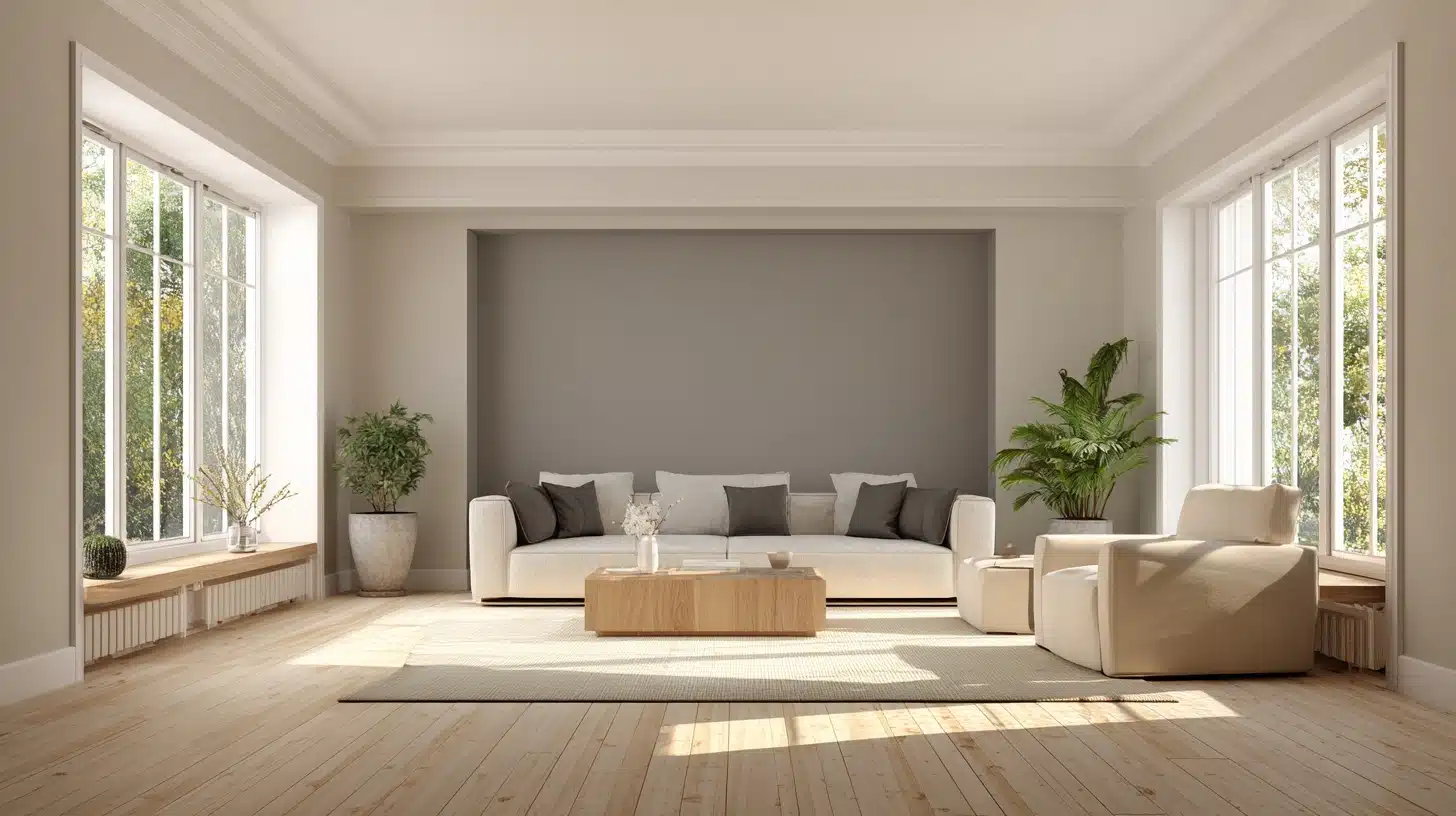
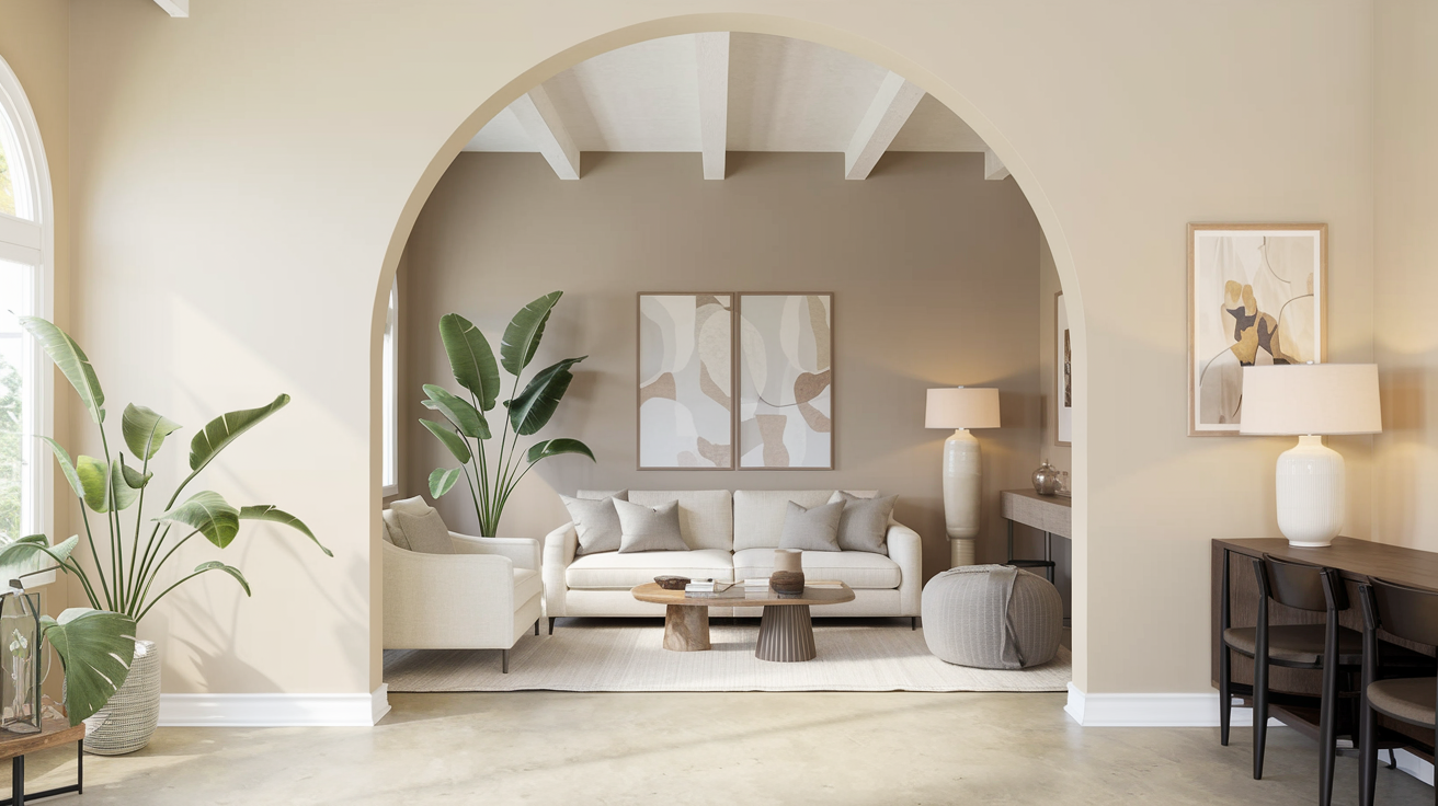
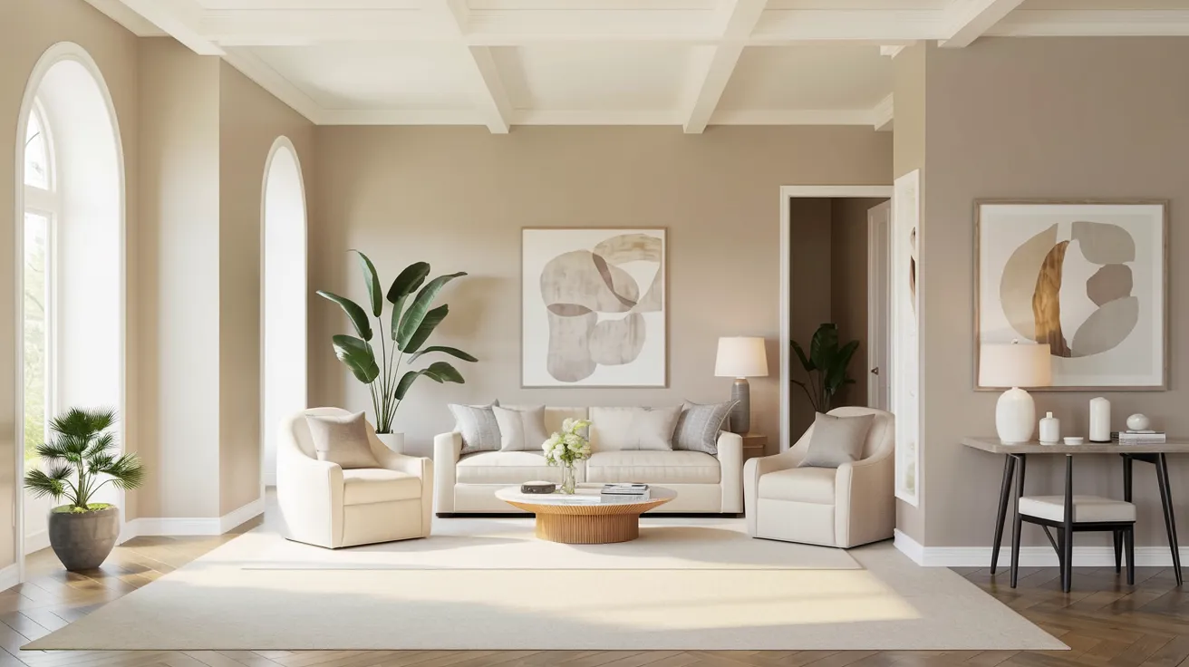
1. Living Rooms
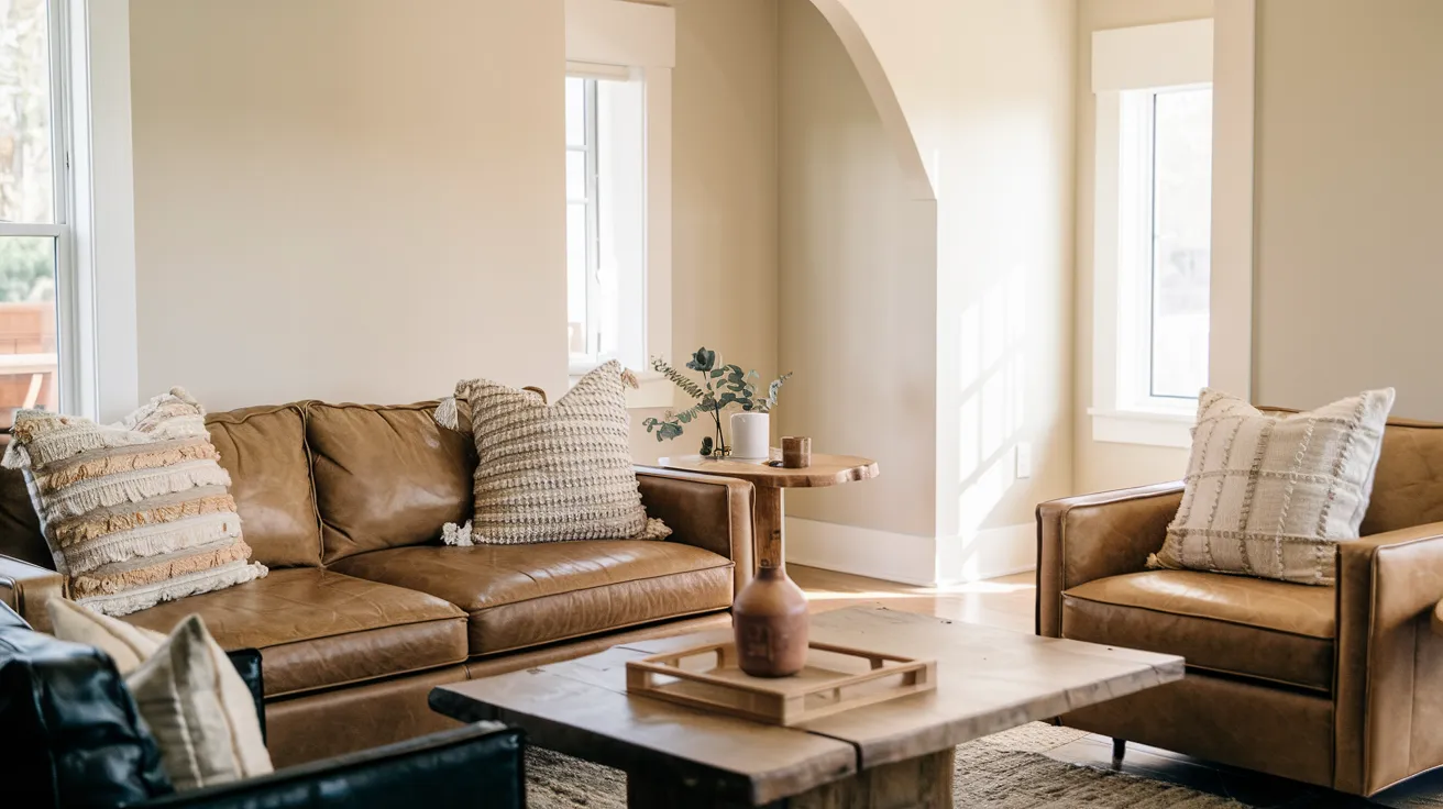
In my living room, SW Accessible Beige brings a calm, welcoming feel.
The color shifts softly with natural light throughout the day, keeping the space fresh yet cozy.
I’ve found it pairs wonderfully with my brown leather couch and creates the perfect backdrop for family gatherings and quiet evenings.
Styling tip: Add textured throw pillows and natural wood pieces to enhance the warmth.
2. Kitchens
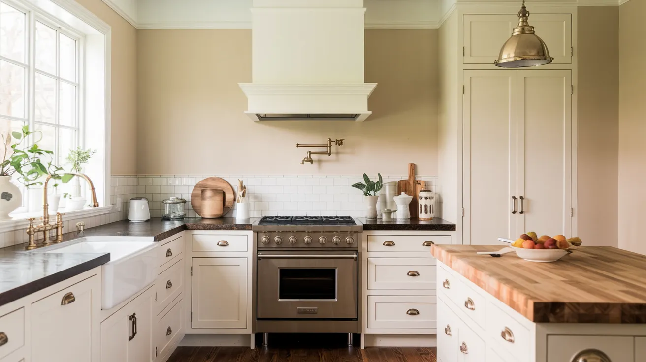
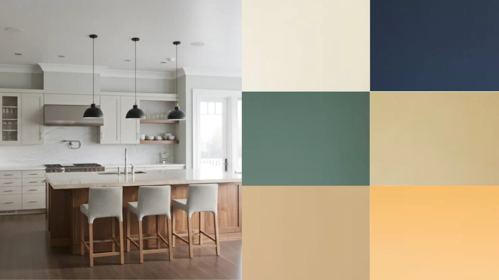
The kitchen is where this color truly shows its worth. It complements both my white cabinets and butcher block countertops beautifully.
When I cook under different lights – morning sun, evening shadows, or artificial lighting – the walls maintain their soft, steady tone without turning too yellow or gray.
Styling tip: Mix in stainless steel and brass fixtures – both metals look great against this neutral.
3. Bedrooms
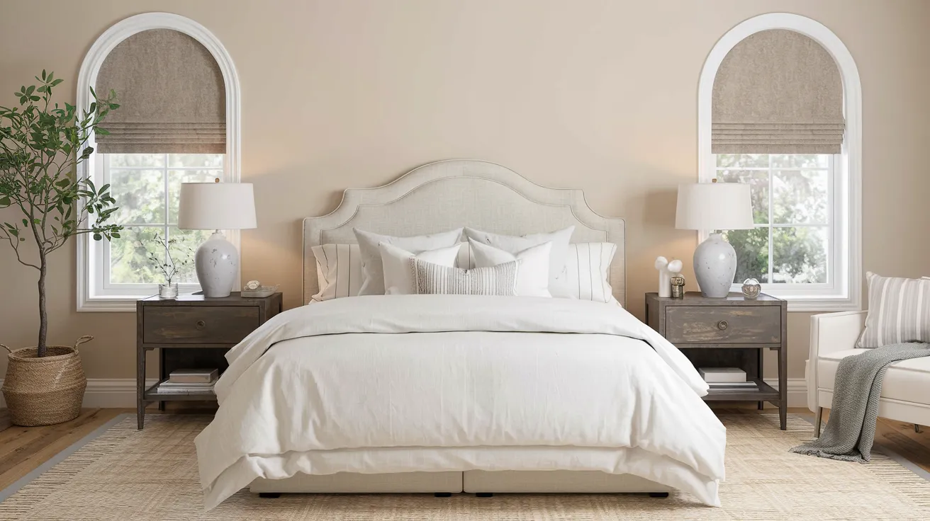
It’s light enough to brighten the space but soft enough to feel restful. The subtle mix of beige and gray notes helps maintain a peaceful atmosphere from dawn to dusk.
Styling tip: Layer different shades of white bedding for depth without disrupting the calm.
4. Bathrooms
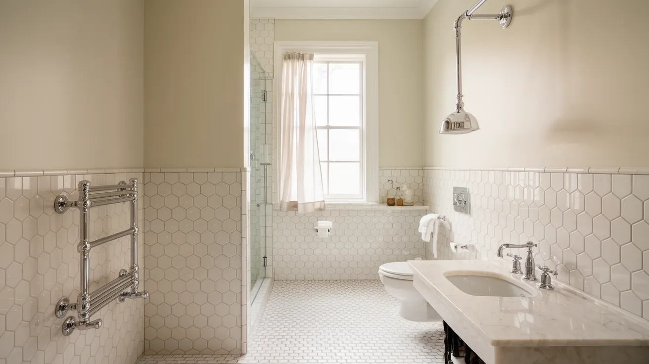
My bathroom features white tile and chrome fixtures, and Accessible Beige pulls it all together perfectly.
The color adds warmth without overwhelming the space.
It works especially well with the natural marble accents, creating a clean, pulled-together look that feels both fresh and relaxing.
Styling tip: Use white towels and natural stone accessories to complement the color.
5. Home Offices & Hallways
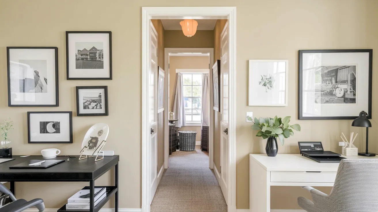
In my home office, this color helps me stay focused without feeling boxed in.
The neutral tone makes my space feel bigger and brighter.
The same goes for hallways – it creates a smooth connection between rooms while making narrow spaces appear wider.
Styling tip: Add black-framed photos or artwork for a striking contrast.
Accessible Beige vs. Other Sherwin-Williams Neutrals
Accessible Beige stands apart from other Sherwin-Williams neutrals with its perfect mix of gray and beige tones.
It’s less yellow than Agreeable Gray and lighter than Balanced Beige.
| Detail | Accessible Beige (SW 7036) | Agreeable Gray (SW 7029) | Balanced Beige (SW 7037) |
|---|---|---|---|
| Hue | Warm beige with a soft gray undertone | Light gray with warm beige undertone | Warm beige with a slight grayish tint |
| Light Reflectance Value (LRV) | 58 | 60 | 46 |
| Undertones | Subtle yellow, gray, and brown undertones | Warm, soft gray with a hint of beige | Slight gray with warm, earthy undertones |
| Room Feel | Cozy and inviting, perfect for living rooms or bedrooms | Soft and airy, works well in open, bright spaces | Warm, grounded, and comforting, ideal for neutral spaces |
| Best Suited For | Traditional, rustic, and farmhouse-style rooms | Modern, transitional, and contemporary spaces | Classic and earthy designs, creating a calm atmosphere |
| Complementary Accents | Warm wood tones, white, cream, and earth tones | Light woods, whites, and soft pastels | Earth tones, rich browns, and neutral hues |
| Use in Lighting | Works well with warm, soft lighting | Adapts to both natural and artificial lighting | Best with warmer lighting to highlight its earthy tones |
Common Mistakes to Avoid When Using Accessible Beige
From my personal experience with this paint color, here are key mistakes to watch out for:
Choosing Too Many Similar Neutrals
- Using beige furniture with beige walls and beige carpet creates a flat look
- Missing the chance to add depth through varied neutral shades
- Forgetting that contrast helps define spaces
- Not including at least one darker or lighter element for visual interest
Not Testing in Different Lighting
- Skipping the sample test in the morning light
- Missing how it looks during the afternoon sun
- Not checking the color under artificial lighting
- Failing to test on all four walls of a room
- Ignoring how nearby trees or buildings affect natural light
Overcomplicating the Design
- Adding too many bold accent colors at once
- Using competing patterns that fight with the wall color
- Including too many statement pieces in one space
- Not letting the neutral walls serve their purpose as a backdrop
- Mixing too many textures, making the space feel busy
Tips for Painting with Accessible Beige
- Paint large test patches (2×2 feet) on all walls – colors look different on each wall
- Check at 3 times: morning, afternoon, and evening with lights on
- Use eggshell finish in living areas, satin for bathrooms and kitchens
- Test next to your floors, counters and built-ins first
- Start with white trim and black touches for clean contrast
- Match room purpose to accents – cool tones for bathrooms, warm for living spaces
- Pick flat finish for ceilings to cut glare
- Let each paint coat dry fully for true color results
Conclusion
After using Sherwin-Williams Accessible Beige in my own home, I can tell you it’s a reliable choice for any space.
This paint color has proven itself as a true neutral that works in every room, from my bright kitchen to my cozy bedroom.
Remember these key points for success:
- Test samples in your specific lighting
- Consider the room’s purpose
- Keep your design simple and clean
Ready to try it in your home? Start with a sample can and test it on different walls. Take time to see how it looks throughout the day.
Pay attention to how it fits with your existing furniture and decor.
Frequently Asked Questions
Is Accessible Beige Too Warm for North-Facing Rooms?
No. In my experience, it stays balanced in north-facing rooms. While you might notice more gray undertones, the color maintains its warmth without turning too cool or dark.
Can I Use Accessible Beige in Small Spaces?
Yes. Its light to medium tone helps make small spaces feel larger. I’ve used it successfully in narrow hallways and small bathrooms.