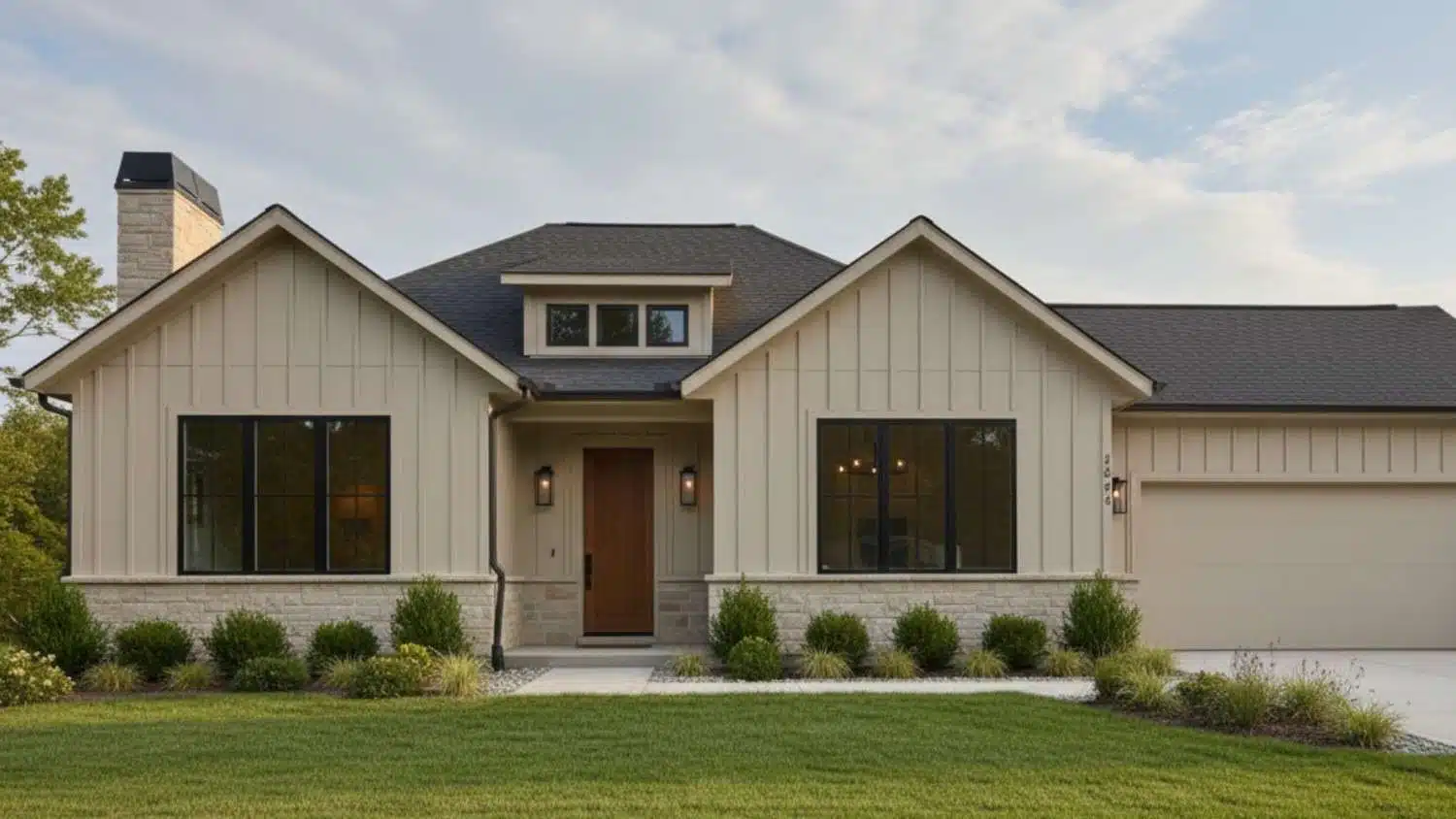
I’ve always liked how a soft neutral can change the whole feel of a room, and lately I keep seeing Accessible Beige cabinets everywhere.
If you’re curious about why this shade still shows up in designer homes year after year, you’re not alone. It’s warm without being yellow, calm without feeling dull, and easy to pair with a lot of finishes.
In this guide, I’ll share what makes Sherwin-Williams Accessible Beige (SW 7036) stand out, how it behaves on cabinets compared to walls, and where it works best.
By the end, you’ll see if it fits your style and lighting before you commit.
What is Sherwin-Williams Accessible Beige?
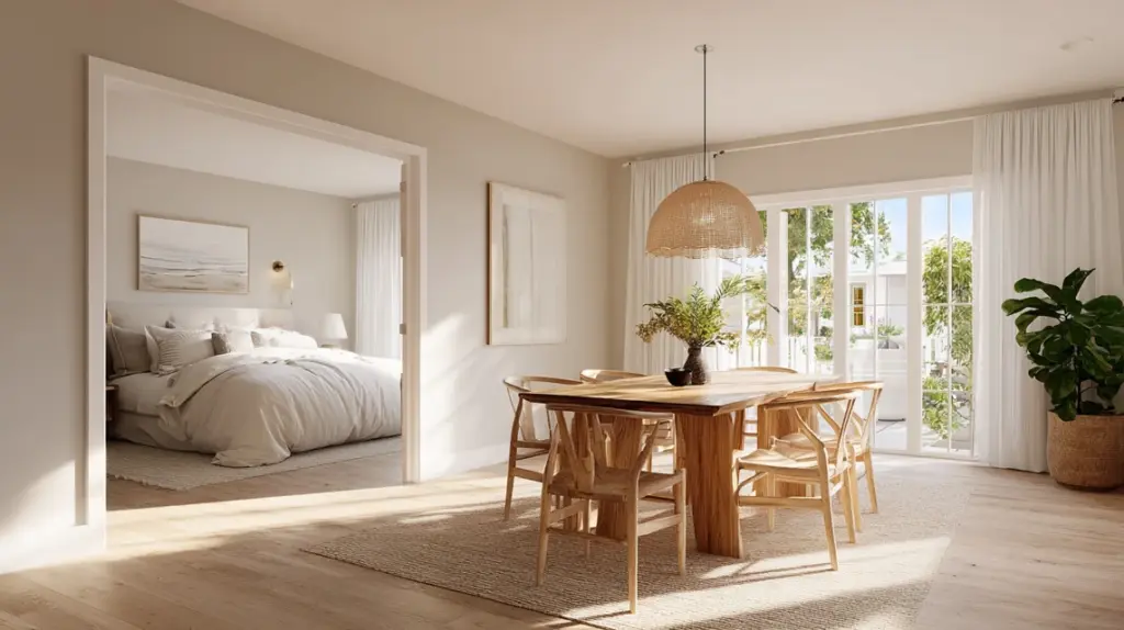
Accessible Beige (SW 7036) is a soft neutral that blends beige and gray, often described as a true greige.
With a Light Reflectance Value (LRV) of 58, it reflects a moderate amount of light, helping rooms feel open and bright without looking stark or washed out. This color has a warm, grounded tone that feels calm and comfortable in nearly any space.
It adapts beautifully to natural and artificial light, shifting gently between warm beige and muted gray depending on the room’s lighting direction.
Accessible Beige pairs effortlessly with both modern and traditional interiors, making it a favorite for cabinets, walls, and trim alike.
As part of Sherwin-Williams’ “Classic Neutrals” collection, it continues to be one of the most reliable choices for creating cohesive, inviting spaces that feel current yet classic.
Accessible Beige Undertones: The Key to Its Popularity

Accessible Beige stands out for its mix of beige and gray, giving it the best of both warmth and neutrality. It’s a true greige, soft, balanced, and adaptable.
The warmth comes through just enough to make rooms feel cozy, while the subtle gray keeps it from turning yellow. In north-facing rooms, a faint green or gray undertone appears, while south-facing spaces bring out its beige glow.
Compared with other neutrals, it’s softer and more inviting than most greiges and warmer than Agreeable Gray. This unique blend of tones is what makes Accessible Beige cabinets so versatile; it stays balanced no matter where you use it.
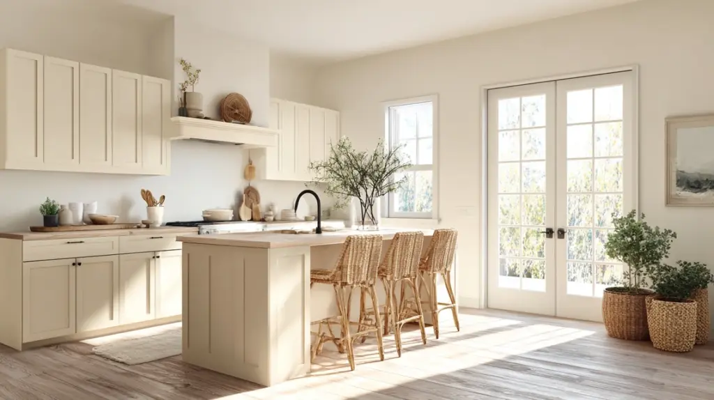
Why Choose Accessible Beige for Cabinets
Accessible Beige is one of those rare colors that feels fresh and familiar at the same time. It blends seamlessly across styles and spaces.
- Classic Appeal: This color stays relevant year after year because it’s neither too warm nor too cool, fitting both modern and traditional homes.
- Versatile Backdrop: Its balanced undertones pair beautifully with a wide range of materials, wood, stone, metal, or tile, without clashing.
- Low Maintenance: Unlike bright whites, it hides fingerprints and everyday marks, making it perfect for busy kitchens or family spaces.
- Improves Space: The soft tone adds warmth and depth without making smaller rooms feel heavy or enclosed.
- Complements Finishes: Works effortlessly with wood floors, dark hardware, and warm white walls, creating a cozy and well-balanced design that always feels inviting.
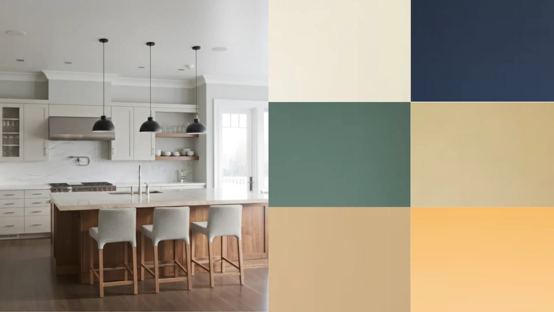
Accessible Beige Kitchen Cabinets: Real-Life Inspiration
Accessible Beige Sherwin-Williams cabinets have become a favorite choice in kitchens for their ability to adapt to different lighting and materials. If your taste leans modern, farmhouse, or transitional, this warm greige adds balance and comfort.
1. Modern Farmhouse Kitchen

Accessible Beige brings a soft warmth that balances rustic textures and crisp finishes in farmhouse kitchens. It pairs perfectly with white quartz countertops, matte black hardware, and wood accents, creating a look that feels both cozy and refined.
Homeowners in r/cabinetry often highlight how this color adds depth without overpowering the beauty of shiplap walls or open shelving.
The result is a space that feels grounded yet bright, blending modern comfort with farmhouse character for a timeless kitchen atmosphere
2. Transitional Kitchen

In transitional kitchens, Accessible Beige acts as the perfect middle ground between classic and modern design.
It pairs beautifully with brass hardware, marble backsplashes, and soft white trims, adding quiet style without looking too formal.
Users in r/kitchenremodel often share how this shade complements both traditional cabinetry and sleek, updated layouts.
It brings cohesion to spaces with mixed materials, allowing natural light to enhance the subtle warmth of the walls. The overall effect is balanced, versatile, and effortlessly welcoming.
3. Contemporary Style

Accessible Beige offers a warm counterpoint to the clean lines and minimal décor found in contemporary kitchens. When combined with flat-panel cabinets, brushed metal accents, and integrated appliances, it creates a sleek yet inviting look.
Members of r/kitchenremodel frequently mention how this shade keeps modern spaces from feeling too cold or sterile. It works especially well in open layouts, where its soft undertone connects adjoining rooms seamlessly.
The result is a space that feels modern, functional, and quietly sophisticated
4. Two-Tone Cabinet Idea

Painting lower cabinets in Accessible Beige and keeping uppers white adds contrast that visually opens small or dimly lit kitchens. The combination introduces depth without overwhelming the space.
Designers and homeowners in r/cabinetry often share photos showing how this approach brightens kitchens while keeping them grounded. It’s a practical way to highlight the layout and make ceilings appear taller.
With natural light or warm fixtures, this palette delivers balance and character while keeping the overall look simple and fresh.
5. Paired with Wood Tones

Accessible Beige complements both light oak and deep walnut finishes, enhancing the grain and warmth of the wood.
It’s a favorite in r/InteriorDesign discussions for blending rustic and modern elements naturally. This pairing feels especially cohesive in kitchens with wood floors or open shelving, where the beige tone softens transitions between materials.
The result is an organic, timeless feel that suits a variety of styles, from earthy farmhouse to modern minimal. It’s understated, natural, and effortlessly inviting.
Best Paint Finishes for Accessible Beige Cabinets
Choosing the right finish helps Accessible Beige cabinets look their best while staying easy to clean. This color pairs beautifully with finishes that offer both durability and a touch of sheen.
Satin Finish: A satin finish gives cabinets a soft, velvety glow that hides small imperfections and fingerprints. It’s ideal for traditional or transitional kitchens where you want a warm, subtle shine without too much reflection.
Semi-Gloss Finish: Semi-gloss provides a brighter surface that resists moisture, grease, and stains, making it perfect for high-traffic areas like kitchens, bathrooms, or mudrooms.
Avoid flat or matte finishes for cabinetry. These tend to show fingerprints and smudges easily, require more maintenance, and don’t hold up well against everyday wear in active spaces.
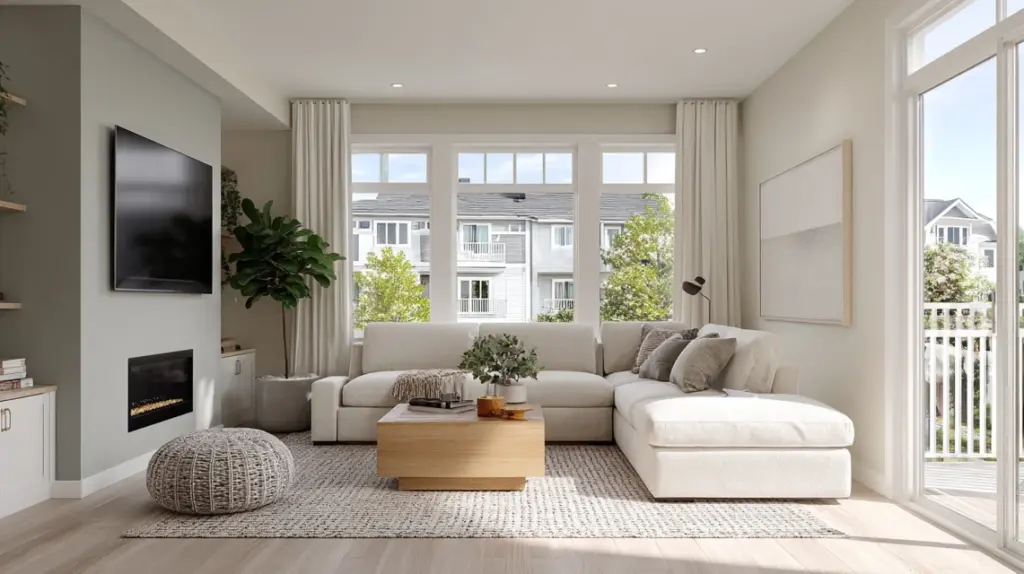
Complementary Colors for Walls and Decor
Choosing the right colors alongside Accessible Beige cabinets helps your home feel balanced, natural, and visually connected from one space to another.
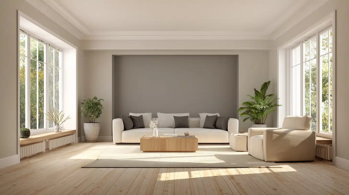
1. Alabaster (SW 7008)
Alabaster is a warm, creamy white that pairs seamlessly with Accessible Beige. It keeps the space bright while adding a hint of softness.
Use it for trim, ceilings, or upper cabinets to create a gentle contrast without harsh lines. This pairing works especially well in farmhouse, transitional, or modern homes, where you want a light and airy flow.
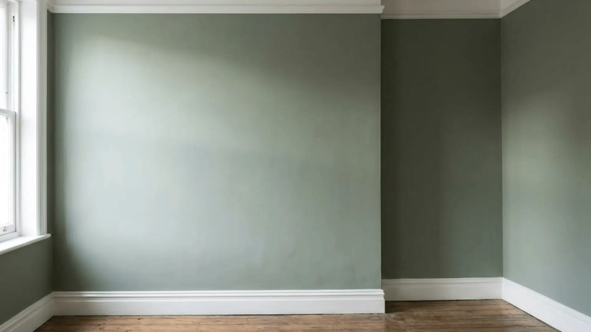
2. Repose Gray (SW 7015)
Repose Gray offers a cool, greige contrast that improves the warmth of Accessible Beige. Together, they create depth and visual interest without feeling heavy.
This combination works well for adjoining rooms or accent walls, maintaining a cohesive look throughout open layouts while preventing monotony.
3. Urbane Bronze (SW 7048)
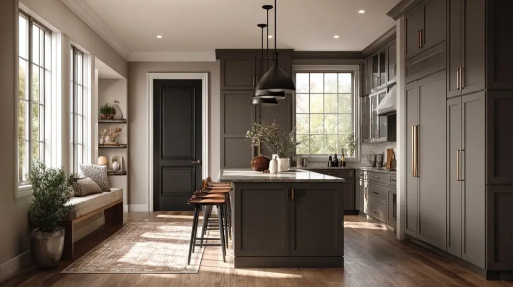
Urbane Bronze brings depth and grounding to spaces featuring Accessible Beige cabinets. Its rich brown-gray undertone adds sophistication, especially when used on doors, islands, or hardware.
This pairing gives modern homes a dramatic edge while still feeling natural and inviting—perfect for creating contrast that feels intentional, not overpowering.
4. Shoji White (SW 7042)
Shoji White offers a soft, natural complement to Accessible Beige. This off-white tone feels light but not stark, making it ideal for ceilings, trim, or nearby walls.
The subtle warmth ties everything together, keeping your color scheme cohesive and bright. It works particularly well in rooms where you want calm, diffused light.
Accessible Beige vs. Other Popular Cabinet Colors
Each neutral tone brings a distinct personality to your space. Here’s how Accessible Beige compares with other popular cabinet colors in tone, light, and feel.
| Feature | Accessible Beige (SW 7036) | Agreeable Gray (SW 7029) | Revere Pewter (BM HC-172) |
|---|---|---|---|
| Tone | Warm greige | Cooler gray | Warm gray-green |
| Light Value | 58 | 60 | 55 |
| Best For | Cozy, classic kitchens | Bright, modern neutrals | Rustic or farmhouse spaces |
| Feel | Inviting and balanced | Airy and crisp | Earthy and natural |
Summary: Accessible Beige stands right in the middle, warm, adaptable, and classic. It bridges gray and beige effortlessly, fitting both modern and classic homes.
Summing Up
I’ve shared how color, finish, and placement can make Accessible Beige cabinets work beautifully in almost any home. You’ve seen what makes this shade stay relevant, how it reacts to light, and which pairings bring out its best.
If you’re planning a project, start small with a sample and look at it in your own lighting before committing. That simple step saves time and stress in the long run. I’ve found this approach makes every design choice feel more confident.
Continue finding my other paint and cabinet guides for more practical ideas to help you plan your next update.