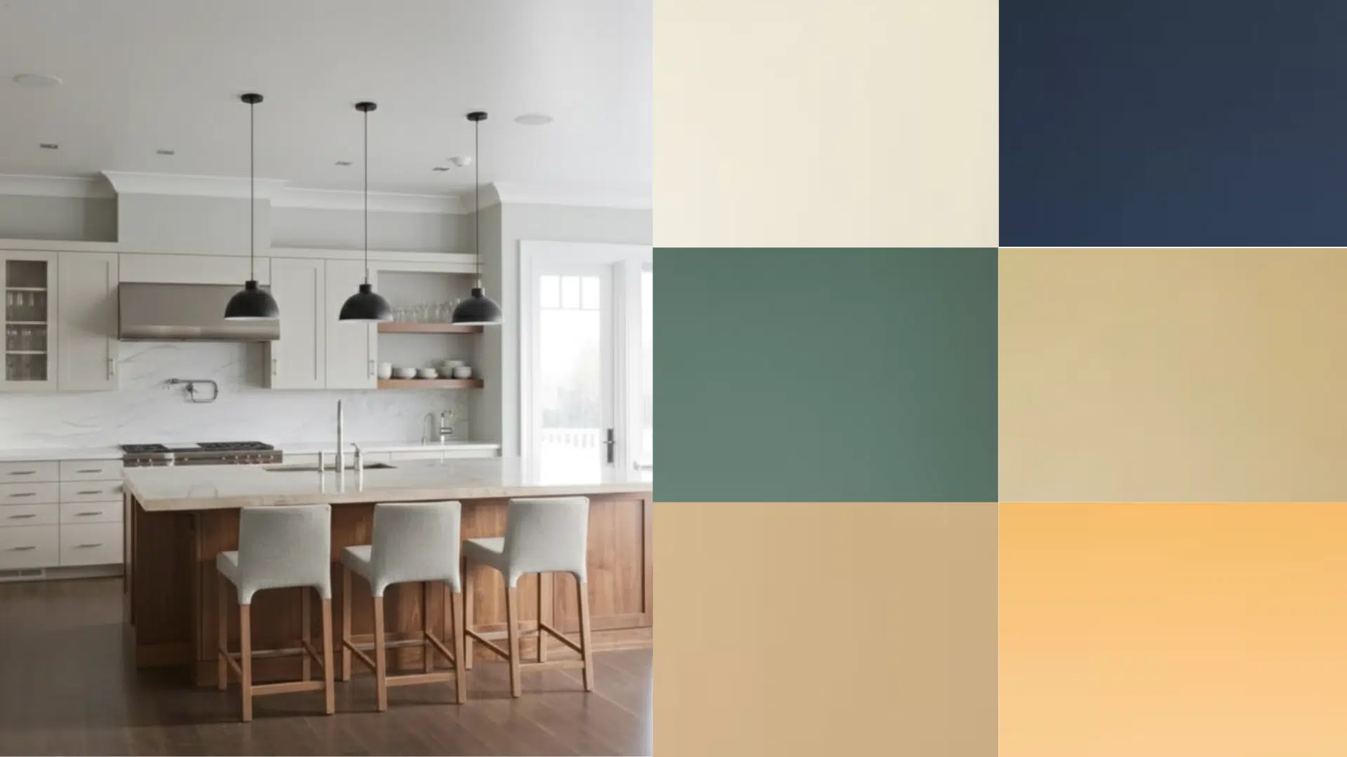
If you’ve ever stared at your kitchen wondering how to make it feel warm but still modern, I get it. I went through the same thing before finding Accessible Beige kitchen cabinets.
The color instantly changed the mood of my space, soft, calm, and inviting without feeling too gray or too creamy. You’ll see how it naturally adapts to light and works with almost any countertop or backsplash.
If your kitchen is sunny or shadowed, Accessible Beige kitchen cabinets bring balance and warmth that never go out of style. Once you picture it in your own space, it’s hard to imagine choosing anything else.
What is Sherwin-Williams Accessible Beige?
Accessible Beige (SW 7036) is one of Sherwin-Williams’ most versatile neutral shades. It’s often called a “greige” because it blends the warmth of beige with the calm tone of gray.
- Color family: Neutral (warm greige)
- Undertones: Soft gray with a hint of warmth
- Light Reflectance Value (LRV): 58, it reflects a medium amount of light, keeping rooms bright without feeling stark
This balance makes it ideal if you want something cozy but not too yellow or cold. It’s neutral enough to match nearly any countertop, flooring, or backsplash finish.
How it behaves in light:
- In bright rooms, Accessible Beige shows its warmer, creamy side.
- In low-light or north-facing kitchens, it leans slightly cooler and more gray.
- Under warm LED lighting, it appears soft and inviting.
That flexibility is what makes it a favorite for cabinets and walls alike.
Now that you know what Accessible Beige really is, let’s look at how this shade actually works on kitchen cabinets.
Accessible Beige Kitchen Cabinet Ideas
Accessible Beige is one of Sherwin-Williams’ most versatile shades. These cabinet ideas show how you can use it beautifully across different kitchen styles, lighting conditions, and design preferences.
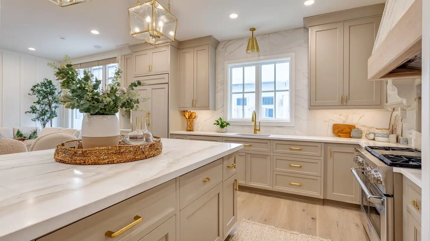
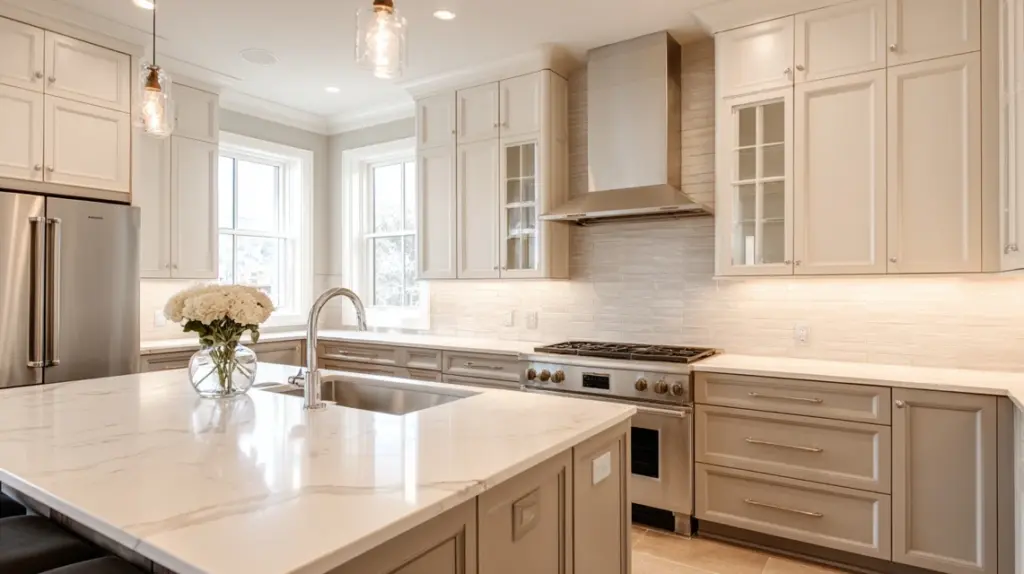
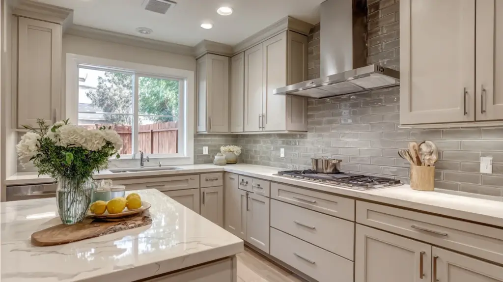
1. Accessible Beige Cabinets with White Quartz Counters

Bright, clean, and perfectly balanced, this pairing brings warmth, contrast, and openness to both large and small kitchens, making even low-light spaces feel airy, polished, and classic.
Why it works:
- White quartz reflects light, brightening darker rooms
- Beige adds warmth and prevents a sterile look
- Ideal for kitchens with limited natural light
Try this:
- Brass or matte black hardware for depth
- Warm LED under-cabinet lights
- Glossy white backsplash for subtle shine
2. Two-Tone Kitchen with Light Uppers
Stylish and space-improving combining Accessible Beige lower cabinets with white uppers adds contrast and openness, keeping the kitchen bright while creating natural balance and visual depth.
Why it works:
- Prevents lower cabinets from feeling heavy
- White uppers reflect available light
- Adds contrast without harsh transitions
Try this:
- Uppers in Sherwin-Williams Alabaster or Pure White
- Beige lowers in satin finish
- Brushed nickel hardware for soft unity
3. Warm Farmhouse Kitchen Design

Cozy, relaxed, and welcoming, this farmhouse look combines Accessible Beige cabinets with wood textures and white accents, creating warmth that feels lived-in but still fresh and clean.
Why it works:
- Beige grounds the rustic aesthetic
- Complements shiplap, wood, and open shelving
- Feels classic yet approachable
Try this:
- White subway tile backsplash
- Natural oak or pine flooring
- Black or bronze pulls for contrast
4. Modern Minimalist Look
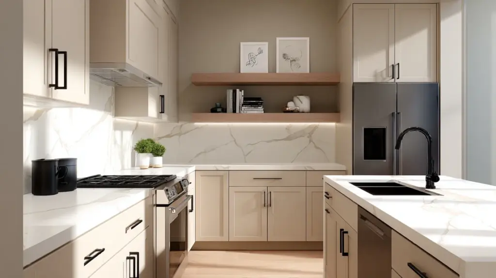
Simple, sleek, and refined, this design uses Accessible Beige to soften a modern kitchen’s clean lines, blending warmth with minimalism for a balanced and sophisticated finish.
Why it works:
- Greige tone warms modern designs
- Flat-panel doors create seamless flow
- Works great in neutral or low-light rooms
Try this:
- Matte black fixtures for contrast
- Quartz backsplash with faint veining
- Recessed LED lighting for even glow
5. Beige Cabinets with Brass Accents

Warm, reflective, and stylish this pairing improves natural or artificial light, making beige cabinets gleam softly while brass details add classic character to your kitchen.
Why it works:
- Brass reflects light beautifully
- Complements beige’s natural warmth
- Adds a subtle upscale touch
Try this:
- Brass pendant lights over the island
- Cream or white countertops
- Warm LED bulbs (2700–3000K)
6. Beige Island in a White Kitchen
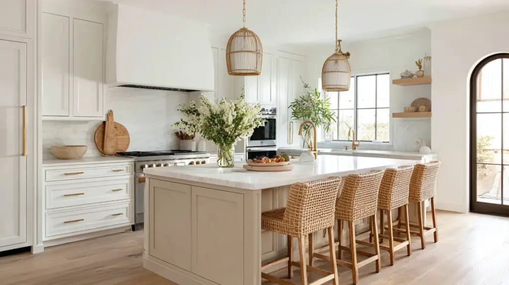
Balanced, inviting, and modern, a beige island anchors an all-white kitchen, adding gentle contrast, dimension, and a cozy focal point without overpowering the space.
Why it works:
- Adds warmth to an all-white palette
- Creates visual focus and depth
- Keeps overall look clean and fresh
Try this:
- White perimeter cabinets
- Rattan or wooden stools for texture
- Gold or black fixtures for contrast
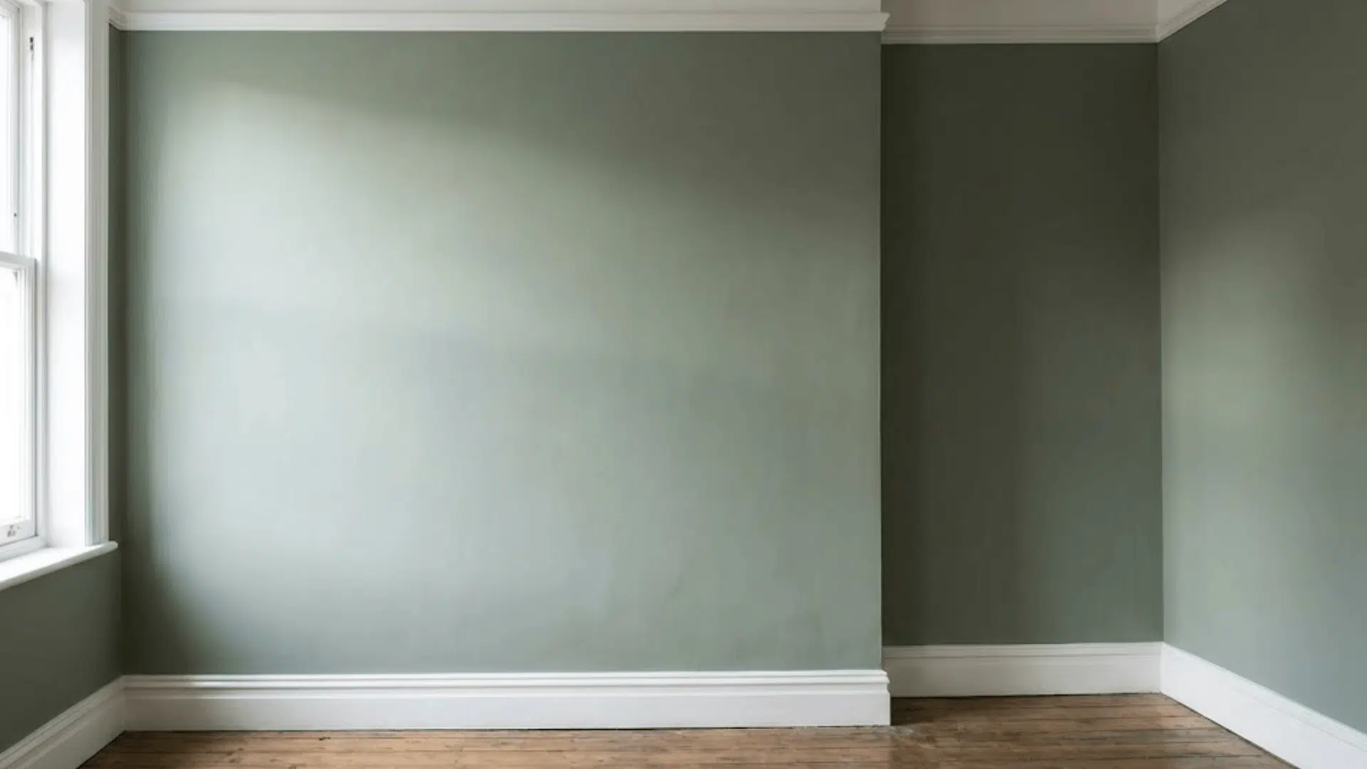
7. Beige Cabinets with Green Accents

Natural, soft, and earthy, this palette combines Accessible Beige with shades of green to create a peaceful kitchen that feels calm, balanced, and connected to nature.
Why it works:
- Neutral beige balances green’s cool tone
- Evokes outdoor freshness indoors
- Works in both bright and low-light kitchens
Try this:
- Sage or olive backsplash tile
- Potted herbs on open shelving
- Brass or wood accents for warmth
8. Accessible Beige with Terracotta Floors

Warm, rustic, and grounded, terracotta flooring pairs beautifully with beige cabinets, giving kitchens a cozy, Mediterranean-inspired charm that feels classic and full of personality.
Why it works:
- Beige complements earthy reds and browns
- Prevents warm tones from overwhelming the room
- Perfect for natural, rustic interiors
Try this:
- White grout for added brightness
- Light beige or off-white walls
- Terracotta pots for subtle repetition
9. Beige Cabinets with Black Countertops

Bold, clean, and stylish, black countertops with Accessible Beige cabinets create a dramatic balance, offering modern contrast without making your kitchen feel too dark.
Why it works:
- Contrasts highlight cabinet tone
- Keeps beige from looking flat
- Adds a sleek, high-end appeal
Try this:
- Glossy tile backsplash for light bounce
- Brass or gold hardware
- Warm LED lighting to soften shadows
10. Small Kitchen with Beige Cabinets

Bright, soft, and space-friendly, Accessible Beige opens up small kitchens, bringing warmth without closing in the space or adding visual weight to compact layouts.
Why it works:
- Light greige expands visual space
- Hides fingerprints better than white
- Works well under warm lighting
Try this:
- Glossy backsplash to reflect light
- Simple hardware and uncluttered shelves
- Warm LED strips below cabinets
11. Beige Cabinets with Natural Wood Details

Organic, cozy, and inviting, natural wood textures highlight Accessible Beige’s earthy undertones, creating warmth and character that never feels too heavy or busy.
Why it works:
- Combines painted and natural finishes
- Adds depth and texture
- Works in rustic or modern homes alike
Try this:
- Wood floating shelves or island base
- Butcher block counters
- Warm white wall paint for balance
12. Beige Cabinets with Gray Backsplash
Neutral, layered, and balanced, pairing gray tile with Accessible Beige creates a refined, tone-on-tone look that feels modern but still soft and welcoming.
Why it works:
- Gray and beige share greige undertones
- Offers contrast without harshness
- Ideal for transitional kitchen designs
Try this:
- Matte gray subway tiles
- Brushed nickel handles
- White quartz counters for brightness
13. Beige Cabinets with Gold Lighting

Radiant, warm, and luxurious, gold fixtures bring soft glow and warmth to beige cabinets, giving your kitchen an elevated yet comfortable feel.
Why it works:
- Gold reflects ambient light
- Enhances beige’s warm undertones
- Brightens dim kitchens naturally
Try this:
- Gold or brass pendants over island
- Cream backsplash with subtle texture
- White quartz or marble counters
14. Beige Cabinets with Navy Walls
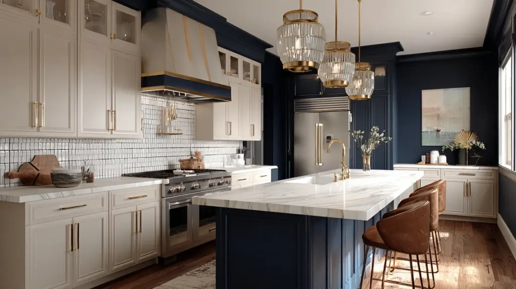
Dramatic, stylish, and grounded, navy walls contrast beautifully with Accessible Beige, creating depth and interest while keeping your kitchen warm and sophisticated.
Why it works:
- Strong contrast improves beige tones
- Navy feels modern yet classic
- Works well in larger kitchens
Try this:
- Brass or copper hardware
- White counters for balance
- Warm LED bulbs to avoid cool shadows
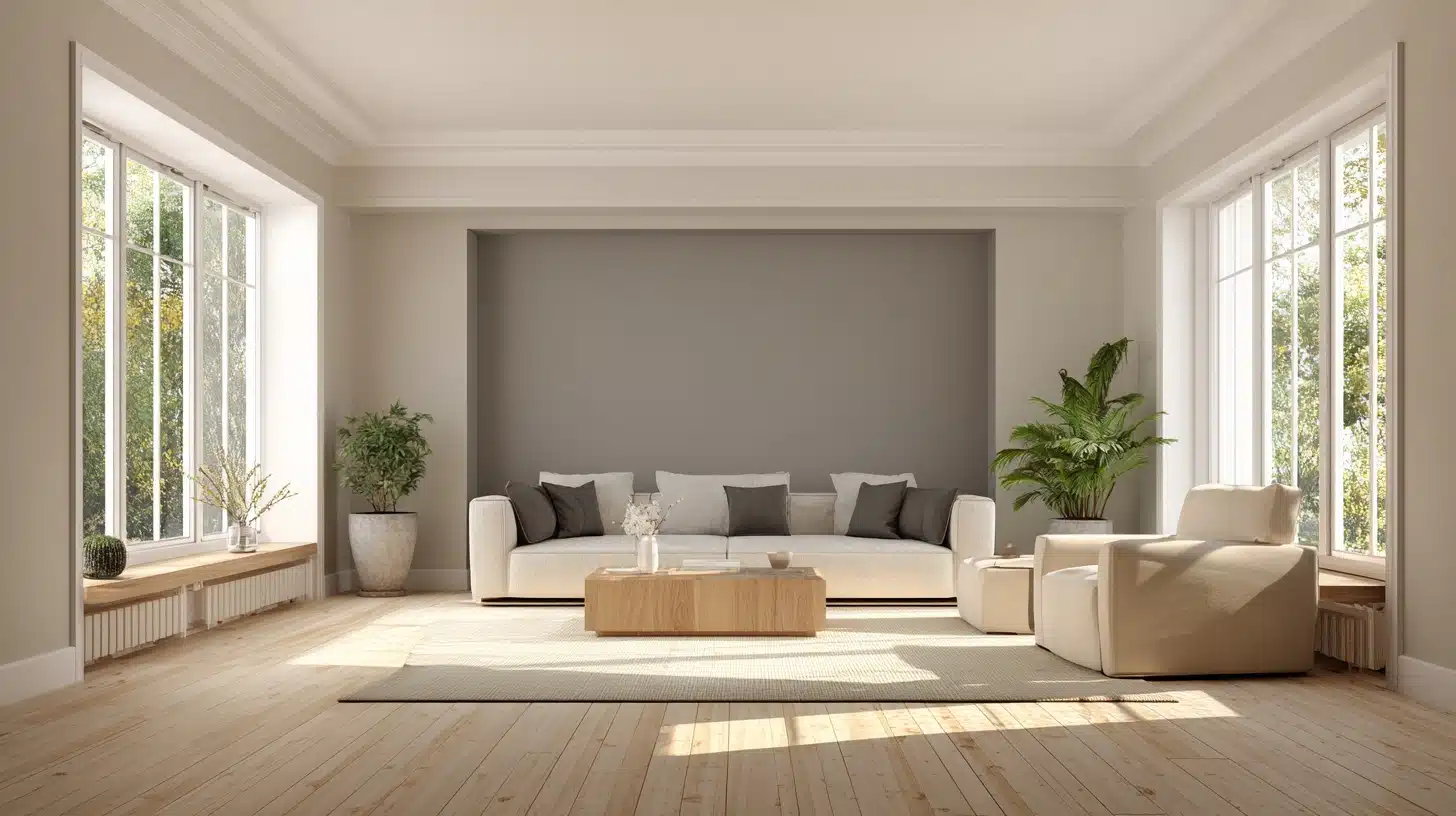
15. Classic All-Neutral Kitchen
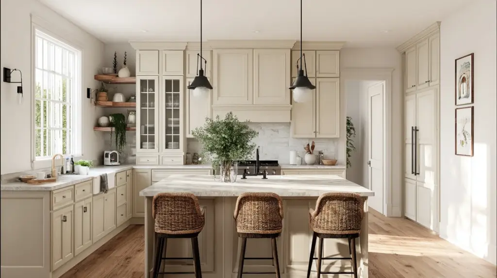
Soft, serene, and classic, combining Accessible Beige with white and natural materials creates a harmonious, neutral space that feels inviting all day long.
Why it works:
- Warm tones create cohesion
- Works in every lighting condition
- Stays stylish through design trends
Try this:
- Beige cabinets and white walls
- Light stone countertops
- Greenery or wood decor for texture
Why Use Accessible Beige for Kitchen Cabinets
Accessible Beige works so well on kitchen cabinets because it strikes the right balance between warmth, neutrality, and versatility.
Its greige tone, a mix of gray and beige, adds subtle warmth without leaning too yellow or too cool. That makes it fit seamlessly in both modern and classic kitchen styles, from farmhouse to minimalist.
The color’s mid-level depth also hides everyday wear, smudges, and dust better than bright whites, making it ideal for high-use areas like kitchens.
With an LRV of 58, it reflects enough light to stay bright but still adds a grounded, cozy feel. Whether your kitchen is sunlit or dimly lit, Accessible Beige stays balanced and welcoming. It’s neutral, dependable, and always classic.
How Accessible Beige Looks in Different Lighting
Lighting plays a big role in how Accessible Beige looks in your kitchen. Different light directions and sources can change its warmth and depth dramatically.
| Lighting Type | Color Appearance | Tips for Best Results |
|---|---|---|
| South-Facing | Appears warm and creamy beige | Pair with white quartz or marble to keep the look fresh |
| North-Facing | Shows cooler, gray undertones | Use warm LEDs to bring back beige warmth |
| East-Facing | Warm glow in mornings, cooler by noon | Choose reflective backsplash or lighter counters |
| West-Facing | Rich golden tones in late day light | Keep walls neutral to prevent orange hues |
| Artificial Light | Varies by bulb type | Use 2700–3000K bulbs for a soft, balanced tone |
Pro tip: Satin or semi-gloss finishes help reflect more light, keeping Accessible Beige cabinets lively in dim kitchens.
What Colours Pair Well with Accessible Beige Cabinets
Accessible Beige pairs beautifully with a wide range of shades and finishes. Here’s how to combine wall, trim, counters, backsplash, and hardware to create a cohesive kitchen palette.
Wall and Trim Colours
Accessible Beige looks best with warm whites and soft neutrals that highlight its greige undertone.
Try Sherwin-Williams Alabaster, Pure White, or Greek Villa for trim and walls. These tones brighten the room without clashing. If you want contrast, pair it with soft taupe or muted green-gray walls.
Avoid bright whites or heavy yellows, they can make the cabinets appear dull or muddy. Keep trim slightly lighter than the walls to frame the cabinetry cleanly and maintain depth across the space.
Countertops
Accessible Beige works with a wide range of countertop materials. For a classic look, use white quartz or marble, they help reflect light in low-lit kitchens.
If you prefer warmth, choose butcher-block or light oak surfaces. Want contrast? Dark charcoal or soapstone adds sophistication while highlighting the beige tone.
Avoid overly busy granite with yellow veining; it can compete with the neutral base. Stick with light, subtle patterns for an elegant and balanced finish that lets the cabinetry stand out.
Backsplash
A well-chosen backsplash enhances Accessible Beige cabinets and pulls the room together. Go for glossy white subway tiles to reflect light or soft gray tiles for a layered greige-on-greige effect.
For warmth, use beige mosaic or tumbled stone tiles that complement the cabinet color. Avoid overly bright or patterned backsplashes that overpower the subtle tone.
In low-light kitchens, glossy finishes help bounce light, keeping the area fresh and open. Consistent undertones between cabinets and tiles make the look cohesive.
Hardware
The right hardware can shift your entire kitchen style. Brass and gold finishes add warmth and catch light beautifully, perfect for dim kitchens.
Matte black brings strong contrast and a modern touch, while brushed nickel fits well in transitional designs. Avoid overly shiny chrome, it can feel too cool against the greige tone.
Keep pulls and knobs simple for a timeless look. If your space lacks natural light, choose reflective metal hardware to help enhance brightness naturally.
Mistakes to Avoid with Accessible Beige Cabinets
Accessible Beige is forgiving, but a few design mistakes can dull its beauty. Avoid these common pitfalls to keep your cabinets looking warm and balanced.
- Using floors that are too dark: Deep wood tones can absorb light, making the beige appear muddy or flat. Balance with lighter flooring or bright rugs.
- Pairing with stark whites: Bright, cool whites clash with beige undertones and make the cabinets look dingy. Choose warm whites like Alabaster or Greek Villa instead.
- Ignoring undertones: Beige has subtle gray and green hints. Test it beside your counters and backsplash to ensure harmony under your lighting.
- Skipping light tests: Paint looks different in every direction. Always view samples in morning, afternoon, and artificial light.
- Overusing warm tones: Too many yellows or reds around Accessible Beige can make the whole space feel dated, mix in neutrals for balance.
Conclusion
After seeing how flexible and easy to work with it is, it’s clear why so many people love Accessible Beige kitchen cabinets. They bring the right mix of warmth and neutrality, blending beautifully with almost any style or lighting.
If your kitchen gets plenty of sunshine or stays on the dim side, this shade has a way of making the space feel calm and complete.
If you’ve been looking for a color that feels classic without being plain, this might be the one.
Would you try Accessible Beige kitchen cabinets in your own home? I’d love to hear how you’d style them. Keep finding more color and kitchen ideas in my other blogs, there’s plenty of inspiration waiting for you.