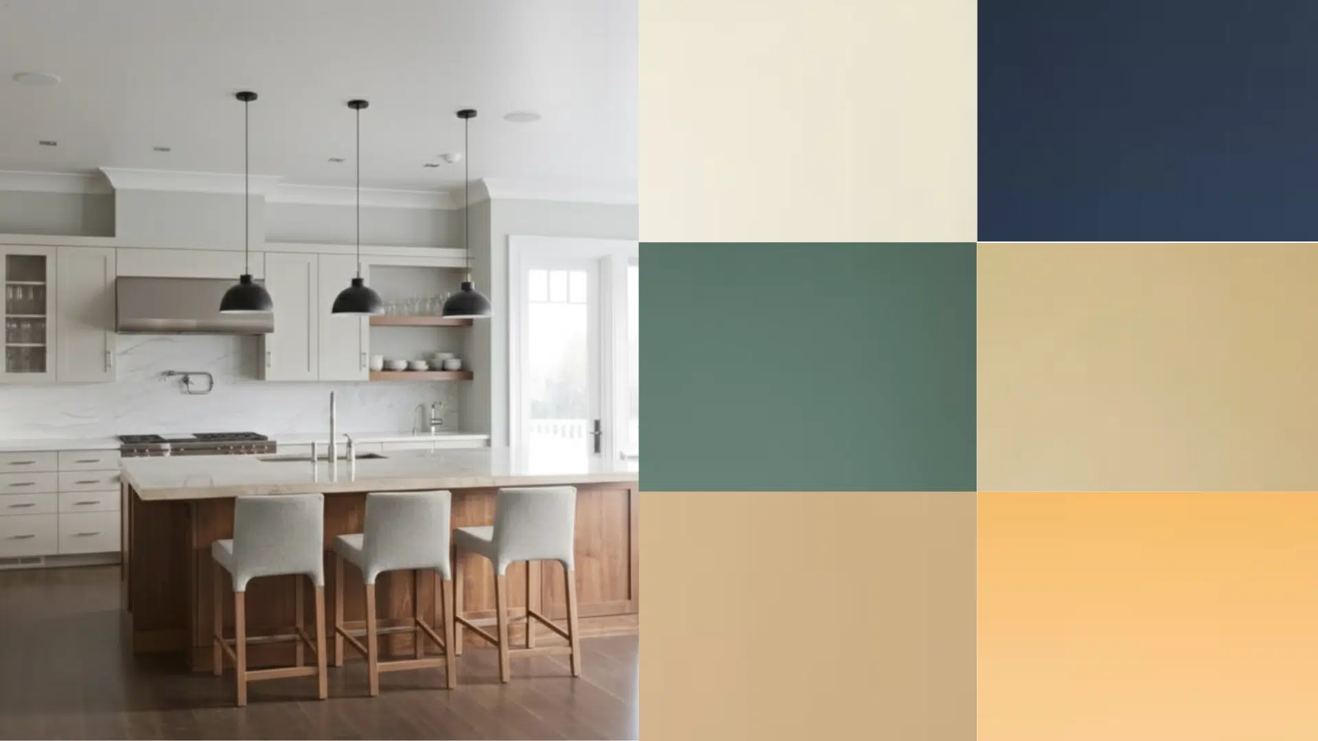
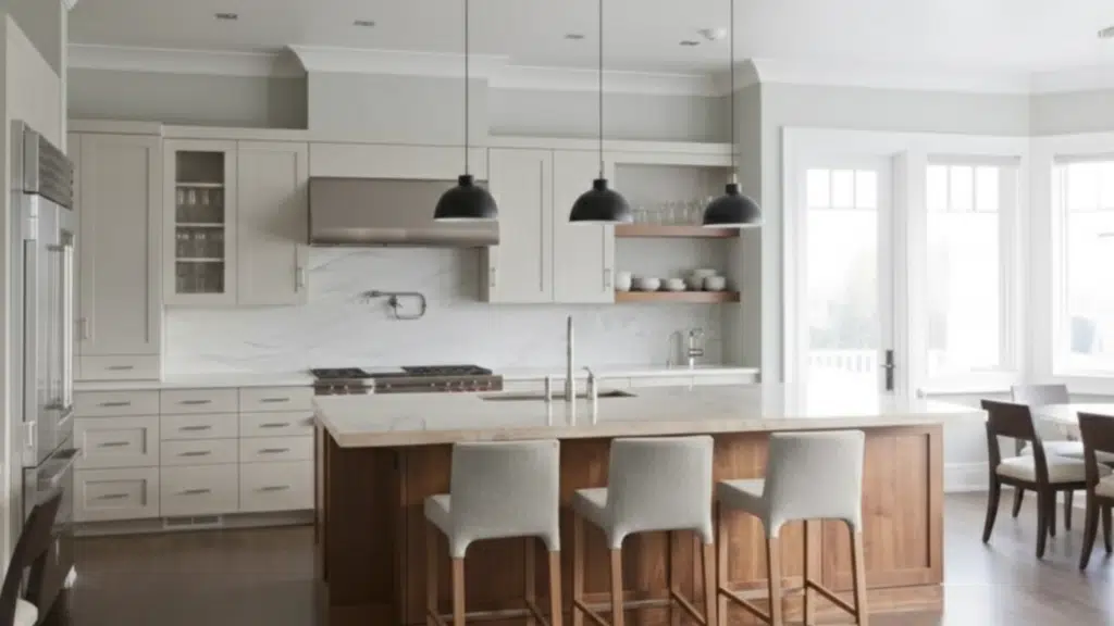
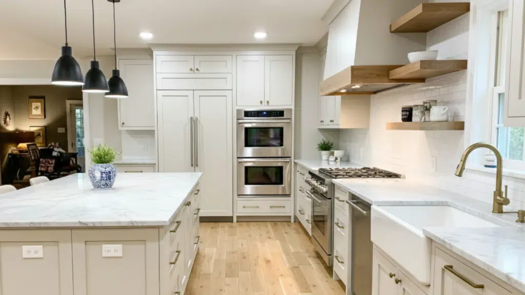
I used to think choosing a wall color for a kitchen with white cabinets would be easy.
You pick a shade you like and move on, right? But once you stand there with twenty paint chips in your hand, you realize how different each one looks in your space.
If you’ve felt that same stress while searching for kitchen paint colors that work well with white cabinets, you’re not alone at all.
The right shade can brighten your room, balance your cabinets, and make everything feel more put-together.
In this guide, I’ll walk you through simple ideas that help you pick the right match without overthinking it. So let’s take a step into the colors that work best.
Key Factors that Affect Paint Colors in A Kitchen with White Cabinets
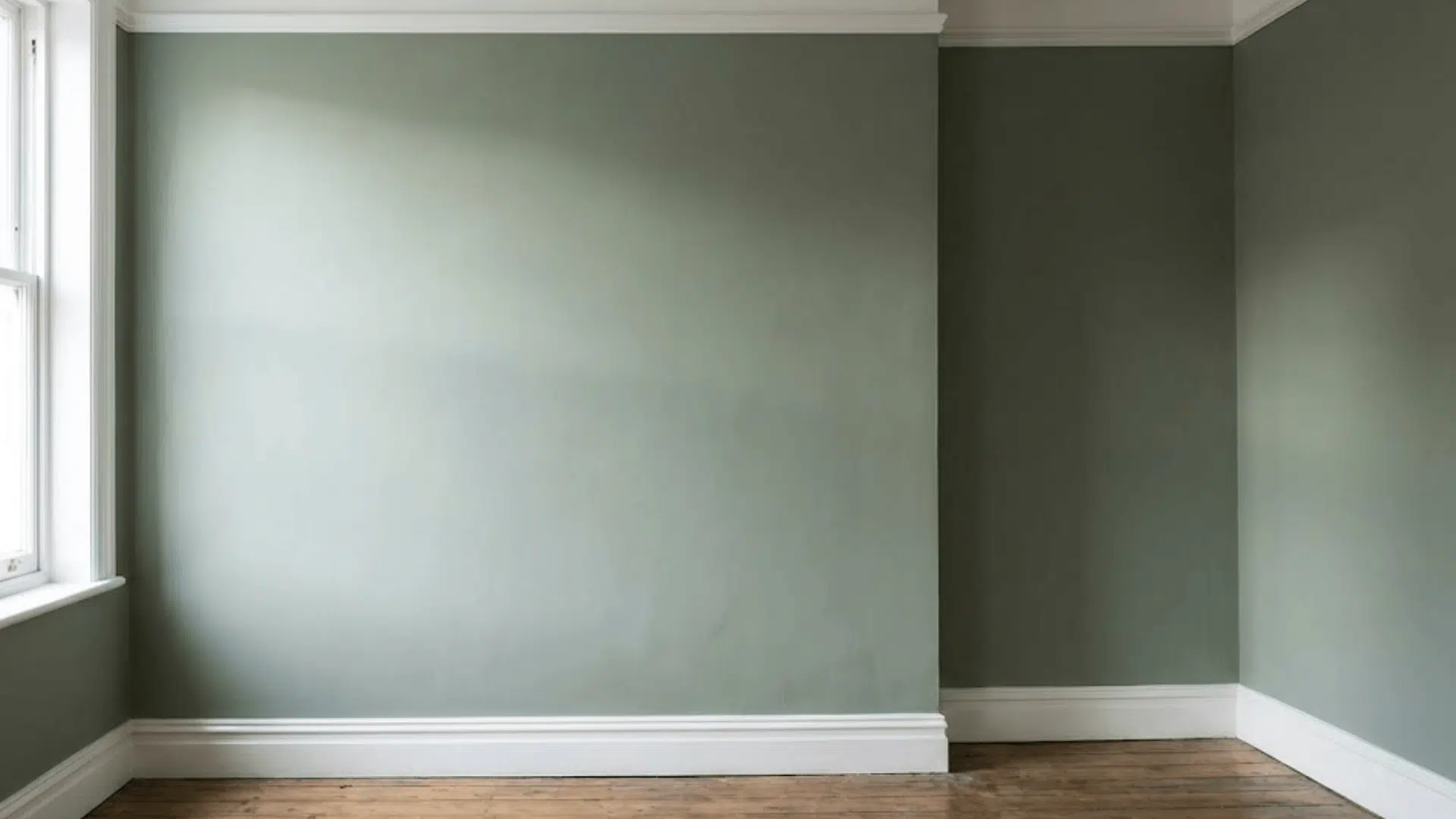
Choosing the right wall color depends on a few important details that shape how every shade looks next to white kitchen cabinets.
- Natural and artificial lighting change how every wall color appears, so check tones in the morning, afternoon, and evening for accurate results.
- Countertops, backsplash, and flooring influence wall color choices because their undertones must coordinate instead of compete or create visual imbalance.
- The cabinet white you already have matters because warm, cool, or clean whites pair differently with specific wall color families.
- Desired contrast level shapes your final choice since soft neutrals blend smoothly, while deeper shades add stronger definition against white cabinetry.
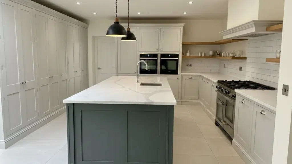
Wall Colors that Work Well with White Cabinets
These wall colors pair smoothly with white cabinets, giving your kitchen balanced contrast, calm undertones, and a clean look with reliable white kitchen paint colors.
1. SW Repose Gray (SW 7015)
Repose Gray is a balanced, versatile gray that works well with most white cabinets because it doesn’t lean too warm or too cool.
It has a soft, subtle undertone that pairs nicely with marble-look quartz, stainless appliances, and light wood floors.
In bright natural light, it appears clean and airy, while in dimmer kitchens it gains a gentle warmth that keeps the space comfortable. This shade creates light contrast without feeling heavy, making it ideal for modern, transitional, or classic kitchens.
Repose Gray also adapts well to open layouts, helping different rooms blend smoothly together.
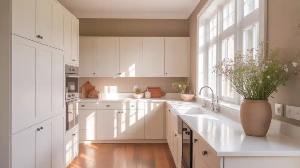
2. SW Accessible Beige (SW 7036)
Accessible Beige is a warm greige that brings a cozy, grounded feel while still staying light enough for open kitchens.
Its beige base is softened with a slight gray influence, preventing the walls from feeling yellow or dated. This color pairs extremely well with creamy cabinet whites and warm countertops like butcher block, beige granite, or taupe quartz.
It works especially well in north-facing kitchens that need extra warmth. The shade is dependable, flexible, and ideal for homeowners who want a warm tone without heaviness. It maintains a calm, welcoming look throughout the day, regardless of lighting changes.
3. BM Gray Owl (OC-52)
Gray Owl is a soft, cool-leaning gray that creates a fresh, clean backdrop for bright white cabinets.
It has subtle blue-green undertones that appear only in certain lighting, giving it a light and crisp look without feeling cold. This shade works beautifully in kitchens with white quartz, chrome fixtures, or cool backsplash tile.
It brightens darker corners and keeps the space feeling open. Gray Owl also suits coastal, modern, and Scandinavian-inspired kitchens.
It’s one of Benjamin Moore’s most popular light grays because it stays neutral enough to complement many surfaces while still giving the kitchen a polished, modern feel.
4. BM Revere Pewter (HC-172)
Revere Pewter is a classic greige that delivers warmth without losing sophistication. It pairs well with both soft and clean white cabinets, making it a reliable choice for varied undertones.
Revere Pewter complements stone countertops, warm floors, and traditional or farmhouse-leaning styles. In brighter kitchens, it becomes a light warm gray, while in low light, it looks cozier and more earthy. This flexibility helps the kitchen maintain a balanced, inviting feel.
The shade works especially well in open-concept homes where multiple rooms need a unifying wall color that transitions smoothly between white cabinetry and other interior elements.
5. Behr Silver Drop (790C-2)
Silver Drop is a light, airy gray with a hint of warmth, making it perfect for kitchens that need softness without beige.
It stays fresh next to white cabinets and helps rooms feel larger and brighter. This shade works with nearly every countertop finish, including marble, white quartz, black stone, and even warm granite.
Silver Drop is ideal for homeowners who want a barely-there gray that reads clean but not cold. It’s highly adaptable in both natural and artificial lighting.
Whether the kitchen has simple white shaker cabinets or more detailed door styles, Silver Drop keeps the space calm and cohesive.
6. Cornforth White (Farrow & Ball No. 228)
Cornforth White is a refined, mid-tone gray with exceptional balance. It is neither overly warm nor distinctly cool, which makes it pair beautifully with crisp white cabinets.
The color delivers a sophisticated, smooth look that works in both modern and classic kitchens. It complements brushed nickel hardware, stone counters, and subtle backsplash patterns.
Its depth is ideal for homeowners who want noticeable contrast but still want the room to feel soft.
Cornforth White maintains stability under different lighting, offering a grounded base that pulls the kitchen together without overwhelming it. It’s a dependable neutral with quiet style.
7. SW Sea Salt (SW 6204)
Sea Salt is a soft blue-green with a muted, dusty quality that looks calm and soothing next to white cabinets. It works especially well in bright kitchens where its subtle color shifts come through gently.
Sea Salt pairs nicely with warm woods, white quartz, and brushed brass accents. It’s a popular choice for coastal-inspired or relaxed transitional interiors. This shade adds color without being bold, making it excellent for homeowners who want something more interesting than gray but still gentle.
Sea Salt changes subtly throughout the day, offering a peaceful and refreshing look that never feels overwhelming.
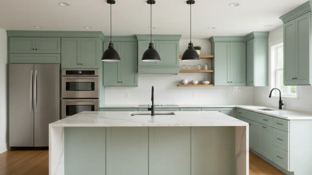
8. SW Evergreen Fog (SW 9130)
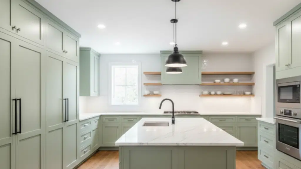
Evergreen Fog is a modern, muted green with a soft gray base that creates a grounded, organic look. It stands out beautifully with white cabinets because the contrast feels natural and soothing.
The color complements wood tones, black hardware, and stone countertops. Evergreen Fog adds depth without darkening the kitchen too much, making it suitable for medium-light spaces.
Its earthy undertone brings warmth, while the gray influence keeps it sophisticated. The shade works particularly well in modern organic, farmhouse, and transitional styles.
Evergreen Fog provides just enough richness to feel current while maintaining long-term appeal.
9. Green Smoke (Farrow & Ball No. 47)
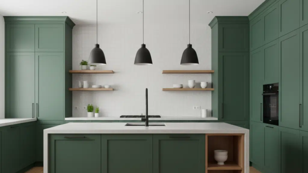
Green Smoke is a rich, moody blue-green that makes white cabinets pop with striking contrast. Its depth brings character to the kitchen without overwhelming the space. This color works best in well-lit rooms where its layered tones can be appreciated.
Green Smoke complements natural wood, brass, black hardware, and vintage-style finishes. It suits homeowners who want a bold, upscale look that still feels grounded.
Because of its muted quality, the color reads sophisticated rather than flashy. It’s ideal for accent walls or full-room applications where a calm but dramatic backdrop improves the clean look of white cabinetry.
10. SW Alabaster (SW 7008)
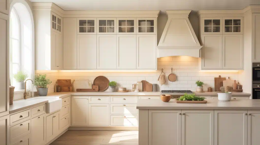
Alabaster is a warm, creamy white that creates a soft, inviting background when paired with white cabinets, especially those with warm undertones. It works well in kitchens where bright whites may feel too stark.
Alabaster glows gently in natural light and helps soften hard surfaces like stainless steel or stone. The shade looks beautiful with warm wood floors, beige countertops, and brass hardware.
Alabaster keeps the room feeling open while adding subtle warmth. This makes it an excellent option for homeowners who prefer a relaxed, comfortable kitchen rather than a cold, ultra-modern look.
11. Behr Swiss Coffee (12)
Swiss Coffee is a warm, gentle off-white that pairs effortlessly with soft white or creamy cabinets.
It adds warmth without leaning yellow and helps brighten dim spaces. This shade works well with warm flooring, taupe or beige countertops, and classic kitchen styles.
Swiss Coffee gives the room a comfortable, welcoming feel and balances bright overhead lighting. It has enough depth to create separation from the cabinets while still keeping the kitchen light.
This makes it ideal for families who want a cozy, classic aesthetic without going too bold or too cool.
12. Behr Honey Moth (350E-2)
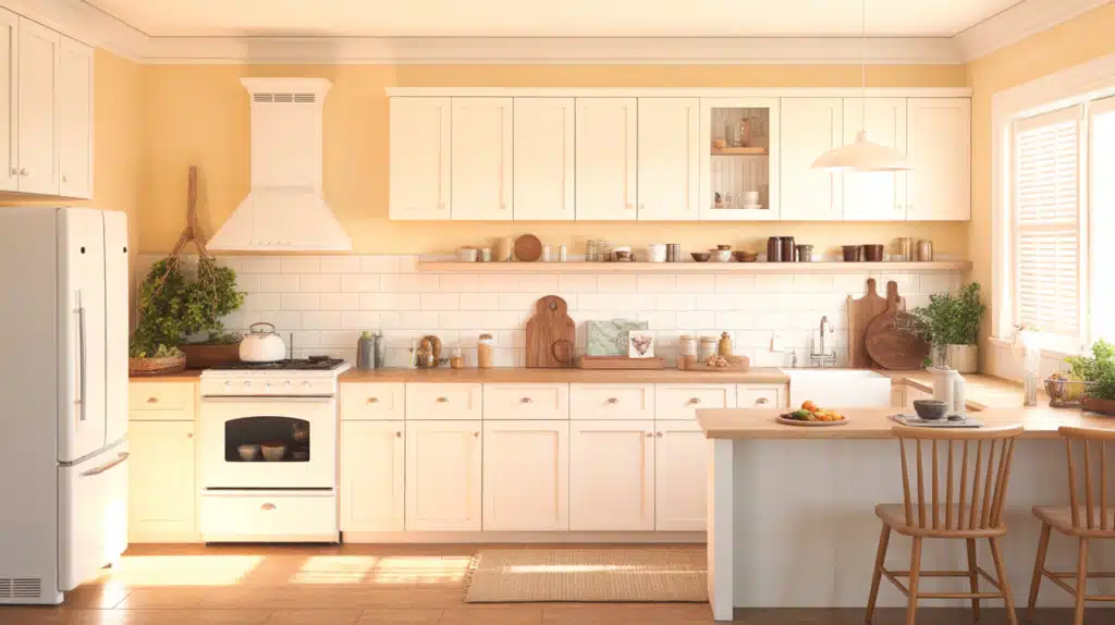
Pale Honey is a warm, light yellow that adds lift and brightness to kitchens with white cabinets. It’s an excellent choice for north-facing rooms that lack natural light.
The color creates a cheerful, sunny atmosphere without feeling overly saturated. It pairs well with warm metals, light wood floors, and natural stone.
Pale Honey works well in traditional, cottage-inspired, or farmhouse kitchens where a gentle touch of color can warm the space. It’s ideal for homeowners who want something uplifting and friendly but still controlled and soft.
13. SW Naval (SW 6244)
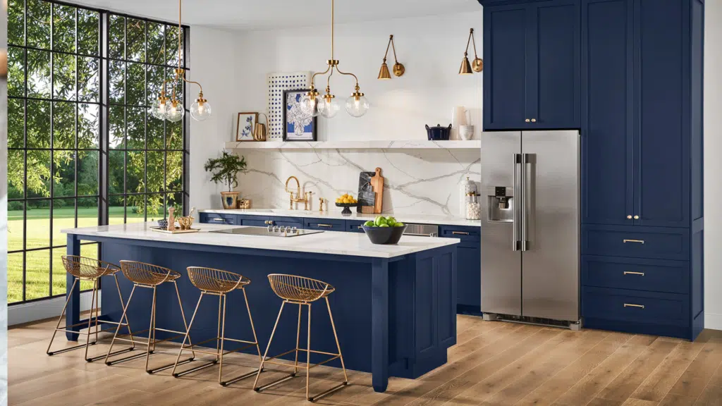
Naval is a deep navy blue that offers bold, dramatic contrast against white cabinets.
The shade is rich, classic, and stylish, making it a great choice for accent walls or full-room applications in bright kitchens. Naval works well with brass hardware, white quartz countertops, and warm wood accents.
Because of its strong depth, it adds instant sophistication without making the space feel too dark when used thoughtfully. It’s ideal for homeowners wanting a classic high-contrast palette that still feels clean and modern.
14. BM Hale Navy (HC-154)
Hale Navy is a beloved deep navy that combines richness with stability. It pairs beautifully with white cabinets by offering high contrast that feels polished rather than overpowering.
Hale Navy works well in kitchens with strong natural light and pairs nicely with white quartz, marble, or butcher-block countertops.
It complements brass, brushed nickel, and matte black hardware, making it easy to style. This shade brings a sense of depth, luxury, and structure to the kitchen. It’s perfect for homeowners looking for a dramatic but timeless look.
15. Valspar Smoked Oyster (6004-1C)
Smoked Oyster is a unique greige with a subtle purple-taupe influence that adds dimension without becoming heavy. It pairs well with white cabinets because the softness creates a gentle contrast while maintaining warmth.
Smoked Oyster works with stone counters, wood floors, and brushed nickel or bronze hardware.
The shade feels cozy without darkening the room too much. It’s ideal for homeowners who want something different from typical greige options but still versatile and compatible with many finishes.
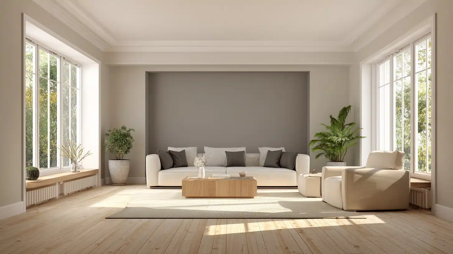
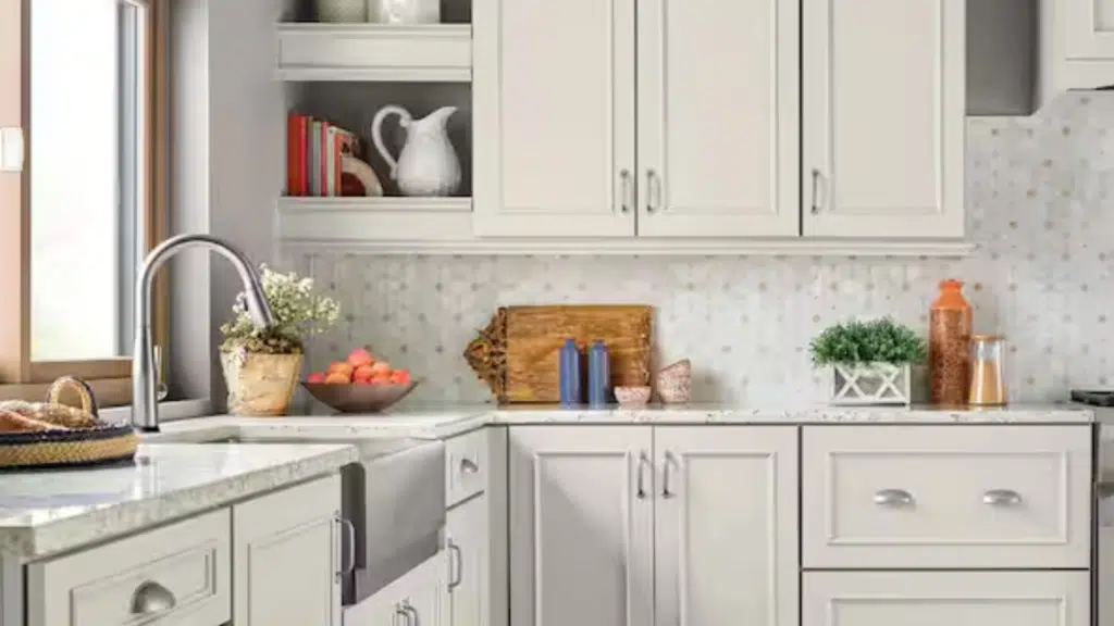
16. BM Simply White (OC-117)
Simply White is a clean, bright white with a hint of warmth that keeps it from looking sterile. It works beautifully with white cabinets because it maintains a fresh, airy feel while still offering slight separation.
Simply White pairs well with cool stone, stainless steel appliances, and black or brass hardware. It’s an excellent pick for modern, minimalist, or Scandinavian-inspired kitchens.
The color helps small kitchens feel larger and brighter. Its subtle warmth makes it more approachable than stark whites, while still delivering a crisp finish.
17. SW High Reflective White (SW 7757)
High Reflective White is Sherwin-Williams’ brightest white, offering a crisp, clean look that improves the lines of white cabinets.
It is ideal for kitchens where maximum brightness is desired. This shade works well with cool grays, navy, black accents, and sleek modern finishes. Because it reflects a large amount of light, it helps smaller kitchens feel more open.
It’s a great match for homeowners who prefer a fresh, contemporary look and want walls that disappear into the background while cabinets, hardware, and decor take center stage.
How to Pick the Right Color for Your Kitchen
Choosing the right kitchen color depends on lighting, surfaces, undertones, and the amount of contrast you want beside your white cabinets.
- Look at natural and artificial lighting to see how colors shift throughout the day beside your white cabinets.
- Check countertops, backsplash, and flooring because their undertones guide which wall shades will blend smoothly without clashing.
- Decide how much contrast you want, since soft neutrals give a calm look and deeper colors create stronger definition.
- Consider your kitchen’s style so the wall color supports modern, classic, or farmhouse design without overwhelming the space.
Color Suggestions Based on Cabinet White
Choosing wall colors becomes easier when you match them to your cabinet white or planned white cabinet paint, since warm, cool, and soft neutrals all need different supporting shades.
If Your Cabinets are Warm White
Warm white cabinets have creamy undertones, so they pair best with shades that support their softness without creating yellowing.
Accessible Beige adds gentle warmth that feels calm and classic.
Revere Pewter introduces a balanced greige that settles the room and blends with warm flooring. Sea Salt brings a soft, cool touch that prevents the kitchen from feeling too warm.
Together, these colors create a comfortable, cohesive look that keeps warm whites feeling intentional instead of overly creamy.
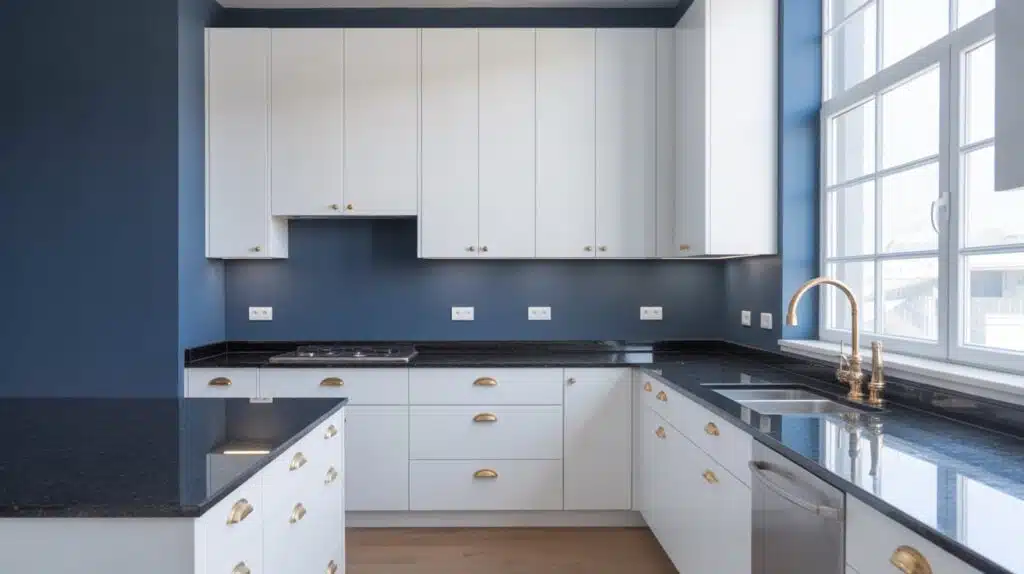
If Your Cabinets are Clean Bright White
Clean bright whites look crisp and modern, so they need wall colors that support that clarity without fighting undertones.
Repose Gray offers light contrast with a smooth, balanced appearance.
Hale Navy brings bold definition for homeowners wanting a striking, sophisticated look. Cornforth White adds a gentle, refined gray that keeps the kitchen clean and cohesive.
Each of these shades improves the brightness of clean white cabinets while giving the room depth, interest, and a polished finish.
If Your Cabinets are Soft Neutral White
Soft neutral whites sit between warm and cool, making them very flexible. Smoked Oyster pairs beautifully by adding gentle depth with a refined, muted taupe tone.
Silver Drop brings a light, airy gray that keeps the kitchen bright without feeling stark.
Evergreen Fog adds an earthy, modern green that complements neutral whites without overwhelming the space.
These colors maintain harmony, improve subtle undertones, and create a calm, balanced kitchen that feels relaxed and well-coordinated.
Best Colors for Common Kitchen Conditions
Different kitchens have unique needs, so choosing the right wall color depends on light levels, layout, and the materials surrounding your white cabinets.
| Kitchen Condition | Recommended Colors | Why These Colors Work |
|---|---|---|
| Dark or North-Facing Kitchen | Pale Honey, Swiss Coffee, Silver Drop | These warm or light shades brighten the space and help balance cool, low-light conditions. |
| Modern Kitchen Style | Gray Owl, High Reflective White, Naval | These crisp tones keep the look clean, structured, and visually sharp against white cabinets. |
| Warm, Classic Kitchen | Accessible Beige, Smoked Oyster, Revere Pewter | These softer neutrals add comfort and pair well with warm flooring and traditional finishes. |
Choosing colors based on your kitchen’s lighting and style helps create a natural flow that supports your white cabinets without overwhelming the space.
Mistakes to Avoid with White Cabinets
Choosing the wrong wall color, lighting, or undertone can make white cabinets look dull, yellow, harsh, or mismatched in a kitchen instantly.
- Picking wall shades with opposite undertones makes cabinets look off, creating a harsh or muddy contrast that you can’t correct with décor.
- Ignoring lighting changes results in unexpected shifts, causing whites to appear yellow, gray, or flat during different times of day.
- Using overly bright whites on every surface can make the kitchen feel cold, unbalanced, and lacking needed depth or definition.
- Skipping sample testing leads to surprises, since colors often behave differently next to cabinets, counters, and backsplash materials.
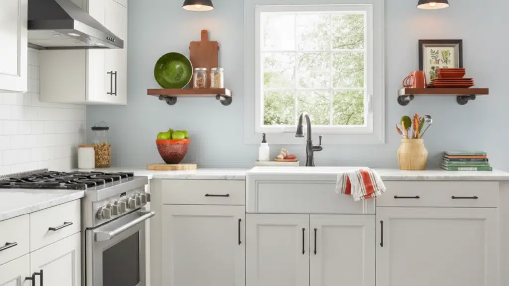
How to Test Your Paint Colors
Testing your paint correctly helps you see the true shade beside your white cabinets, preventing surprises and saving time, stress, and money.
Use Sample Boards
Sample boards give you a larger, more accurate view of the color compared to small swatches.
Paint two coats on poster boards or peel-and-stick samples, then place them at cabinet height to see how the shade reacts to nearby surfaces.
Move the boards around the room, especially near counters and backsplash areas, since colors shift when placed beside different materials.
This method shows how each color behaves realistically in your kitchen instead of guessing from tiny chips.
View Colors at Different Times
Paint changes throughout the day as natural and artificial light shift, so observing each sample in the morning, afternoon, and evening is essential.
A color that looks soft and calm in daylight may appear cooler or warmer under evening lights. This helps you understand how the color will behave during cooking, family time, and daily routines.
Paying attention to these changes prevents choosing a shade that only looks good during one specific lighting condition.
Compare Next to Cabinets
Paint must be tested directly beside your white cabinets because undertones behave differently when the colors sit next to each other.
Hold or place sample boards right against cabinet doors, trim, and corners to see if the shades clash or blend well. This comparison reveals whether the wall color improves your cabinets or makes them appear yellow, dull, or overly sharp.
Testing this way ensures you choose a shade that truly works with your cabinetry in real-life conditions.
Conclusion
I hope this helped you feel more confident about choosing colors that support your white cabinets. We looked at soft neutrals, light greens, warm shades, and deeper tones that bring out the shape and style of your kitchen.
Each option works in a different way, and now you have a clearer path to finding what feels right for your home.
If you’re still comparing kitchen paint colors white cabinets can pair with, remember to test a few shades and check them in different light.
I’d love for you to find more ideas next, so take a look at my other blogs and keep building the space you want.