I used to stare at paint samples longer than I’d like to admit, trying to understand why some rooms looked calm while others felt off.
You’ve probably felt that moment too, when nothing seems to match the picture in your head. That’s why getting wall and trim color combinations right matters more than people realize.
When the walls and trim work together, the whole room feels steady, warm, and easy to live in.
In this guide, I’ll walk you through simple tips, clear ideas, and real combinations that make choosing paint feel less stressful.
By the end, you’ll feel more confident about using wall and trim color combinations in your own home without second-guessing every shade.
Things to Consider Before Choosing Wall and Trim Colors
Before you pick colors, focus on lighting, undertones, contrast, and the room’s mood so your final wall and trim choices feel right.
- Check the room’s natural light since it changes how both wall and trim colors look during the day and evening.
- Notice warm or cool undertones in floors, furniture, or wood pieces because they guide which wall and trim tones feel right together.
- Decide if you want soft contrast or strong contrast, since this choice shapes how bold or calm the room will feel overall.
- Think about the room’s mood and how you use the space so the wall and trim colors match comfort, function, and daily use.
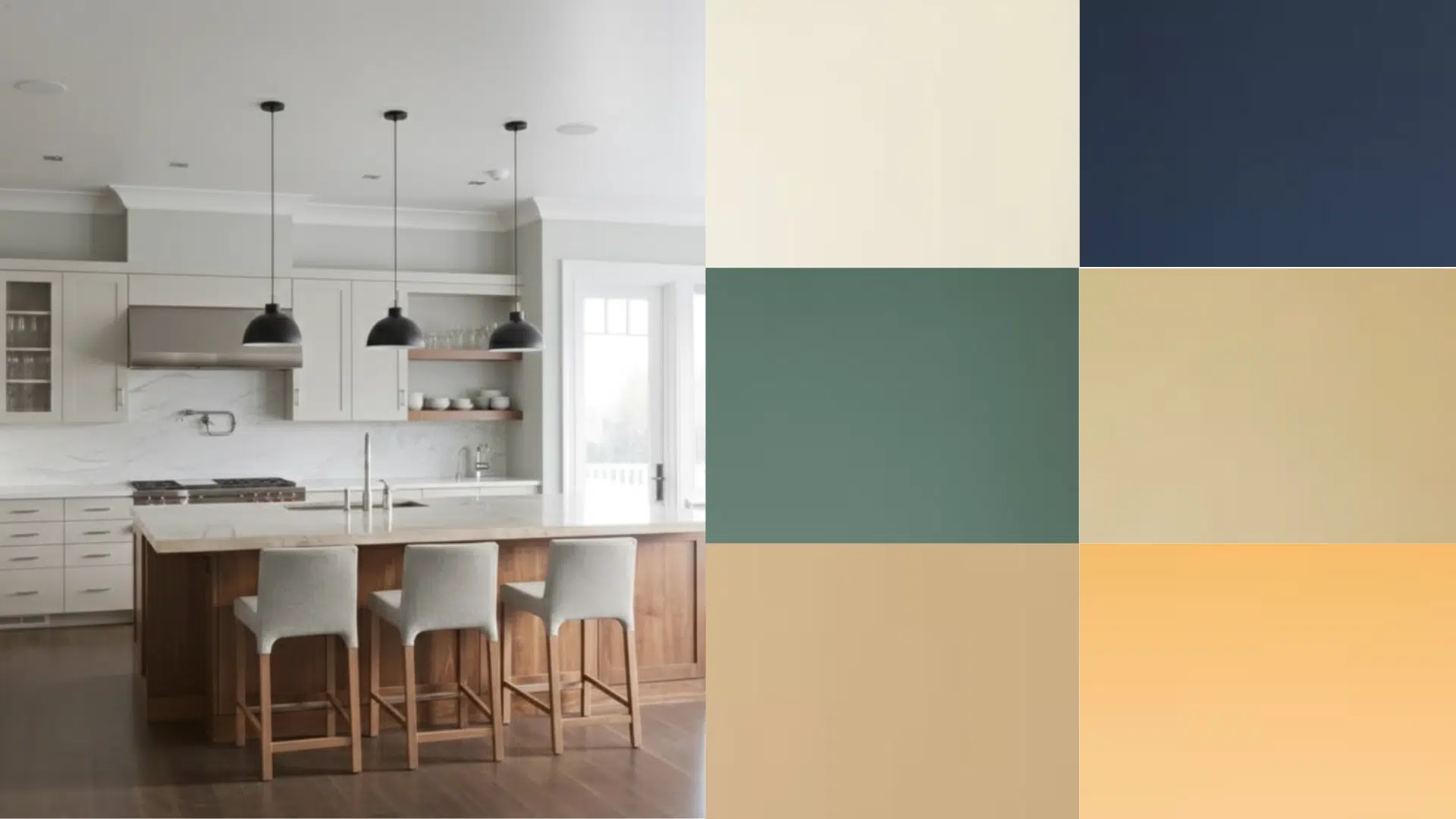
Quick Inspiration: Wall and Trim Color Combinations
Choose from these easy wall and trim combinations that work in real rooms and help you create a balanced and comfortable look every time.
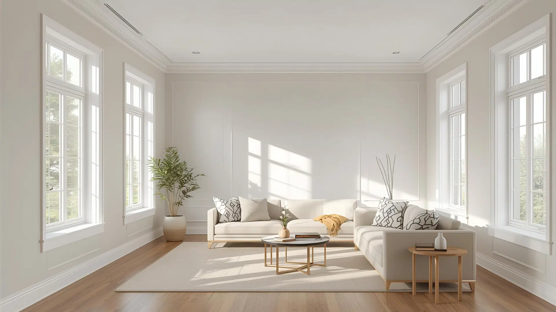
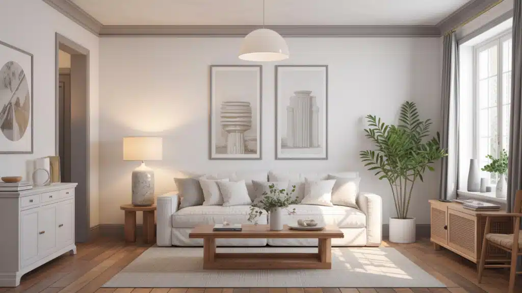
1. Soft Warm White Walls + Bright White Trim

This combination gives your room a gentle, creamy backdrop while keeping the trim crisp and sharp.
The warm white on the walls adds comfort without looking heavy, making it great for living rooms or airy open spaces.
The bright white trim outlines windows and doors cleanly, helping the room feel structured and lifted. This mix works well in morning and evening light because the contrast stays soft and stable. It pairs with warm floors, natural fabrics, and simple décor.
If you want a classic look with a comfortable feel, this warm-and-bright pairing is dependable in almost any home. If you prefer a simpler look, you can also use white walls with white trim for a cleaner and more seamless finish.
Paint Matches:
- Walls:Sherwin-Williams Alabaster, Benjamin Moore White Dove
- Trim:Sherwin-Williams Pure White, Benjamin Moore Chantilly Lace
2. Light Gray Walls + Soft Cream Trim
This pairing creates a calm, balanced feel with a gentle contrast that works well in bedrooms, offices, and quiet spaces.
Light gray gives you a steady backdrop without feeling cold, especially when paired with cream trim that softens the edges. This mix blends beautifully with wood tones, cozy fabrics, or modern furniture.
It performs well in natural and warm lighting, helping the room stay comfortable throughout the day. The cream trim adds a warm highlight without overpowering the gray walls.
If you want a flexible palette that works with many styles, this combination gives you both freshness and warmth.
Paint Matches:
- Walls:Sherwin-Williams Repose Gray, Benjamin Moore Classic Gray
- Trim:Benjamin Moore White Dove, Sherwin-Williams Creamy
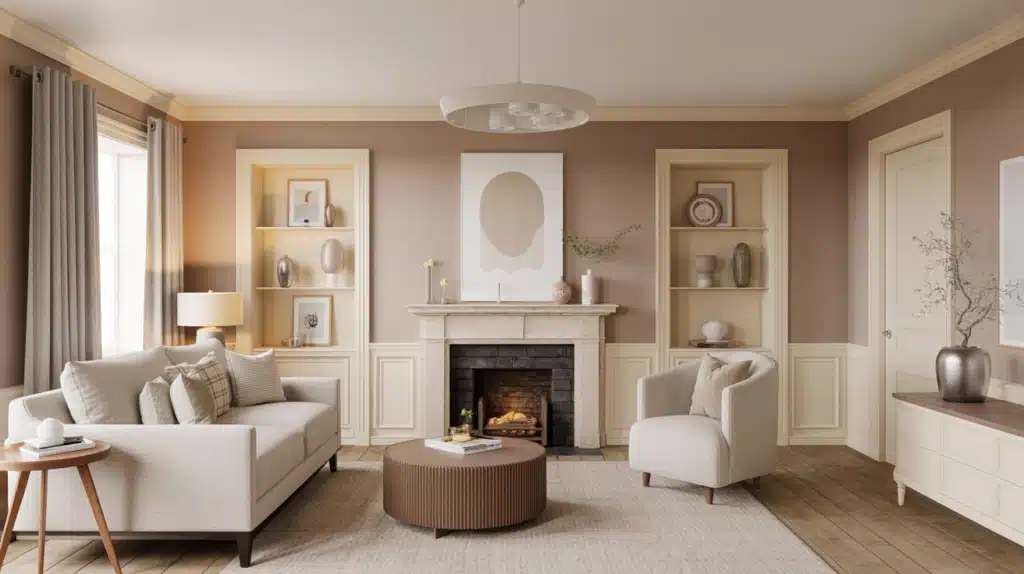
3. Warm Beige Walls + Soft Warm White Trim
This combination gives your room a cozy and inviting feel. Warm beige creates a grounded base that shines in natural light, while the soft warm white trim adds gentle brightness around windows and doors.
This pairing works well in bedrooms, hallways, and family rooms where comfort matters. It blends nicely with warm floors, woven textures, and simple furniture.
Because both colors share warm undertones, the room feels connected and soothing. The trim lifts the beige walls just enough to add structure without sharp contrast.
If you want a warm, settled look that stays consistent in different lighting, this mix is a safe choice.
Paint Matches:
- Walls: Sherwin-Williams Accessible Beige, Benjamin Moore Shaker Beige
- Trim: Sherwin-Williams Alabaster, Benjamin Moore Swiss Coffee
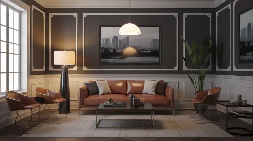
4. Deep Navy Walls + Clean Bright White Trim
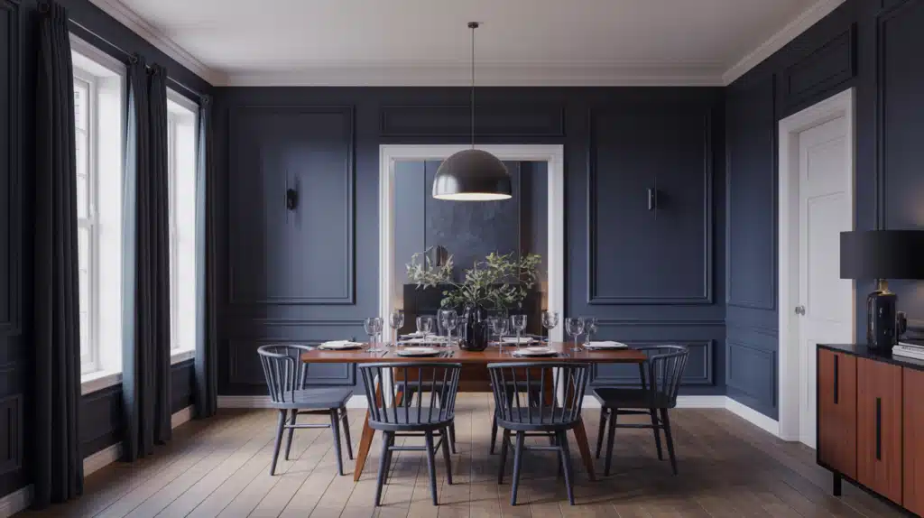
This combination creates confident contrast and sharp edges that pull the room together.
Deep navy adds richness without overwhelming the space when bright white trim frames it cleanly. This pairing works beautifully in dining rooms, offices, or accent walls where you want depth and structure.
The crisp trim keeps the room from feeling too dark, making the overall look balanced. This mix blends well with brass, matte black fixtures, warm wood pieces, or simple modern lines.
Even small rooms benefit because the bright trim opens up the darker backdrop. If you want a bold but timeless look, this pairing delivers strength and clarity.
Paint Matches:
- Walls:Benjamin Moore Hale Navy, Sherwin-Williams Naval
- Trim:Benjamin Moore Chantilly Lace,Sherwin-Williams Extra White
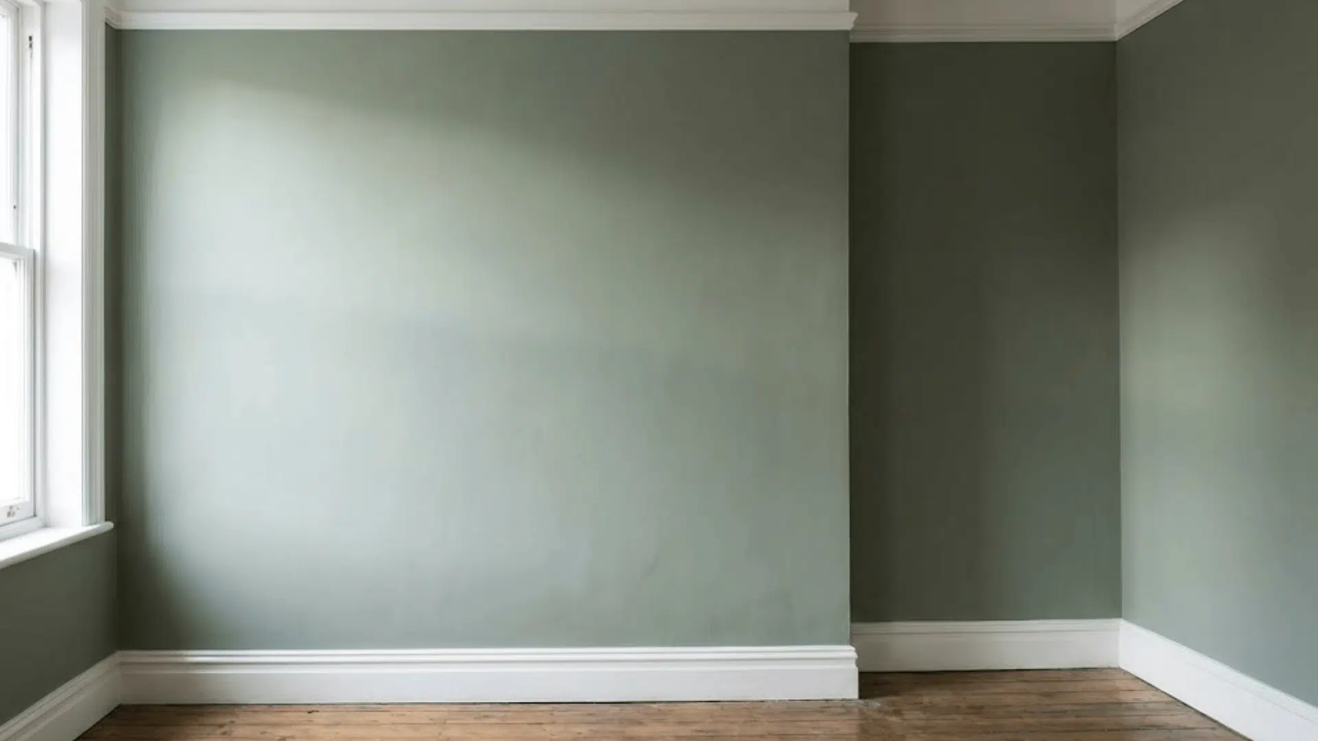
5. Soft Green Walls + Warm White Trim

This combination brings a natural, peaceful feel to your space.
Soft green walls add quiet color without overpowering, while warm white trim adds a gentle glow around edges and moulding. This pairing works well in kitchens, bathrooms, sunrooms, and bedrooms, anywhere you want a relaxed mood.
The warm trim softens the green so the room feels calm and steady. It pairs nicely with light wood, woven accents, and neutral fabrics.
The colors stay stable in different lighting, making the room feel comfortable throughout the day. If you want a hint of color that still feels neutral, this combination is a great middle ground.
Paint Matches:
- Walls: Benjamin Moore October Mist, Sherwin-Williams Clary Sage
- Trim: Benjamin Moore White Dove, Sherwin-Williams Shoji White
6. Greige Walls + Soft Cream Trim
This mix creates a warm, balanced environment with subtle definition. Greige brings the right blend of gray and beige, making it adaptable in both cool and warm lighting.
The soft cream trim adds a gentle lift around doors, windows, and baseboards without creating a harsh contrast. This combination suits open layouts, living rooms, and calm multipurpose spaces.
It blends nicely with wood tones, metal finishes, and natural materials. Because both shades sit in a flexible neutral zone, the room stays easy to decorate.
If you want a dependable palette that adjusts well to different décor, this mix is ideal for long-term use.
Paint Matches:
- Walls: Sherwin-Williams Repose Gray, Benjamin Moore Edgecomb Gray
- Trim:Benjamin Moore Swiss Coffee, Sherwin-Williams Creamy
7. Light Gray Walls + Nearly Black Trim
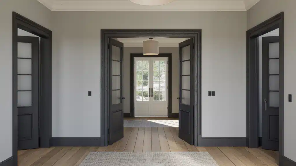
This pairing gives your room a clean, modern edge. Light gray walls keep the space open and airy, while the dark trim adds depth and draws attention to architectural details.
This mix works well in entryways, living rooms, and spaces with simple lines. The contrast remains smooth rather than harsh, making the room feel structured without looking heavy.
It pairs nicely with metal accents, minimal décor, and warm wood floors. Even in bright light, the nearly black trim stays rich and grounded.
If you want a bold, contemporary look with clear outlines, this combination brings definition and confidence to your space. This combination is also a great example of a dark trim color scheme that feels modern without overwhelming the room.
Paint Matches:
- Walls:Benjamin Moore Gray Owl, Sherwin-Williams Passive
- Trim:Sherwin-Williams Iron Ore, Benjamin Moore Wrought Iron
8. Warm Off-White Walls + Deep Brown-Black Trim
This combination offers warm contrast and cozy structure.
Warm off-white walls keep the space bright, while the deep brown-black trim adds earthy definition without feeling as sharp as pure black. This mix works well in bedrooms, living rooms, and hallways with warm flooring.
The tones blend nicely with leather, warm metals, and rustic or organic décor. Even in softer lighting, the trim feels rich rather than stark. The pairing gives clarity to the room’s edges while keeping the atmosphere grounded.
If you want contrast with a softer feel, this warm wall and deep trim combination is a comfortable choice.
Paint Matches:
- Walls:Sherwin-Williams Shoji White, Benjamin Moore Cloud White
- Trim: Sherwin-Williams Black Fox, Benjamin Moore Espresso Bean
9. Gentle Green Walls + Soft Clean White Trim

This mix brings a fresh, natural feeling that works in many rooms.
Gentle green walls offer calm color with a soothing presence, while the soft, clean white trim gives definition without sharpness.
This combination suits bedrooms, kitchens, bathrooms, and small reading spaces. It pairs beautifully with woven textures, light wood, and simple décor. The look stays steady in warm and cool lighting, making it versatile for different exposures.
The trim brightens the space enough to balance the soft green, keeping the room lively but peaceful. If you want color that stays subtle, this pairing creates a soft and natural foundation.
Paint Matches:
- Walls:Benjamin Moore October Mist, Sherwin-Williams Sea Salt
- Trim:Benjamin Moore Simply White, Sherwin-Williams Alabaster
10. Deep Blue-Black Walls + Bright White Trim
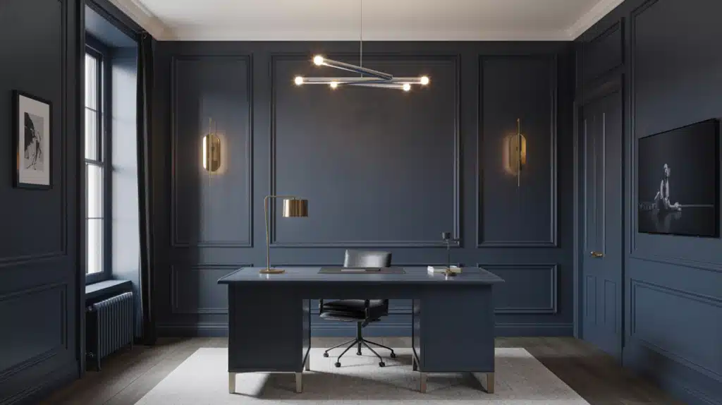
This combination creates a dramatic, confident look with clear contrast.
Deep blue-black walls bring strong depth, while bright white trim outlines the space sharply, giving clean visual boundaries. This pairing is ideal for offices, dining rooms, or bold accent walls. It pairs well with brass, matte black hardware, warm woods, and modern décor.
The bright trim keeps the room from feeling heavy by adding light and clarity. Even smaller rooms can handle this mix when used thoughtfully.
If you want a bold feature that still looks classic and structured, this combination performs beautifully in many settings.
Paint Matches:
- Walls: Sherwin-Williams Cyberspace, Benjamin Moore Wrought Iron
- Trim: Sherwin-Williams Extra White, Benjamin Moore Chantilly Lace
11. Warm Terracotta Walls + Soft Cream Trim
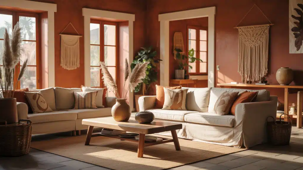
This pairing delivers a grounded, earthy feel with gentle brightness.
Terracotta walls bring natural warmth and depth, while soft cream trim adds a smooth, uplifting edge. This combination works well in living rooms, dining spaces, and cozy nooks. It blends seamlessly with light wood, woven textures, and rustic décor.
The colors hold steady in low light, giving the room a warm, comfortable mood. Cream trim softens the terracotta enough to keep the space from feeling too dark or heavy.
If you want a natural, welcoming environment, this combination creates a warm, homey backdrop.
Paint Matches:
- Walls:Benjamin Moore Terra Cotta Tile, Sherwin-Williams Cavern Clay
- Trim:Benjamin Moore Swiss Coffee, Sherwin-Williams Creamy
12. Soft Blue Walls + Light Warm Gray Trim
This combination creates a clean, calming feel that works well in bedrooms, bathrooms, and small living spaces.
Soft blue adds a refreshing touch without becoming too bright, while warm light gray trim gives gentle contrast. The pairing blends well with brushed metals, simple textiles, and light wood furniture.
It stays steady in daylight, keeping the room soft and cool. The gray trim outlines the blue walls in a quiet, subtle way that doesn’t overpower the main color.
If you want a cool palette that still feels warm enough for daily living, this mix balances both sides.
Paint Matches:
- Walls:Sherwin-Williams Misty, Benjamin Moore Breath of Fresh Air
- Trim:Benjamin Moore Gray Owl, Sherwin-Williams Repose Gray
13. Deep Green Walls + Soft Neutral White Trim
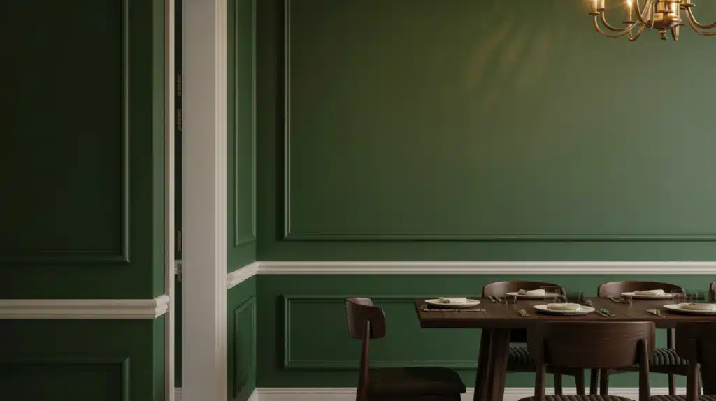
This pairing gives your room a grounded, moody feel with a fresh edge.
Deep green brings strong depth and character, while neutral white trim lightens the borders and adds clarity. This combination works in dining rooms, entryways, or cozy sitting areas.
It pairs well with black metal accents, natural wood, and simple lighting. The tones stay stable in dim and moderate light, helping the room feel balanced.
If you like rich color but still want the room to feel open, this mix offers just enough brightness around the trim to keep everything comfortable.
Paint Matches:
- Walls:Sherwin-Williams Pewter Green, Benjamin Moore Backwoods
- Trim: Benjamin Moore Cloud White, Sherwin-Williams Alabaster
14. Taupe Walls + Clean Warm White Trim
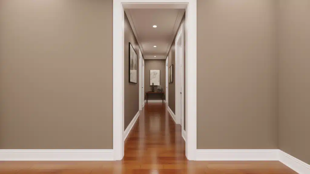
This pairing gives a calm, classic feel with a touch of warmth.
Taupe offers a grounded neutral base that works across many styles, while warm white trim lifts the room softly without strong contrast.
It blends well with both warm and cool décor, making it ideal for living rooms, hallways, or bedrooms. The tones stay consistent in mixed lighting, so the room always feels stable.
The trim brightens the taupe just enough to create a clear outline. If you want a quiet, flexible palette that still feels inviting, this combination is an easy choice that fits almost any home.
Paint Matches:
- Walls:Benjamin Moore Driftwood, Sherwin-Williams Perfect Greige
- Trim: Benjamin Moore White Dove, Sherwin-Williams Shoji White
15. Charcoal Walls + Soft White Trim
This pairing gives your room a bold, structured look without feeling too strong.
Charcoal walls add depth and style, while soft white trim brightens edges and keeps the room grounded. This combination works well in offices, bedrooms, or large living rooms where you want a dramatic tone.
It pairs nicely with metal hardware, warm wood furniture, and simple modern décor. The lighter trim helps balance the darker walls so the space doesn’t feel closed in.
If you want bold color with a gentle frame, this mix gives strong definition with a smooth, comfortable finish.
Paint Matches:
- Walls:Sherwin-Williams Peppercorn, Benjamin Moore Kendall Charcoal
- Trim:Sherwin-Williams Snowbound, Benjamin Moore Simply White
16. Clean White Walls + Soft Greige Trim
This mix adds warmth and depth to a classic white room.
Clean white walls keep the space bright and open, while soft greige trim brings a gentle, grounding touch. This pairing works in hallways, living rooms, and bedrooms where you want lightness with subtle contrast.
It pairs well with warm floors, natural fabrics, and calm décor. The greige trim gives dimension without drawing too much attention, helping the room feel layered but simple.
If you want white walls that don’t feel plain, this combination adds soft interest while staying airy and flexible.
Paint Matches:
- Walls:Benjamin Moore Chantilly Lace,Sherwin-Williams Extra White
- Trim:Sherwin-Williams Agreeable Gray, Benjamin Moore Pale Oak
17. Clay Beige Walls + Soft Cream Trim

This combination creates a warm and comfortable space with gentle definition.
Clay beige offers natural warmth and soft depth, while cream trim adds a smooth highlight around the edges. This pairing works well in bedrooms, reading areas, and family rooms where calm and comfort matter.
It blends nicely with warm wood tones, simple décor, and plush fabrics. The tones stay steady in soft lighting, giving your home a relaxed mood throughout the day.
If you want warmth without going dark, this pairing gives you a cozy foundation with a balanced, approachable feel.
Paint Matches:
- Walls:Sherwin-Williams Natural Tan, Benjamin Moore Muslin
- Trim: Benjamin Moore Swiss Coffee, Sherwin-Williams Creamy
Simple Framework for Choosing Wall and Trim Colors
Step 1: Start by noticing the fixed features in your space, including floors, wood tones, cabinets, and large furniture pieces.
Step 2: Decide whether the room naturally leans warm, cool, or neutral so your final choices feel steady and balanced.
Step 3: Pick a wall shade that fits the room’s mood by choosing something soft, mid-tone, or deep.
Step 4: Select how the trim should behave, using crisp contrast, soft contrast, or a quiet tonal look.
Step 5: Test your samples throughout the day so you see how the tones shift in different lighting conditions.
Room-Specific Combinations for a Balanced and Comfortable Home
Different rooms need different wall and trim approaches, so these simple ideas help you shape each space based on mood, size, and function.
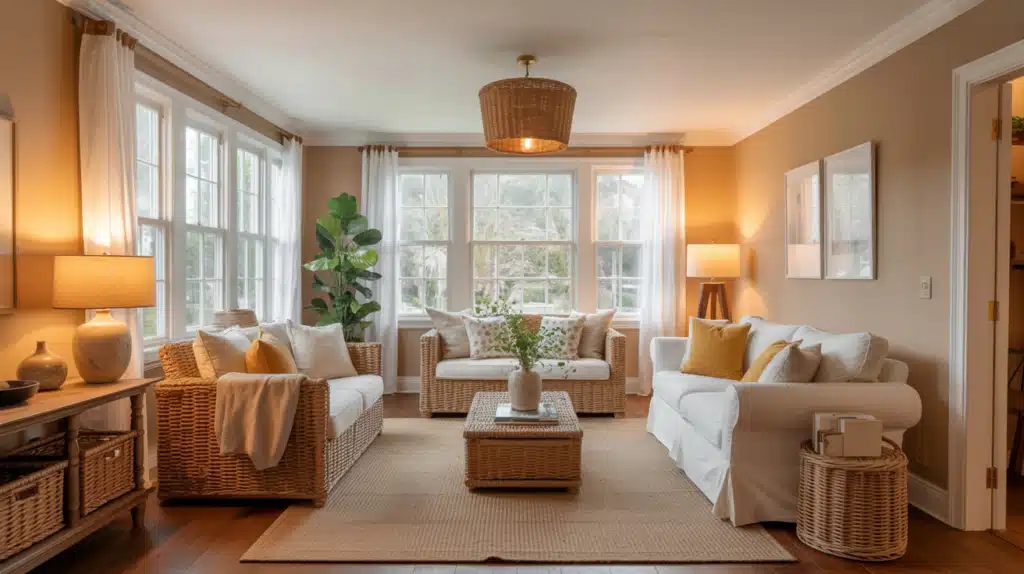
Living Room Ideas

Your living room often handles the most movement, so wall and trim choices should support a warm, steady feel. Soft neutrals help open the space and work well with natural light, while gentle contrast brings structure without feeling sharp.
Use slightly deeper trim when you want the room to feel grounded, or lighter trim when you want an open and relaxed setting. Add comfortable textures, warm lighting, and simple décor to complete the look without overwhelming the space.
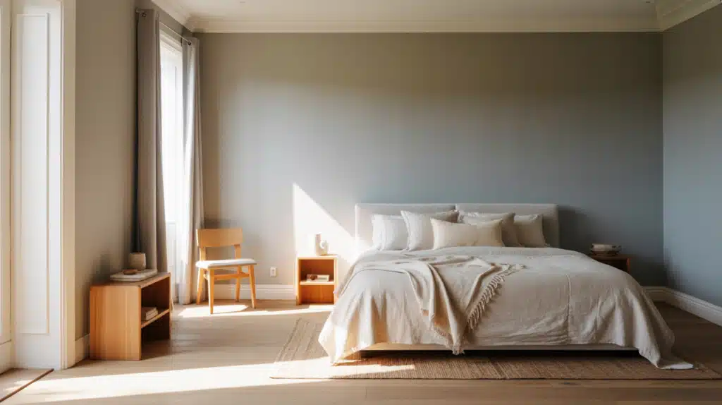
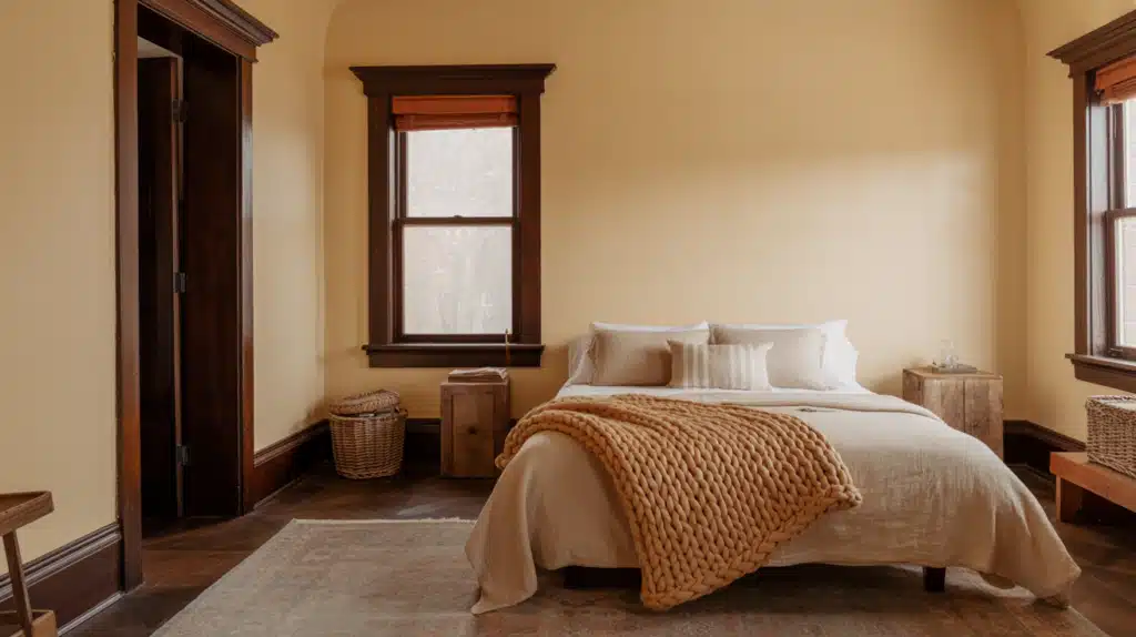
Bedroom Ideas

Bedrooms benefit from colors that help you rest, so calmer tones and soft trim details work best. Aim for shades that feel peaceful in both morning and evening light, creating a steady atmosphere for sleep.
Light trim adds a quiet frame around doors and windows without drawing attention, helping the room stay comfortable. Avoid sharp contrast or strong edges since they can feel busy.
Keep fabrics, lighting, and décor simple so the walls and trim support a relaxing, steady mood.
Kitchen Ideas

Kitchens need wall and trim combinations that stay clean and balanced alongside cabinets, counters, and backsplashes.
Keep the walls light enough to reflect daylight and brighten the workspace, while the trim provides a clear outline around doors and windows. Choose tones that blend smoothly with appliances, flooring, and tile patterns.
Too much contrast can make the room feel crowded, so aim for steady balance. This approach keeps the kitchen practical, open, and easy to update with small décor changes.
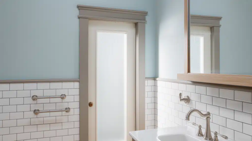
Bathroom Ideas
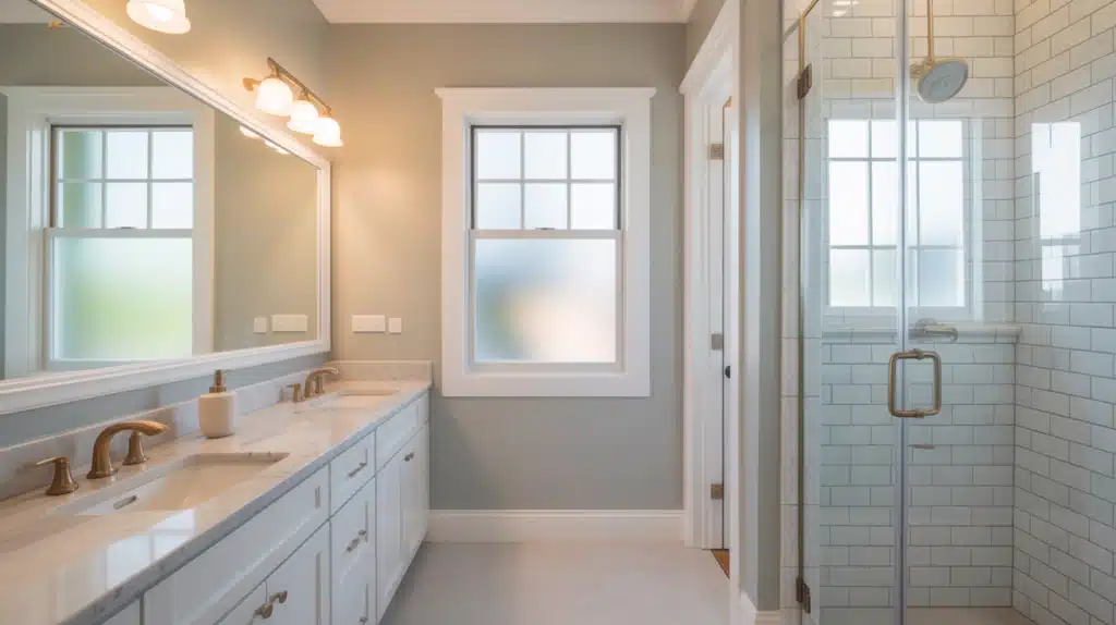
Bathrooms look best with wall and trim combinations that increase brightness and keep the space feeling fresh. Light walls help amplify natural and artificial light, while trim adds a soft highlight around mirrors, doors, and windows.
Pick tones that feel clean without appearing cold, so the room stays comfortable during both daytime and evening routines.
Since bathrooms are small, a subtle contrast helps create depth without overwhelming the space. This simple approach makes your bathroom feel calm, open, and easy to maintain.
Wall and Trim Color Combinations to Avoid
Some wall and trim pairings create harsh contrast, uneven tones, or clashing undertones, so avoiding these mistakes keeps your rooms balanced and comfortable.
- Strong contrast in small rooms can make the space feel tight and heavy instead of open and steady.
- Mixing warm and cool undertones often causes the walls and trim to fight each other visually.
- Very dark trim in low-light areas exaggerates shadows and makes the room feel unbalanced.
- Using several unrelated tones in one room creates visual clutter and weakens the overall design flow.
Conclusion
Now that you’ve gone through these ideas, you can see how small choices shape the way a room feels.
You’ve learned how light, undertones, and contrast guide the overall look, and you’ve seen how simple tweaks create a calmer and more comfortable space.
My goal was to make wall and trim color choices less confusing, and I hope you feel that shift now. If you’re ready to try your own wall and trim color combinations, start with a few samples and test them in different lights.
I’d love for you to keep finding, so check out my other blogs for more easy home ideas, simple color tips, and practical guidance you can use right away.