When I first started comparing paint colors, I kept asking myself the same thing: What color is Alabaster, and why does everyone recommend it? If you’ve ever felt stuck between bright whites and warmer tones, I know exactly how that feels.
Sherwin-Williams’ Alabaster is one of those rare shades that sits right in the middle, soft, inviting, and versatile.
In this blog, I’ll share what makes it unique, how it looks in different light, and the best ways to use it so you can decide if it’s the right white for your home.
Alabaster Paint Color Overview
Alabaster (SW 7008) is a warm, white paint color from Sherwin-Williams, widely chosen for both interior and exterior use. If you’ve ever asked what color Alabaster is, the answer is that it’s a warm white with soft undertones that balance brightness and comfort.
- Name & Code: Sherwin-Williams Alabaster (SW 7008)
- HEX Code: #EDEAE0
- RGB: 237 / 234 / 224
- LRV (Light Reflectance Value): 82
- Availability: Interior and exterior paints
Sherwin-Williams Alabaster white is available in both interior and exterior formulas, making it a flexible choice.
Alabaster Undertones and Lighting Effects
Alabaster reacts strongly to lighting, which is why it can look different from room to room. Its undertones reveal themselves in unique ways depending on exposure, time of day, and the type of light used.
Warm vs. Cool Balance
Alabaster is a warm white at its core, but it doesn’t always read the same way. In south-facing spaces, it feels soft and creamy, complementing natural warmth.
In cooler settings, like shaded exteriors or rooms styled with gray or blue decor, its warmth settles down, and the color appears closer to a balanced neutral. This shifting quality makes Alabaster more adaptable than other warm whites.
Why It Can Look Yellow
Alabaster’s beige undertones sometimes push forward, especially in low-light spaces or under incandescent bulbs. This is when the paint may appear more yellow than expected.
The effect isn’t a flaw in the color but a reaction to lighting. If yellowing worries you, pair Alabaster with cooler accents or test it in several spots to see how strong the creamy undertone appears in your home.
How Natural and Artificial Light Changes Its Appearance
Sunlight, shadows, and bulbs all affect the appearance of Alabaster. North-facing daylight emphasizes the beige in its base, while south-facing light makes it feel softer and brighter.
In the evening, warm bulbs highlight its creaminess, while cool LEDs neutralize it. Because of these shifts, the same color can feel cozy in one home and crisp in another. Testing samples at different times of day is the best way to anticipate results.
How Does Alabaster Look in Different Rooms
Alabaster changes beautifully across rooms, adapting to light and decor. Its warmth makes bedrooms cozy, kitchens clean, and exteriors bright yet soft. Here is how the color looks in different parts of your home:
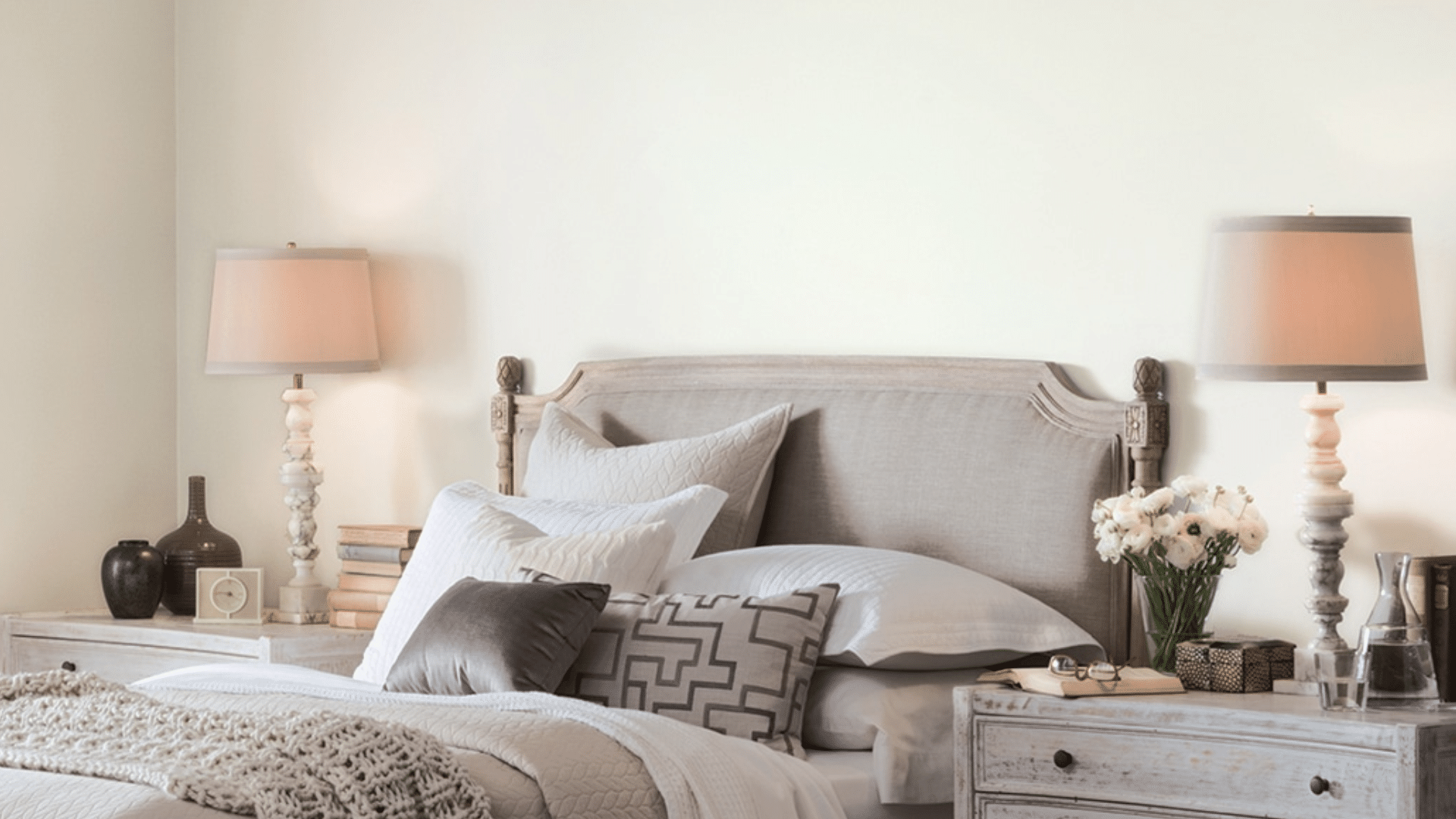
1. Bedrooms
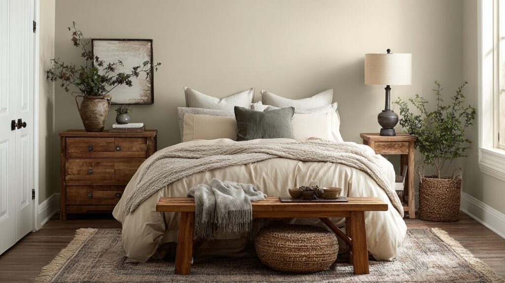
Alabaster brings calmness to bedrooms. Its soft warmth pairs perfectly with linen bedding, light wood furniture, and cozy lighting. It creates a restful atmosphere that helps you unwind at the end of the day.
The color’s gentle cream tone adds comfort without overpowering the space, making it ideal for rooms meant to feel soothing and peaceful. If you want a warm, inviting retreat, Alabaster is a dependable bedroom wall color.
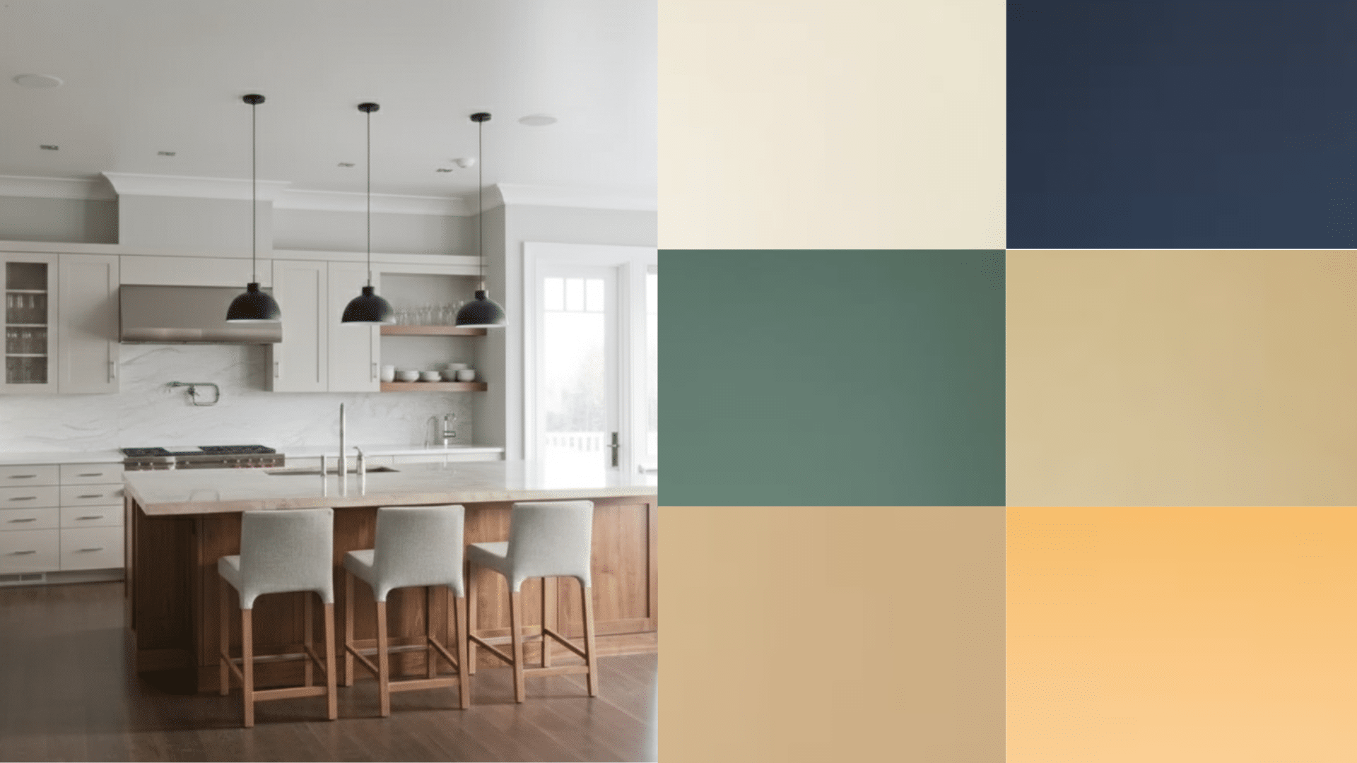
2. Kitchens
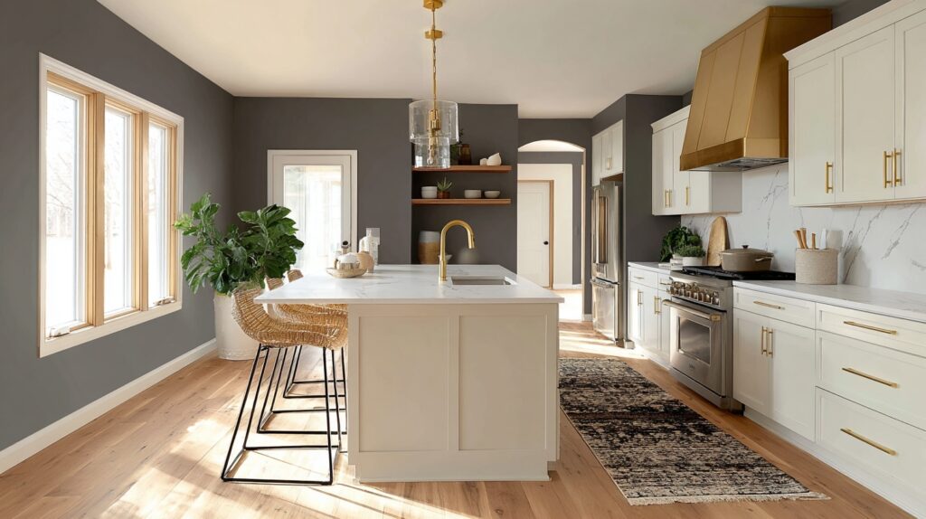
In kitchens, Alabaster works as a bright yet welcoming backdrop. It pairs beautifully with natural stone, tile backsplashes, and both light and dark cabinets. The tone keeps the space open and comfortable, not stark or cold.
It reflects light well, making smaller kitchens feel bigger and more cheerful. Alabaster’s balanced warmth complements stainless steel, wood finishes, and neutral countertops, blending easily with any decor style. It’s a great choice for classic or modern kitchen designs.
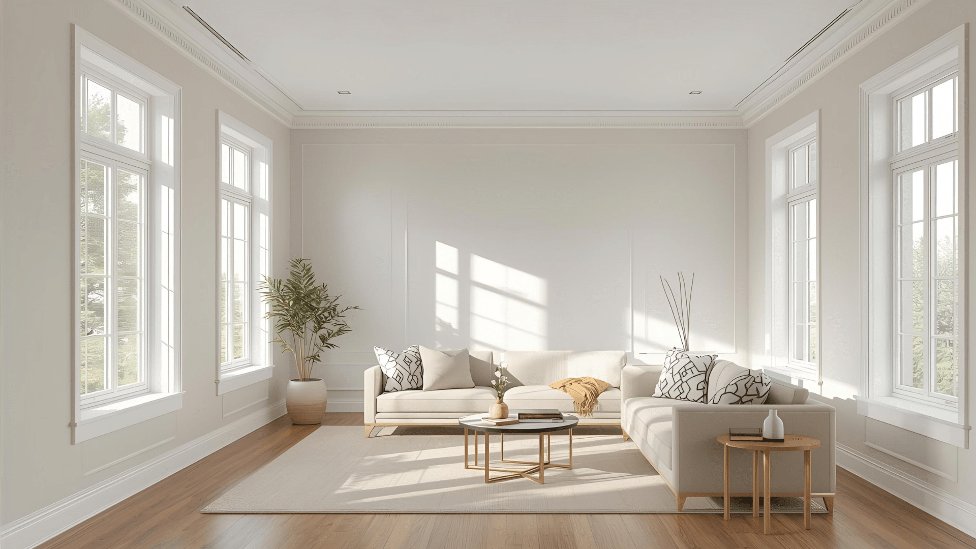
3. Living Rooms
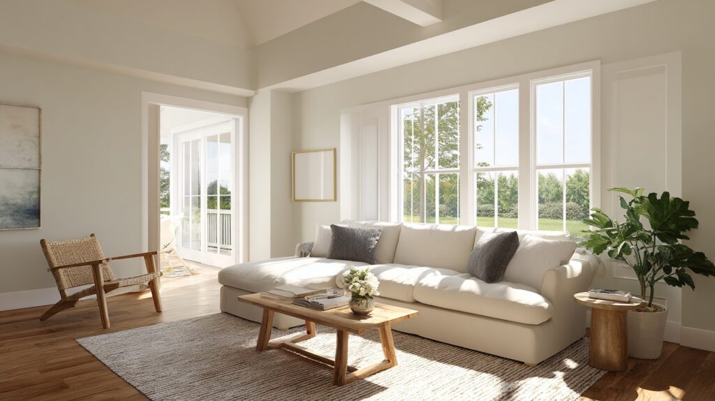
Alabaster gives living rooms a balanced, timeless feel. It reflects just enough light to make the space bright without glare. Whether your style is rustic, farmhouse, or modern, it works effortlessly with any palette.
The soft white tone allows furniture and decor to stand out naturally. It pairs beautifully with warm woods, natural fabrics, and soft accents. If you want your living space to feel open, welcoming, and grounded, Alabaster delivers that harmony perfectly.
4. Exteriors
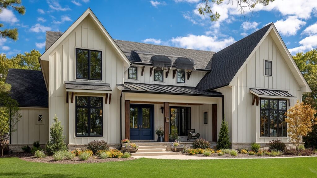
On exteriors, Alabaster stands out as a warm yet clean white. It keeps its tone consistent in natural light, avoiding the starkness that some whites show outdoors. The color pairs beautifully with dark trim, black doors, or navy shutters for striking contrast.
It’s a favorite for farmhouse, coastal, and cottage-style homes because it feels bright but never too harsh. Alabaster’s softness gives exteriors an inviting, timeless look that stays fresh throughout every season.
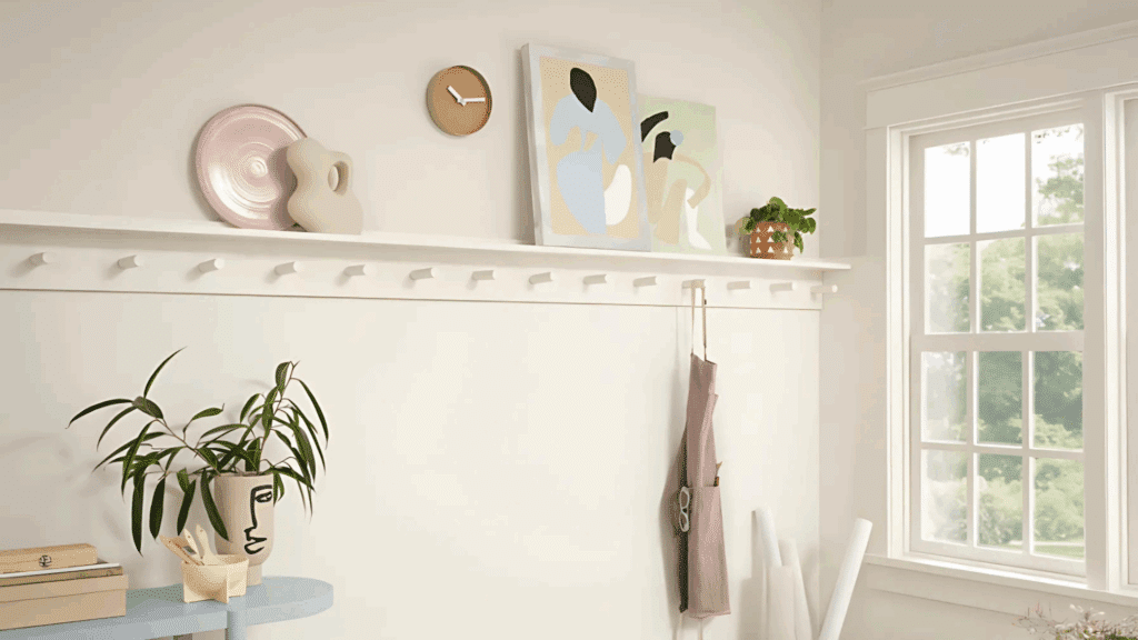
Alabaster with Trim, Cabinets, and Ceilings
Alabaster’s gentle warmth makes it perfect for details like trim, cabinets, and ceilings, bringing balance and cohesion throughout your home. Things like these are great to keep in mind before deciding on a contrasting color:
Trim
Alabaster trim offers a soft, natural outline that enhances walls without feeling too sharp. It works beautifully with warm or cool wall shades, creating a seamless flow from room to room.
The color’s subtle warmth softens bold tones and complements natural materials like wood or stone. Many homeowners use it for doors, baseboards, and moldings because it brightens edges while keeping the overall space calm, balanced, and timeless.
Cabinets
For cabinets, Alabaster gives just the right mix of warmth and freshness. It makes kitchens and bathrooms look open and inviting without feeling cold. The color pairs perfectly with brass, black, or nickel hardware, giving you flexibility with finishes.
It also blends well with stone, quartz, and butcher block countertops. If you want a farmhouse, coastal, or classic look, Alabaster cabinets keep the space grounded while adding a soft, sophisticated glow.
Ceilings
Using Alabaster on ceilings creates a smooth transition from wall to overhead space. It removes the harsh contrast that pure white ceilings often create, making the room feel more unified.
The color’s light reflectivity keeps rooms bright without glare, especially in open or vaulted spaces. It’s an excellent option for homes with mixed lighting conditions, helping ceilings feel airy and natural while maintaining a cohesive, connected look across the entire space.
Comparing Alabaster White to Other Whites
Alabaster is often compared to other popular whites. Understanding these differences helps you choose the right shade for your home:
Alabaster vs. Pure White (Sherwin-Williams)

Pure White is cooler and crisper, while Alabaster leans warmer and softer. On walls, Pure White delivers a clean finish that suits modern spaces, while Alabaster adds subtle warmth and comfort.
If you want a color that feels welcoming without looking stark, Alabaster is the better choice. Pure White works best when paired with contemporary designs or cooler-toned accents.
Alabaster vs. White Dove (Benjamin Moore)

Benjamin Moore’s White Dove is often compared to Sherwin-Williams’ Alabaster white because of their shared softness.
White Dove shares similarities with Alabaster, but it has stronger gray undertones. This makes White Dove feel slightly more muted and less creamy. Alabaster, on the other hand, holds onto warmth that feels cozy in low-light settings.
Choosing between them often depends on your lighting conditions. White Dove works well in brighter spaces, while Alabaster is dependable in dimmer or north-facing rooms.
Sherwin-Williams vs. Benjamin Moore Alabaster

Sherwin-Williams Alabaster (SW 7008) is warm with beige-gray undertones, while Benjamin Moore Alabaster (OC-129) leans cooler with a faint pink undertone.
The two are not direct matches, and side-by-side, they read differently. If you’re considering “Alabaster,” make sure you specify the brand since each offers a distinct take on soft white. Both can work, but context and palette matter.
When to Choose Each Option
Select Alabaster (Sherwin-Williams) if you want a warm, versatile white that feels soft in most conditions. Choose Pure White for a clean, modern finish with cooler accents.
Go with White Dove if you need a neutral white that balances gray undertones. Consider Benjamin Moore Alabaster for subtle pink warmth. Testing swatches under your own lighting is the safest way to decide.
| Color | Undertone | Best Use | Notes |
|---|---|---|---|
| Sherwin-Williams Alabaster (SW 7008) | Warm beige-gray | Interiors/exteriors | Soft warmth, versatile |
| Sherwin-Williams Pure White (SW 7005) | Neutral, cooler | Modern trim/walls | Crisp and clean |
| Benjamin Moore White Dove (OC-17) | Gray-cream | Bright interiors | Slightly muted, cozy |
| Benjamin Moore Alabaster (OC-129) | Pink-white | Accent walls, trim | Subtle pink cast |
Coordinating Colors with Alabaster
Pairing Alabaster with the right colors creates a balanced and inviting space. These tips will help you choose shades that highlight its soft warmth without overwhelming the room:
Neutral Pairings
Pairing Alabaster with neutrals creates a calm, layered effect. Light grays add balance, while warm taupes and soft beiges enhance its creaminess. This approach works well for bedrooms, living rooms, or kitchens where subtle contrast is preferred.
For trim, deeper grays like Sherwin-Williams’ Mindful Gray can ground the palette. These combinations keep Alabaster feeling soft and adaptable without pulling the attention away from furniture or architectural details.
Bold Accent Options
Alabaster also handles bold colors well. Navy offers crisp contrast for cabinets, doors, or accent walls. Deep greens bring out its warmth while keeping the overall scheme grounded and natural.
Terracotta, with its earthy red-orange tone, introduces richness and complements Alabaster’s creamy undertones.
Using these accents strategically, on front doors, statement furniture, or feature walls, adds interest without overpowering the soft neutrality that Alabaster provides as the base color.
Whole-House Palette Examples
For a cohesive whole-house palette, use Alabaster as the anchor across walls or trim. Pair it with warm neutrals like Accessible Beige in common areas, add depth with Iron Ore for accents, and soften transitions with Agreeable Gray in hallways.
In bedrooms or bathrooms, introduce muted blues or greens to create subtle variation. This approach ensures continuity while still allowing each room to feel distinct, practical, and welcoming throughout the home.
Pros and Cons of The Color
Alabaster is a popular white paint that offers warmth and adaptability, though certain conditions highlight drawbacks like which makes it worth considering before choosing:
Pros of Alabaster
Alabaster’s strengths make it one of Sherwin-Williams’ most used whites, valued for flexibility, comfort, and suitability across design styles.
- Works well for both interiors and exteriors
- Soft white that feels inviting, not sterile
- Complements a wide range of color palettes
- Pairs easily with wood tones and natural textures
- Adaptable across farmhouse, modern, and transitional styles
Cons of Alabaster
Despite its appeal, Alabaster can present challenges depending on light conditions and design context, requiring careful testing before full application.
- May appear yellow in dimly lit rooms
- Warm bulbs can exaggerate creaminess
- It can look flat under strong sunlight outdoors
- Undertones sometimes clash with cool, crisp palettes
- Lighting and room orientation heavily affect results
Where to Buy Alabaster Paint
Sherwin-Williams Alabaster (SW 7008) can be purchased directly from Sherwin-Williams stores or through their official website at www.sherwin-williams.com. You can also find it at authorized retailers.
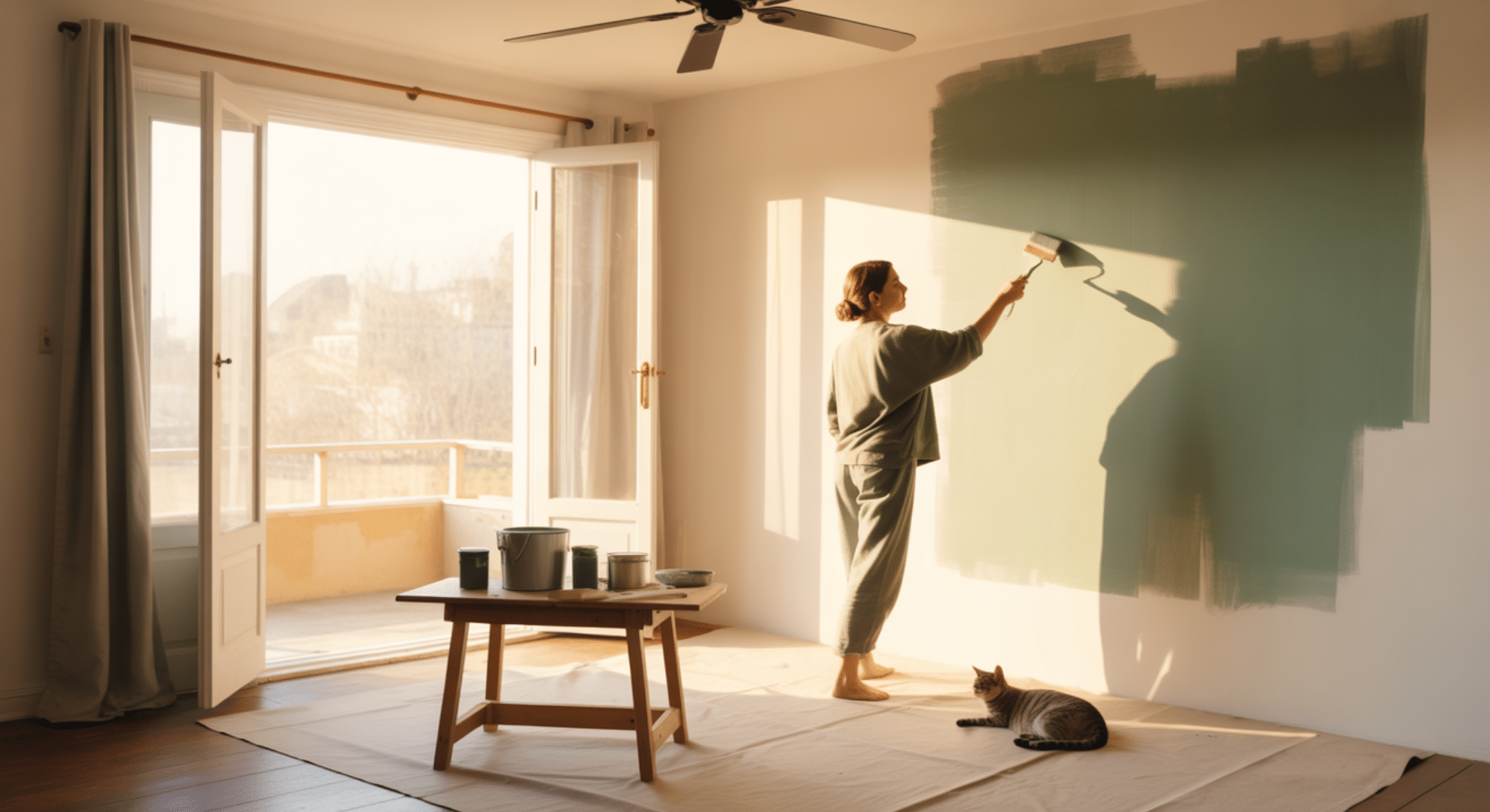
Many homeowners prefer to start with sample sizes or peel-and-stick swatches from services like Samplize, which let you test how the color looks in your space before committing.
Full gallons are available in both interior and exterior formulas, making this shade suitable for any project. Don’t forget to check Sherwin-Williams’ Paint Perks program for current promotions and confirm availability at your local store before purchasing.
Conclusion
After testing it myself, I finally understood the answer to what color is Alabaster: it’s a comfortable, flexible white that works anywhere. It doesn’t come across too harshly, and it blends beautifully with other colors.
The real test, though, is how it looks on your walls. That’s why I always recommend sampling first before making a commitment.
If you want a white that’s flexible and dependable, Alabaster is a strong choice. I hope this guide gave you clarity, and I’d love for you to check my other paint reviews to find more colors that could work perfectly in your home!