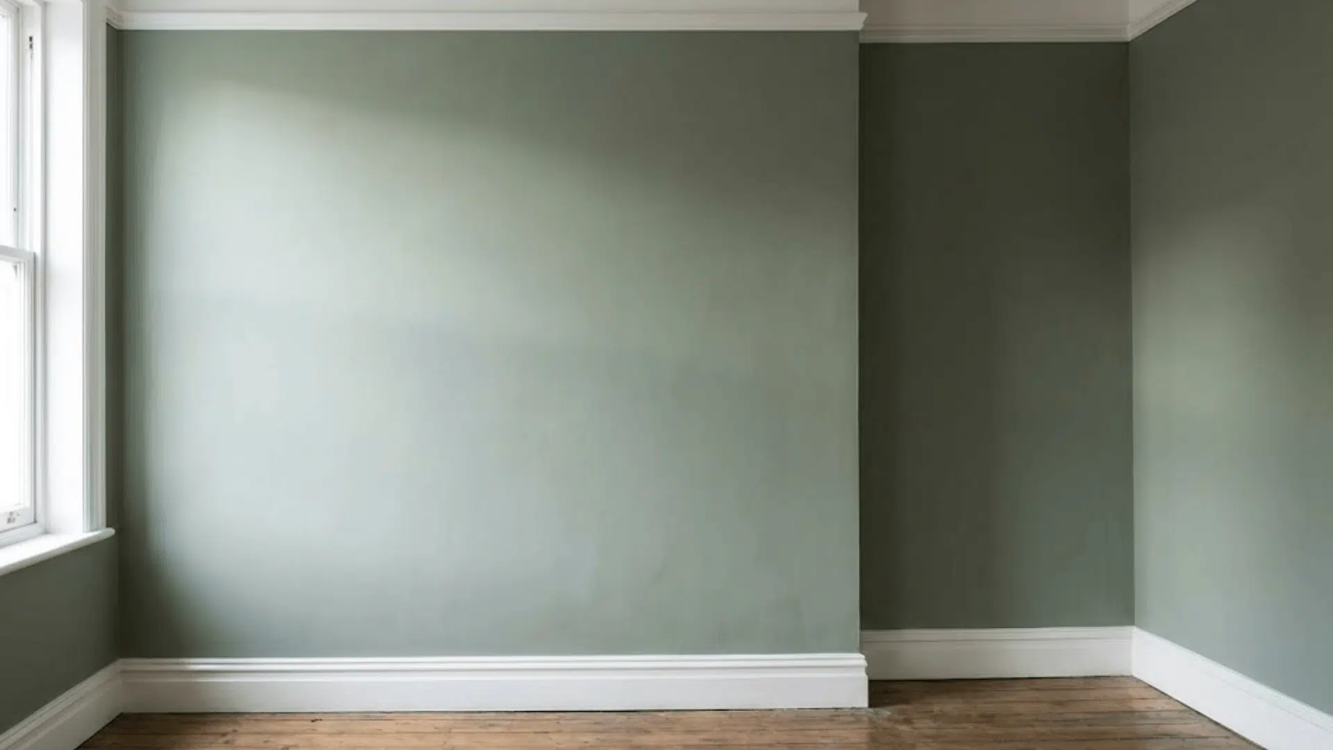
Benjamin Moore’s Blue Note (2129-30) is a unique blend of blue and Gray that brings calm and depth to any space.
This adaptable shade works well in various settings to create a cozy, intimate atmosphere or a modern, chic vibe.
Blue Note is ideal for living rooms, bedrooms, kitchens, and bathrooms, making it a great choice for your next design project.
Its classic appeal ensures it pairs beautifully with various other colors, giving Infinite options for creating a balanced, refined space.
In this post, we’ll guide you on how to use Blue Note to improve your home.
Why Choose Blue Note?
Blue Note is a color that communicates strength without being overpowering.
It’s not just blue but a careful mix of blue with gray, creating a depth that isn’t seen in other colors.
A sense of quiet refinement makes it suitable for various interior spaces, from bedrooms to living rooms and even kitchens.
Here’s why Blue Note stands out:
Classic and Flexible
One of the primary reasons Blue Note is a fan favorite is its adaptability.
If you’re looking for a modern look or a more traditional feel, Blue Note adapts to both styles.
It holds up well in various lighting conditions, allowing it to shift slightly in tone, which means it will never feel out of place, even as trends evolve.
It’s a color that feels fresh and timeless, grounding your home.
Subtle and Calming
Unlike brighter blues, which sometimes feel too bold or loud, Blue Note has a muted, grayish quality that gives it a calming presence.
The result is a soft yet impactful color that encourages relaxation.
Ideal for spaces like bedrooms or reading corners, it invites peace and serenity without overwhelming the senses.
Complements a Wide Range of Decor
Blue Note easily complements other design elements from mid-century modern to farmhouse chic.
Its neutral undertones allow it to blend well with natural wood tones, metals, and even other colors.
Whether it’s sleek stainless steel in a kitchen or rustic wooden furniture in the living room.
Blue Note serves as a versatile backdrop that improves any design scheme.
Where to Use Blue Note in Your Home
Blue Note is a flexible color that can be used in almost every room. Its ability to adapt to different spaces and lighting makes it a top choice for large and small rooms.
Let’s look at how you can make the most of Blue Note in different areas of your home:
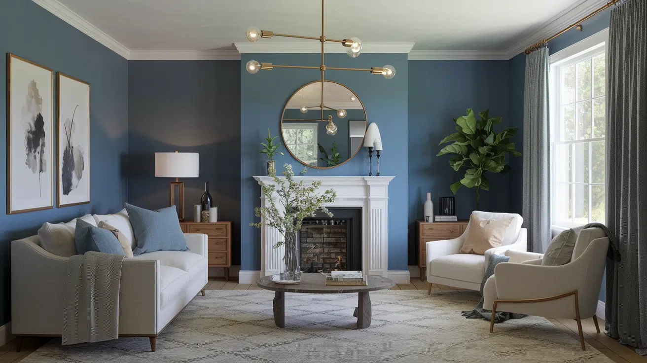
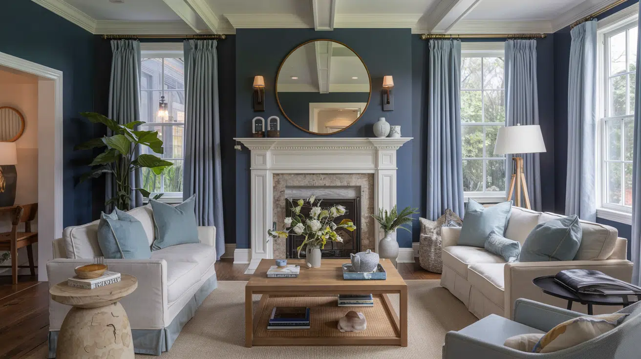
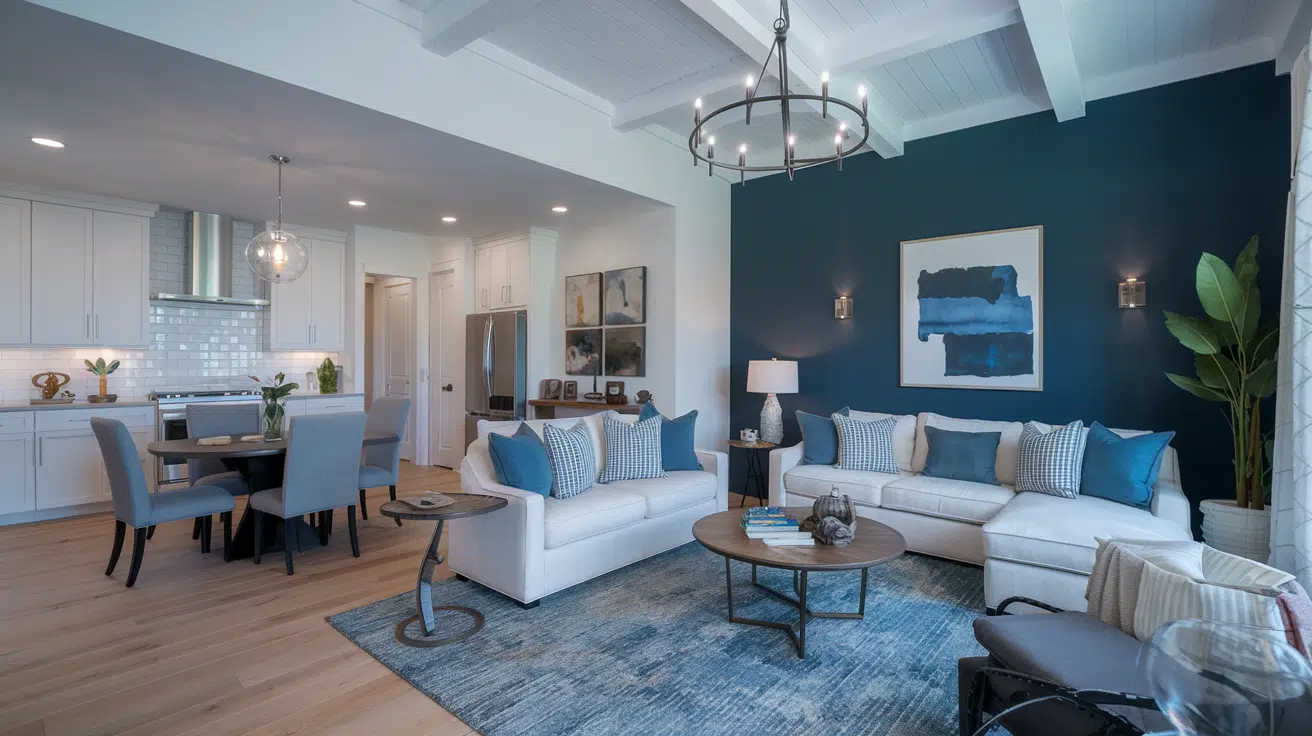
Living Rooms
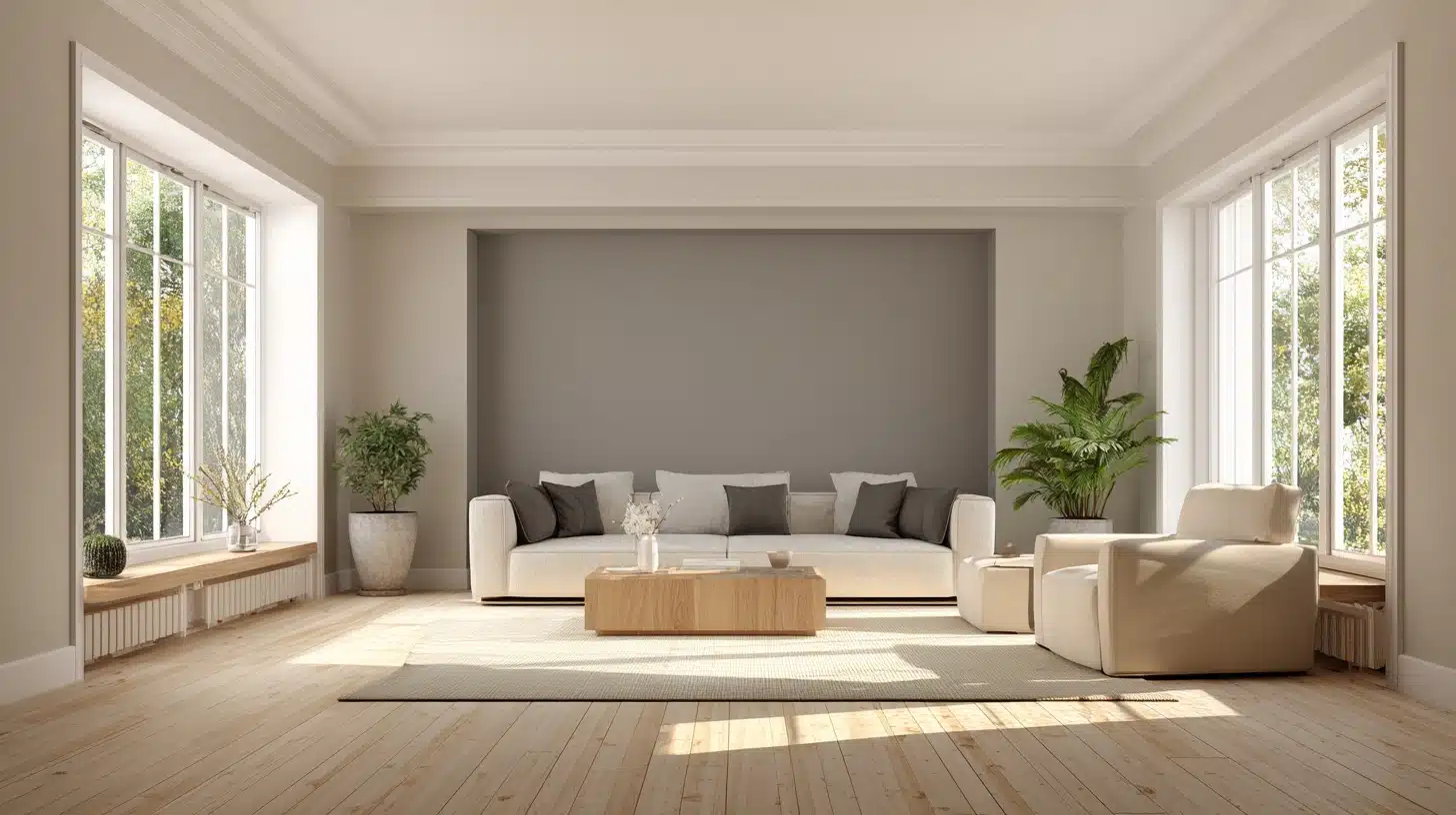
Blue Note can serve as a calming backdrop and a focal point in living rooms. Pair it with light gray or beige furniture to allow the color to shine without overpowering the space.
You can use it for an entire wall or as an accent behind a sofa or fireplace. The richness of Blue Note adds complexity while keeping the room open and welcoming.
If your living area has plenty of natural light, Blue Note will appear lighter and brighter, infusing the room with energy.
It will create a deeper, more intimate atmosphere in rooms with limited natural light, perfect for evening relaxation.
Bedrooms
Blue Note works wonders in bedrooms, creating a natural environment for relaxation. It brings a sense of calm that’s perfect for winding down at the end of the day.
Combine Blue Note with crisp white bed linens or soft beige accents for an airy yet cozy, balanced look.
Pair it with rich wood tones and metallic gold or silver accents for a more luxurious touch. These pairings bring out the grace of Blue Note and create a serene, improved sleeping area.
Bathrooms
Although dark colors are often avoided in smaller spaces, Blue Note’s muted tones make it an excellent option for bathrooms.
Paired with white tiles, a modern shower, or vintage fixtures, Blue Note can transform your bathroom into a serene sanctuary.
For a cohesive look, incorporate light wood or stone accents that complement the soft richness of the color.
Hallways and Entryways
Use Blue Note in your hallway or entryway to immediately set the tone for the rest of your home. A soft, welcoming shade that doesn’t overwhelm creates an inviting atmosphere while still making a statement.
This can be particularly effective when paired with neutral furniture and soft lighting fixtures that allow the color to stand out.
How to Style Blue Note
Once you’ve decided on Blue Note for your walls, the next step is styling the room. Here are a few tips to bring out the best in this adaptable color:
Use Lighter Accents
To balance out Blue Note’s deep tones, consider incorporating lighter hues for furniture, trim, and accessories.
Crisp whites, soft beiges, or light grays can keep the room from feeling too heavy.
For example, white trim along the baseboards, windows, and doors adds a crisp contrast to the richness of the Blue Note walls.
This helps brighten the space without detracting from the main color.
Pairing with Metallics
If you want to add a touch of glam to your design, Blue Note pairs wonderfully with metallic accents. Gold, copper, or brushed nickel can all enhance the class of this shade.
You might consider metallic light fixtures, picture frames, or mirrors that reflect light and make the color pop.
Bring in Natural Elements
Wood accents are an excellent way to bring warmth and texture to a Blue Note-painted room.
Whether it’s a wooden coffee table, bookshelves, or even hardwood floors, the earthy tones contrast beautifully with the cooler hues of Blue Note, adding depth and character.
Blue Note pairs wonderfully with reclaimed wood furniture if you have a vintage or rustic style.
DIY Application Tips
- What finish works best for this shade
- Best primers for optimal coverage
- How to paint step-by-step
- Common mistakes to avoid when using Blue Note
What Finish Works Best?
High-end paint like Benjamin Moore’s Blue Note comes in several finishes.
For living spaces, eggshell offers the perfect balance of durability and sophistication.
Pearl or satin works beautifully in bathrooms and kitchens. For a dramatic look, consider matte in low-traffic areas.
Best Primers to Use
The deep blue tone requires proper priming. Use Benjamin Moore’s Fresh Start High-Hiding Primer or their Color Foundation Primer.
For dark walls, a gray-tinted primer helps achieve true color coverage.
Comparison of Blue Paint Colors with Blue Note (2129-30):
| Benjamin Moore Blues | Color Code | Characteristics | Best Used For |
|---|---|---|---|
| Blue Note | 2129-30 | Deep navy with subtle purple undertones; sophisticated | Accent walls, built-ins |
| Hale Navy | HC-154 | Classic dark navy; balanced neutral undertones | Traditional spaces, doors |
| Gentleman’s Gray | 2062-20 | Dark blue-gray with green undertones | Libraries, offices |
| Van Deusen Blue | HC-156 | Historical blue with gray undertones; lighter than Blue Note | Bedrooms, living rooms |
| Blue Danube | 2062-30 | Vibrant maritime blue; brighter than Blue Note | Coastal homes, bathrooms |
| Kensington Blue | 840 | Mid-tone blue with slight gray undertones | Living spaces, exteriors |
| Admiral Blue | 2065-10 | Deep, intense navy; darker than Blue Note | Dramatic accents, cabinetry |
| Newburyport Blue | HC-155 | Traditional navy blue; warmer than Blue Note | Colonial homes, studies |
Complementary Color Pairings
Blue Note doesn’t just complement neutral tones; it works well with several other colors, including:
Light Grays and Whites: These colors help create a balanced, airy feeling when paired with Blue Note.
For instance, Benjamin Moore’s Chantilly Lace (OC-65) is a perfect white complementing deep blue-gray.
Earthy Greens: For a touch of nature, consider adding shades of green.
Benjamin Moore’s Hunter Green (2041-10) can offer an earthy contrast to Blue Note while keeping the design grounded and natural.
Soft Pastels: Soft pinks or muted yellows can add a gentle touch of warmth to a Blue Note room. This combination is perfect for a more subtle, relaxing ambiance.
Lighting Considerations for Blue Note
Lighting plays a crucial role in how Blue Note looks in your home.
Depending on the amount of natural or artificial light in the room, it can alter its tone, making it appear brighter or deeper.
Natural Light
Blue Note can look lighter and more vibrant in rooms with plenty of natural light.
The bright sunlight will reflect off the cool tones of the paint, creating an open, airy atmosphere. Blue Note offers the perfect balance of style and lightness for rooms that receive a lot of sunlight.
Artificial Light
Blue Note may appear darker and moodier in rooms with limited natural light.
To ensure the room doesn’t feel too heavy, use warm artificial lighting, such as yellow or amber tones, to bring a cozy, inviting feel.
You can also improve the color’s depth with strategic lighting, highlighting Designer features like artwork, shelves, or furniture.
Common Mistakes to Avoid
Don’t skip proper wall preparation. Never thin this premium paint. Avoid painting in direct sunlight. Don’t rush between coats.
Skip the cheap rollers that can leave lint. Remember to maintain consistent room temperature during application and drying.
Conclusion
Blue Note is a perfect example of how a single color can change the entire atmosphere of a room. Whether you use it on all walls or as an accent, it creates a calm yet polished environment.
It works across different spaces—living rooms, bedrooms, kitchens, and even bathrooms—and pairs beautifully with various furniture and design styles.
Combining Blue Note with natural materials, metallic accents, or complementary hues can bring a fresh, flexible beauty to your home.
No matter your style or space size, Blue Note offers an adaptable solution that suits various tastes and design ideas.
Frequently Asked Questions
Can I use Blue Note in a small room?
Blue Note works well in small rooms when balanced with light-colored furniture or accessories. It creates an intimate feel while still adding depth.
What trim colors look best with Blue Notes?
White, light gray, or soft beige trim colors help to highlight Blue Note’s rich tones and provide contrast, keeping the space bright and open.
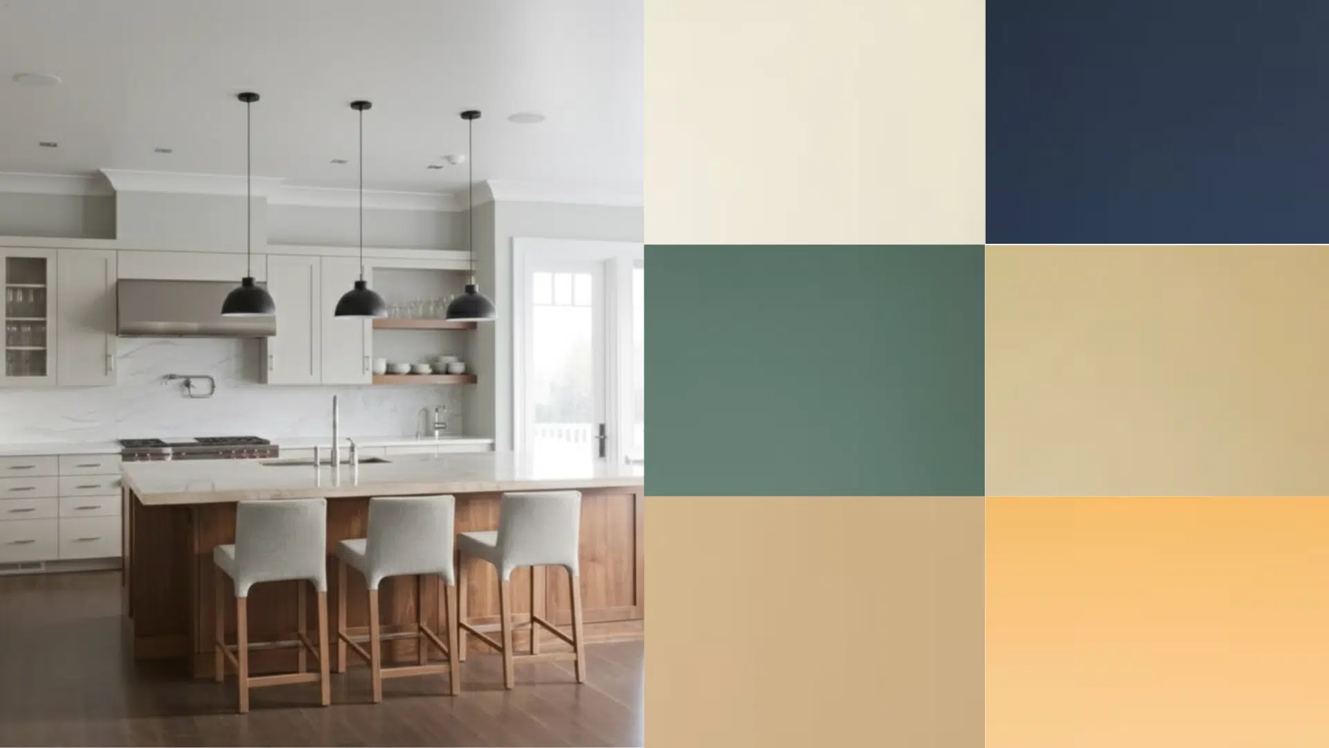
Is Blue Note a good choice for a kitchen?
Absolutely! Blue Note pairs well with white countertops, stainless steel appliances, and wooden elements, making it a great choice for modern or farmhouse kitchens.