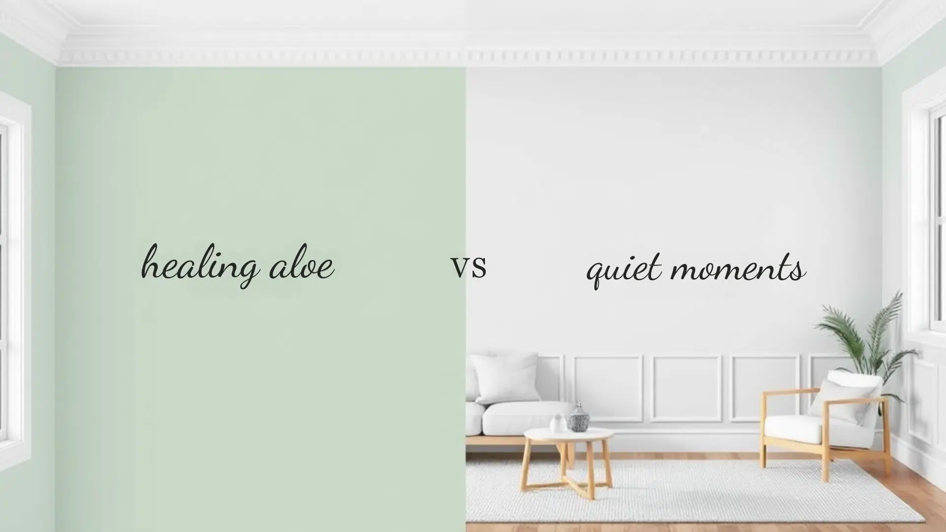
Paint colors can make a big difference in how you feel at home.
Today, we’re looking at two popular paint shades: Healing Aloe and Quiet Moments.
These colors have gotten lots of attention from people wanting to create calm spaces in their homes.
If you’re planning to paint your walls soon, this guide is perfect for you. I’ve helped homeowners refresh their spaces.
Even if you like doing home projects yourself or are an interior designer helping clients, we’ll help you choose between these two lovely options.
Both colors bring a special feeling to a room, and we’ll show you exactly how they differ.
Overview of Each Color
Let’s get to know these two popular Benjamin Moore colors better – they might look similar at first glance, but each has its own unique personality.
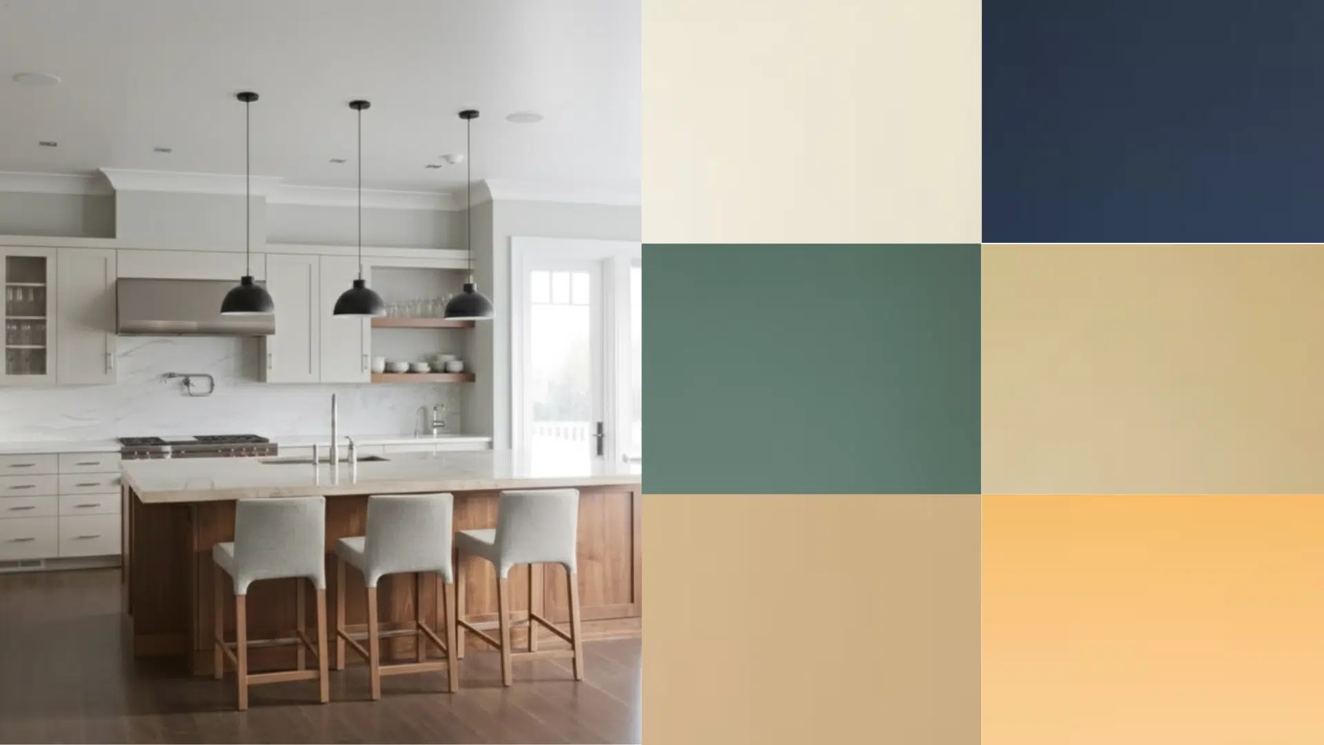
Healing Aloe (BM 1562)
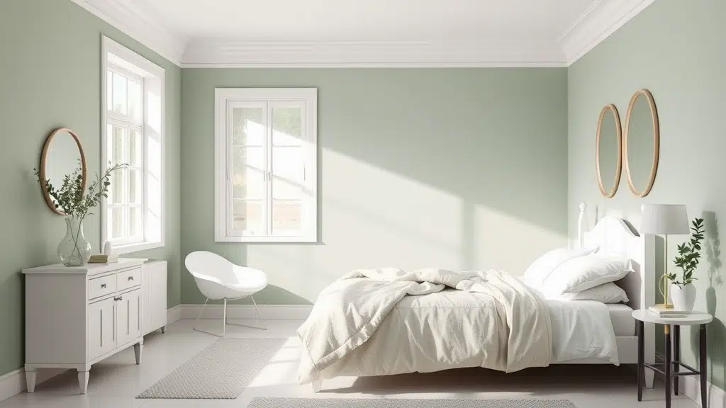
This soft green-gray paint has a gentle blue undertone that shows up more in natural light.
It’s a light shade that reminds me of the sea glass you might find on the beach.
Benjamin Moore describes it as a calming pastel that brings a fresh feel to any room.
The color shifts subtly throughout the day, appearing more green in the morning and grayer in the evening.
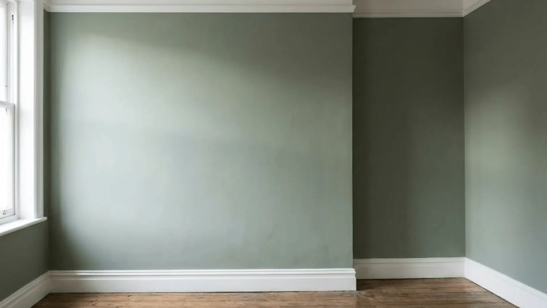
Quiet Moments (BM 1563)
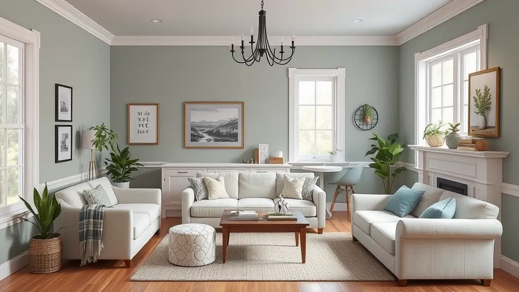
This is a softer, more gray-focused color with gentle green and blue hints mixed in.
Think of early morning fog over a lake – that’s the feeling it creates.
Benjamin Moore calls it a tranquil shade that works well in spaces where you want to relax.
The color stays pretty steady in different lights but can look slightly more blue when paired with pure white trim.
Healing Aloe vs Quiet Moments: Side-by-Side Comparison
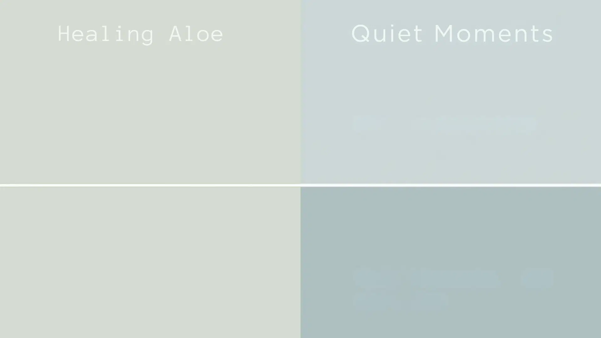
When you compare these colors, you’ll notice some subtle but important differences that can help you make your choice.
Key Differences
Healing Aloe has a Light Reflection Value (LRV) of 61, slightly brighter than Quiet Moments, which has an LRV of 60.
Healing Aloe shows more green, while Quiet Moments leans more into gray with a touch of blue.
How They Look in Different Lighting Conditions
Morning sun brings out the green in Healing Aloe while it makes Quiet Moments look more blue.
In evening light, both colors get softer – Healing Aloe turns more grayish, and Quiet Moments keeps its calm gray look.
Which One is Warmer or Cooler?
Healing Aloe feels a bit warmer thanks to its green notes.
Quiet Moments stays on the cool side because of its blue-gray base.
This makes Healing Aloe feel more like spring, while Quiet Moments feels more like a misty morning.
Best Uses for Each Color
Let’s look at where these colors shine brightest in your home. Each one has spots where it works especially well.
Healing Aloe: Where it Works Best
This color feels right at home in bedrooms and bathrooms.
Its soft green hints make it perfect for spaces where you want to feel refreshed.
Many people love it in home offices, too – it’s bright enough to keep you alert but gentle enough to help you focus.
It also looks amazing in rooms that get lots of natural light.
Quiet Moments: Where it Works Best
This color creates a cozy feeling in living rooms and family spaces.
It’s also a great pick for kitchens and reading nooks where you want to feel peaceful.
If you’re thinking about painting outside, this color holds up really well on exterior walls and looks beautiful with white trim and natural stone.
Color Pairing Guide for Healing Aloe vs Quiet Moments
Picking the right colors to go with your main paint choice can make a big difference.
Here’s what works well with each shade.
Best Trim Colors
Both colors look clean with pure white trim like White Dove or Chantilly Lace.
For something softer, try Swiss Coffee with Healing Aloe.
Quiet Moments pairs nicely with Light Gray – it creates a subtle, smooth look.
Complementary Colors for Accent Walls
Healing Aloe works well with light blues and soft grays.
Quiet Moments matches beautifully with deeper grays and gentle cream colors.
These pairings help create a calm, connected feel in your space.
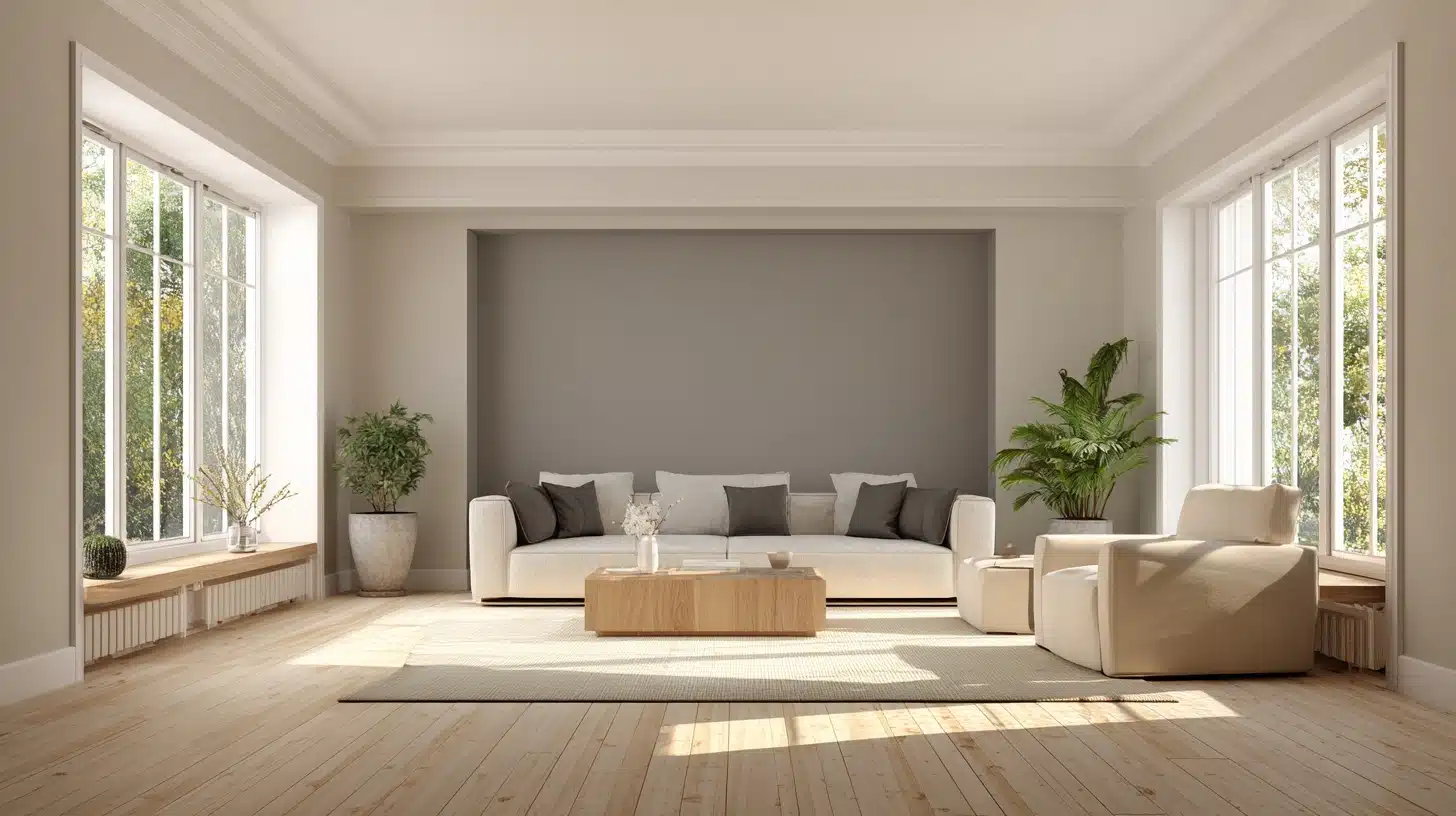
Matching Furniture & Decor Styles
Light wood and white furniture look great with both colors.
Add natural textures like cotton and linen.
Brown leather chairs and cream-colored sofas stand out nicely against these wall colors.
Expert & User Opinions
It’s helpful to hear from people who work with these colors and those who live with them every day. Here’s what they have to say.
Interior designer insights
Design pros often pick these colors for clients who want a calm space.
They say Healing Aloe looks great in sun-filled rooms and brings a fresh feel.
For Quiet Moments, designers love how it changes through the day while keeping its peaceful mood.
Homeowner Reviews
People who chose Healing Aloe say their rooms feel bright and clean.
Many mention how it makes small spaces feel bigger.
Those with Quiet Moments in their homes love its calming effect, especially in busy areas like kitchens and family rooms.
Testing & Painting Tips
Getting the color right the first time saves you time and money.
Let’s look at how to test these colors and make sure you’ll love your choice.
How To Sample the Colors Correctly
- Paint a 2-foot square on each wall you plan to paint.
- Look at it during the morning, afternoon, and evening.
- Use two coats of paint on your test spot – this shows the true color.
- Take photos in different lights to help you decide.
Tips for Avoiding Color Regret
- Buy small paint samples first.
- Paint them on white poster boards that you can move around the room.
- Live with the samples for a few days.
- Check how they look with your furniture and in natural light.
- Remember, both colors need two coats for the best results.
Final Thoughts
Picking between Healing Aloe and Quiet Moments comes down to what you want for your space.
Go with Healing Aloe if you like fresh and bright colors, especially in rooms where you spend your mornings.
It’s great when you want a hint of green that’s not too bold.
Choose Quiet Moments if you’re looking for a more laid-back, calming color that works in any room.
It’s perfect if you prefer gray tones with just a touch of blue and green. This color is especially good for spaces where you want to relax.
Remember, both colors work well in modern and traditional homes, so you can’t really go wrong with either choice.
Trust your gut feeling when you look at your paint samples!