Looking for the perfect off-white paint color? Sherwin Williams Pearly White (SW 7009) might be what you need.
The color has a warm, welcoming feel that makes spaces feel open without being stark white.
Many homeowners and designers choose this shade because it is neither too bright nor too dull- it sits right in that sweet spot.
In this guide, we’ll look closely at what makes Pearly White special, focusing on its soft undertones that change with the light.
You’ll learn how this gentle off-white shade works in different rooms and what colors go well with it.
By the time you finish reading, you’ll know if this popular paint color is right for your home.
Get in on why Sherwin Williams Pearly White is such a widely loved option and how you can use it in your home.
What is Pearly White?
Pearly White by Sherwin Williams has gained fans for good reasons – it’s gentle on the eyes and works well in many homes.
Pearly White is a soft off-white paint color that leans warm without being too yellow.
Its Light Reflectance Value (LRV) of 77 means it reflects quite a bit of light, making rooms feel open and bright.
Think of it as a cozy blanket of color that wraps your room in warmth without being too strong.
Appearance
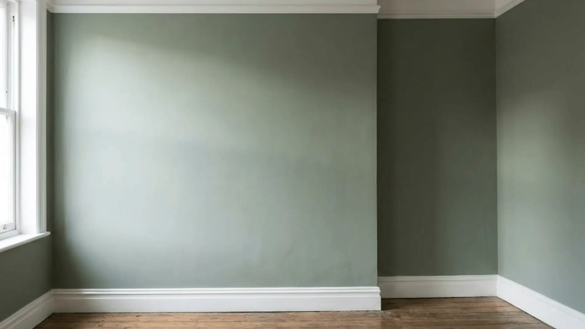
When you see Pearly White on walls, you’ll notice its subtle creamy tone. It’s lighter than typical cream colors but warmer than pure white.
The color shifts slightly throughout the day as sunlight changes.
In bright spaces, it appears almost white, while in shadowy areas, its warm hints become clearer.
Many people love how it makes rooms feel comfy without being too beige or too stark.
The Subtle Undertones of Pearly White
Understanding the hidden colors within Pearly White helps you see how it will look in your home.
These small hints of color make a big difference in how the paint appears on your walls.
Soft Yellow Undertones
There’s a tiny bit of yellow hiding in Pearly White, but don’t worry – it won’t make your walls look like a banana.
This soft touch of yellow gives the color its cozy feel. Think of it like adding a drop of cream to your coffee – it softens the color without taking over.
The yellow is so mild that most people won’t even notice it’s there.
But this small amount of warmth keeps the color from feeling cold or harsh like pure white can.
In morning light, you might catch a hint of this creamy tone, making your space feel sunny and welcoming.
The Gray Influence
Mixed into Pearly White is a touch of gray that does something special – it calms down the warm yellow hints.
This gray acts like a filter, making the color softer and easy on the eyes. Without this gray touch, the color might look too creamy.
But with it, you get a clean, fresh look that stays warm without going overboard.
Occasional Pink and Green Tones
Here’s something interesting about Pearly White – it can play tricks with light!
Sometimes, when the sun hits it just right, you might see tiny hints of pink or green. This happens because of how light bounces around your room.
How to Test Pearly White in Your Space
Before you buy gallons of paint, let’s discuss how to ensure that Pearly White is right for your home.
It’s so important to test this paint before you commit. Put some sample patches on different walls and watch them throughout the day.
Morning sun might bring out one tone, while evening light shows another.
Make sure you like all these subtle changes before you paint your whole room.
Testing helps you avoid any surprises once the paint is on your walls.
The Importance of Lighting
Your room’s lighting makes a big difference in how Pearly White looks.
In bright morning sun, it might appear almost white, while late afternoon light brings out its warmer side.
Turn on your lamps, too – different light bulbs can change how the color looks at night.
Try This Simple Test
Paint a big piece of poster board and move it around your room during the day.
Check it in sunny spots and shady corners.
This helps you see all the ways the color can change in your space.
Using Peel-and-Stick Samples
Paint samples you can stick on your wall are a great way to test Pearly White.
Companies like Samplize make these easy-to-use squares that show you exactly how the color will look. Just stick them up and move them around!
Put these samples next to your couch, curtains, and other items in your room. Leave them up for a few days.
This gives you time to see if you like how the color works with everything in your space.
Where to Use Pearly White in Your Home
This paint color fits well in many spots around your home.
Let’s look at the best ways to use it and what colors work well with it.
Best Applications for Pearly White
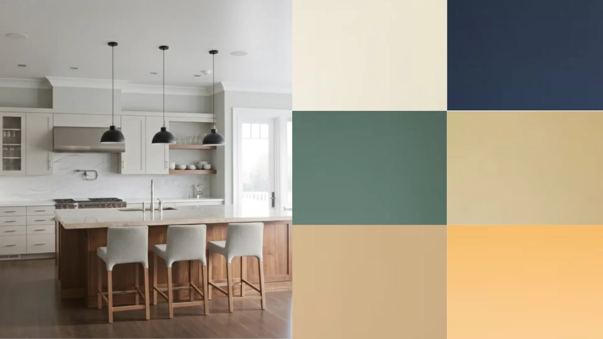
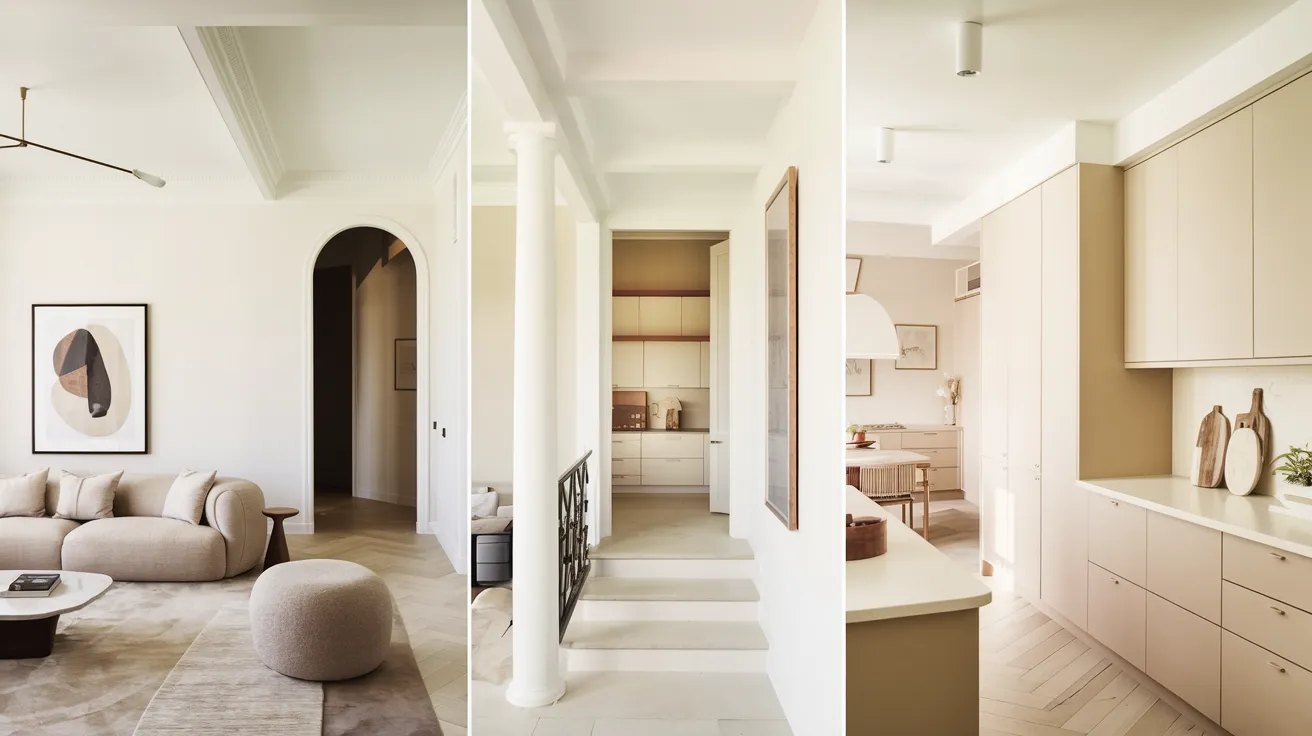
Pearly White shines on walls, but that’s not all it can do!
It looks clean and fresh on kitchen cabinets and adds a soft glow to ceilings.
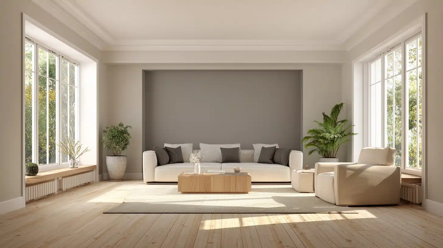
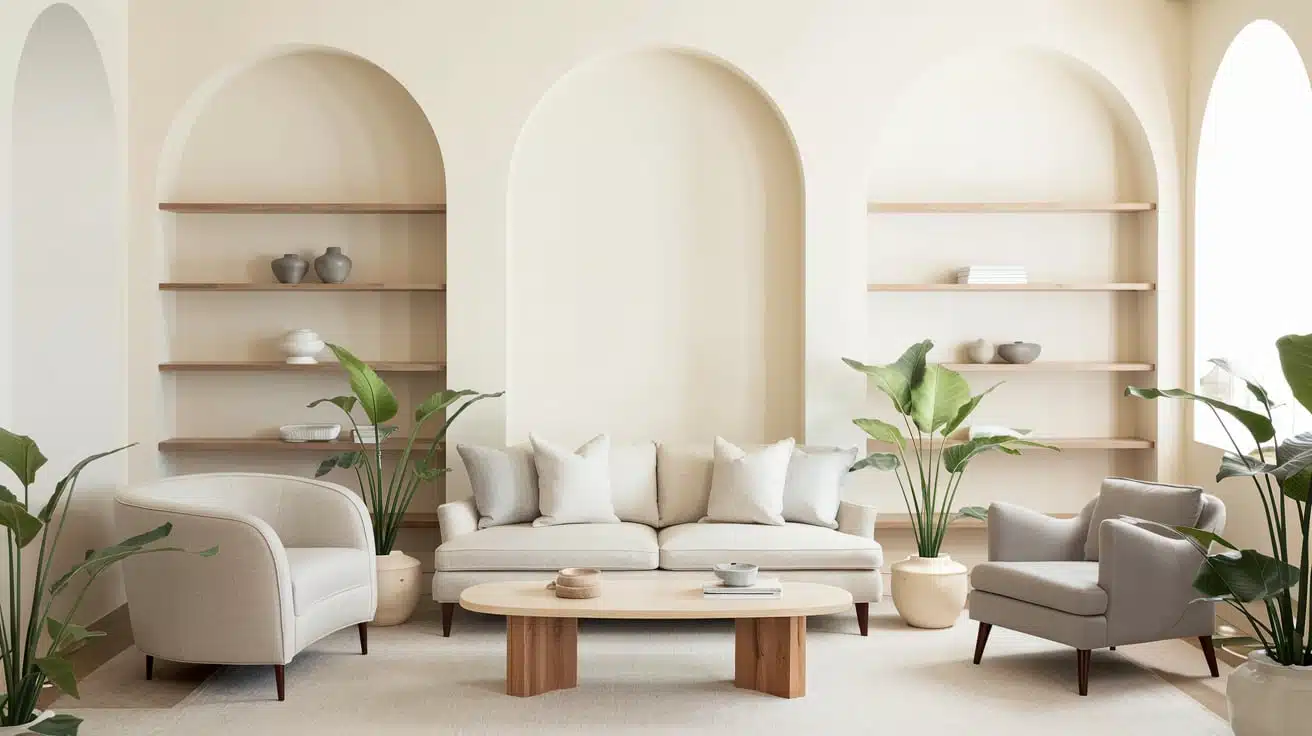
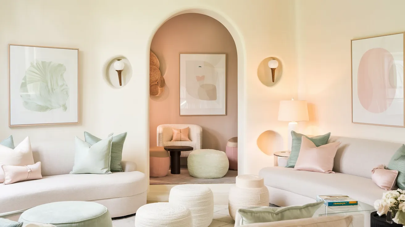
In living rooms, it creates a cozy feel without making the space too dark.
Bathrooms look clean and bright with this shade, while bedrooms feel peaceful and calm.
This color works extra well in spaces that get lots of natural light.
But don’t worry if your room is a bit darker. Pearly White can still work its magic by making the space feel bigger and more open.
Pairing Pearly White with Other Colors
You don’t have to guess what goes well with Pearly White. Dark blues and grays make it pop, while wood tones bring out its warm side.
For trim, try Sherwin Williams Pure White for a clean look or Greek Villa if you want to keep things soft and warm.
Brown furniture looks rich against Pearly White walls, and silver or gold accents sparkle next to it.
Even black metal fixtures stand out nicely against this gentle background.
The key is balance – this color plays well with others without fighting for attention.
Pearly White in Exterior Design
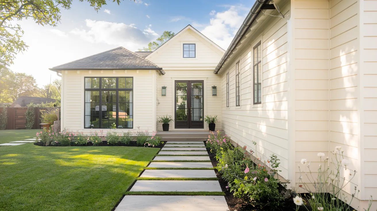
On house exteriors, Pearly White really shows its strength in sunny spots.
The sun brings out its clean, bright look without making it glare like pure white might.
It holds up well in different types of light and makes homes look fresh and clean.
This color looks amazing next to red brick, giving a clean contrast that’s not too sharp. It also pairs beautifully with gray stone, creating a soft, natural blend.
For a modern touch, try it with black windows or dark gutters – these create nice clean lines that catch the eye.
If you have natural wood elements like a front door or porch beams, Pearly White lets these features stand out while staying subtle itself.
Pearly White vs Other Similar Off-Whites

Picking between off-white paint colors can be tricky since they look so similar at first glance.
Let’s see how Pearly White stands up against other popular options.
Pearly White vs Greek Villa
While both colors bring warmth to a room, they’re not twins. Greek Villa has more yellow in it, making it feel a bit warmer than Pearly White.
Think of Pearly White as the middle ground – it’s not as warm as Greek Villa but not as cool as pure white.
Greek Villa works better for rooms that need extra warmth, while Pearly White is best for spaces that want just a hint of coziness.
Pearly White vs Aesthetic White
These two colors might look alike on tiny paint chips, but they act differently on walls.
Aesthetic White shows more gray, giving it a cooler feel. Pearly White keeps its soft, warm glow while staying light and fresh.
In bright rooms, Aesthetic White can look more crisp, while Pearly White maintains its gentle warmth.
Pearly White vs Creamy
Here’s where the differences really show up.
Creamy lives up to its name – it has strong yellow tints that make it much warmer.
Pearly White is more subtle, with just a touch of warmth.
If you like the idea of Creamy but worry it might be too yellow, Pearly White gives you that warm feeling without going too far.
Conclusion
We’ve taken a good look at what makes Pearly White special – from its tiny hints of yellow to its touch of gray that keeps things balanced.
Now you know why this color changes throughout the day and how it works both inside and outside your home.
Remember, paint colors are personal choices. What looks perfect in your friend’s living room might feel different in yours.
That’s why testing is so important. Try some samples, watch how the light plays with the color, and see how it feels with your furniture.
If you’re still not sure, don’t worry! A paint expert can help you make the final call.
After all, you wouldn’t want any regrets when looking at your walls.